Tizen UX Conversion Tutorial: Tab-Based Menu Navigation Tutorial - Part 2
PUBLISHED
Tab-Based Menu Navigation
Overview
This article is part two of a two part series that demostrates the Tab based navigation design, implemented in part 2 using Tizen web UI framework. And the UI is modified to follow the Tizen UX Guidelines.
The Tab-based navigation sample application is based of Tizen web UI framework. The application demonstrates how the Tab navigation menu can be designed for the Tizen applications. Each tab pages can have different navigation styles (like List views), based on the requirements.
Tab Navigation
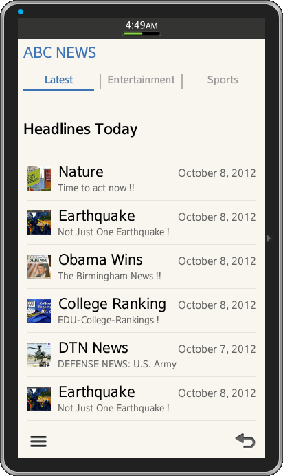
The application home page provides tabs of pages for navigation. The tab navigation is achieved using the tabbar widget provided by the Tizen Web UI service, it’s a page-width bar which equally divides the width of the browser window. The tabbar is unordered list of buttons in a header or footer wrapped together in a single group with data-role="tabbar" as attribute. Again each list item links to the respective pages when selected any options from the tab menu. The current view page tab is highlighted by using the ui-btn-active class and the class ui-state-persist is used to restore active state every time navigating back to the page.
Tizen Ux guidelines strongly recommend to use the Tab in the first screen of the application and can be placed either in header or footer depending on the need of application design. Up to four Tabs can appear in single screen and additional tabs can be displayed flicking the screen sideways.
Also keep the following guidelines in mind, when using tabs in the header:
- Use tabs to show the overall categories on the first screen.
- Show internal categories as a combination of icons and text. Use such combinations as needed.
- Don't use buttons for other functions in the header if you are also displaying a tab at the top of the screen. In this case, find another location for your buttons – besides the footer or tab!
<div data-role="header" data-position="fixed">
  <h1>ABC NEWS</h1>
    <div data-role="tabbar">
      <ul>
	<li><a href="#one"class="ui-btn-active ui-state-persist">Latest</a></li>
	<li><a href="#two">Entertainment</a></li>
	<li><a href="#three">Sports</a></li>
      </ul>
    </div>
</div>
Page Footer Design
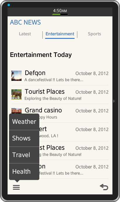
- More Options Menu Button
The application provides more buttons as an options menu. The More button should be placed on the left edge of the footer. If there is no function to offer in the More button, leave the space empty. Use a pop-up screen, if you want to give users access to more than two function buttons. The pop-up should appear when the user touches the More button on the left side of the footer.
<div data-role="footer">
  <a href="#pop_js" data-role="button"  data-icon="naviframe-more" data-transition="slideupfade" data-rel="popup"></a>
  <div id="pop_js" data-role="popup">
    <ul data-role="listview">
      <li><a href="#" data-rel="back">Weather</a></li>
      <li><a href="#" data-rel="back">Shows</a></li>
      <li><a href="#" data-rel="back">Travel</a></li>
      <li><a href="#" data-rel="back">Health</a></li>
    </ul>
  </div>
</div><!-- /footer -->- Back or Cancel Button
Per Tizen UX design guidelines, you should be offering users a return path to the previous stage (or level) in the form of Back or Cancel buttons. Place these buttons on the right edge of the footer and ensure they appear on every screen of your application.
In our case here, we have provided the back button using the page widget attribute data-add-back-btn added to every page as below,
<div data-role="page" id="one" data-add-back-btn="true">
Using Listview for Contents
The list view can be viewed as a simple unordered list containing linked items with a data-role="listview" attribute. To add a list widget (with anchor) to your application, use the below basic HTML markup.
<ul data-role="listview">
   <li>
      <a href="#">First Item In List</a>
      <a href="#">Second Item In List</a>
   </li>
</ul>
The code from the sample application shows, how the list view can be achieved along with the picture and subtexts added.
<ul data-role="listview">
  <li class="ui-li-has-multiline">
   <a href="#newspage">
    <img src="./css/images/Latest/nature.png" alt="icon" class="ui-li-bigicon">
     Nature
    <span class="ui-li-text-sub">Time to act now !!</span>
    <span class="ui-li-text-sub2">October 8, 2012</span>
   </a>
  </li>

  <li class="ui-li-has-multiline">
   <a href="#newspage">
    <img src="./css/images/Latest/earth.png" alt="icon" class="ui-li-bigicon">
     Earthquake
    <span class="ui-li-text-sub">Not Just One Earthquake !</span>
    <span class="ui-li-text-sub2">October 8, 2012</span>
   </a>
  </li>

  <li class="ui-li-has-multiline">
   <a href="#newspage">
    <img src="./css/images/Latest/win.png" alt="icon" class="ui-li-bigicon">
     Obama Wins
    <span class="ui-li-text-sub">The Birmingham News !!</span>
    <span class="ui-li-text-sub2">October 8, 2012</span>
   </a>
  </li>
</ul>
Snapshot:
Below are the snapshots of the Tab menu from sample application.
License:
The icons used in the applications are licensed under Creative Commons License Attribution-ShareAlike 2.0.
Development Environment:
Tizen SDK
Version : 2.1.0
Build id : 20130416-1439
Note:
The sample application is available for reference (See under File Attachment section).