Keeping high portability of your Tizen web applications
PUBLISHED
Introduction
Before reading this article we recommend you to get familiar with the “Canvas2D mobile web game development – basics” and “Canvas2D mobile web game development – implementation” where we introduced Canvas 2D API along with concepts of the game loop and the adaptive game loop. We also shortly described a basic web game architecture and a class diagram for the sample application - Earth Guard - was presented.
Tizen is a HTML5 compatible platform, so if you follow some rules while programming your applications, you can achieve a very high portability. Basically there are two types of HTML5 compatible platforms:
- Platforms that need special wrappers to launch HTML5 applications. These include: Android, iOS and Windows Mobile. I will refer to these as platforms without native HTML5 support.
- Platforms that provide support for HTML5 applications with no wrappers. These include: Tizen, webOS, FirefoxOS and desktop browsers. In this article I will call them platforms with native HTML5 support.
In this article we will present a set of guidelines and concepts that you should follow in order to launch your Tizen web game on PC browsers and on Android platform. In case of the Android platform you need a special wrapper application with WebView object instance that acts as a web runtime for HTML5 application. Launching application on Android platform will be described in a separate article – “Launching Tizen applications on Android platform”.
NOTE: The sample application, attached to this article, requires a device supporting the DEVICE ORIENTATION event.
Launching on platforms with native HTML5 support
Feature detection
When you launch your application on multiple HTML5 supporting platforms you need to remember that even though lots of W3C specifications, regarding new HTML5 APIs, are recommendations or candidate recommendations, their support varies between different platforms. If the target for our web application is just one platform – let’s say Tizen, more or less you know which HTML5 features are supported and which are not. But when your targets for HTML5 application are multiple platforms we are not sure which HTML5 features are supported on which platform. This is why we need to check the availability of each HTML5 feature prior to its usage. In “Canvas2D mobile web game development – basics” article we demonstrated feature detection approach using pure JavaScript. In our application we decided to use an external library called Modernizr that does the verification for us and returns a Boolean value. In case of Earth Guard we need to check if Canvas 2D and localStorage are available – please refer the view module in ./js/modules/view.js:
checkEnviroment : function() {
    game.log("checkEnviroment");
    var canvas = document.getElementById('game');
    var ctx = canvas.getContext && canvas.getContext('2d');
    width = canvas.width;
    height = canvas.height;
    if (!Modernizr.canvas || !Modernizr.localstorage) {
        this.resize();
        this.error("Earth Guard cannot be launched on this device/browser!");
        return false;
    }
    game.setContext(canvas, ctx);
    $("#container").height(height).width(width);
    if (!this.isItMobile()) {
        $('head').append('<link rel="stylesheet" href="./css/menu.desktop.css" type="text/css" />');
    }
    return true;
},
If either one of them is not available we display an error message and the application will not launch. This is the case for IE version 8 and lower.
Canvas scaling
Our web application heavily relies on Canvas HTML5 element. It is a good practice to prepare your canvas and its container for the highest possible resolution and then dynamically scale it down. In our case the highest resolution is HD: 1280x720 which is the highest resolution supported by Tizen 2.0.0. Unfortunately there are many devices and even desktop displays with lower resolution. We use simple scaling algorithm to fit our canvas to almost all screens.
Let us define the maximum resolution values:
maxWidth = 720
maxHeight = 1280
Let’s say that the device we want to launch our application on has the following screen dimensions:
devWidth = 480
devHeight = 800
We set the canvas height to the device height:
newHeight = devHeight = 800
We calculate the scaling factor:
scale = devHeight/maxHeight = 0.625
We calculate the new canvas width:
newWidth = scale * devWidth = 300
Thanks to this approach canvas proportions are kept on lower screen resolutions. Fortunately Canvas API provides a scaling function.
context.scale(x_sale_factor, y_scale_factor);
The above approach is implemented in view module in the resize method.
resize : function() {
if (config.resolution.scaled.use) {
var scaleWidth = width;
var scaleHeight = config.resolution.scaled.height;
} else {
var scaleWidth = $(window).width();
var scaleHeight = $(window).height();
}
scale = scaleHeight / height;
var newWidth = Math.floor(scale * width);
$("#game").attr("height", scaleHeight).attr("width", newWidth);
if (game.getCtx())
game.getCtx().scale(scale, scale);
$("#container").height(scaleHeight).width(newWidth);
sWidth = newWidth;
sHeight = scaleHeight;
// Scale main font size.
sFontSize = Math.round(fontSize * scale);
$(document.body).css('fontSize', sFontSize + 'px');
},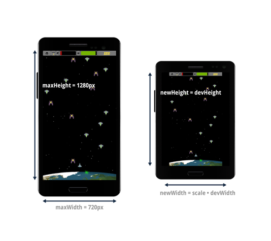 Fig 1: Canvas scaling example
Put it in DOM or leave it on Canvas?
Our application should work on any available resolution on desktop as well as on mobile device. This brings up the problem of the UI scaling. As I mentioned before the Canvas element already scales correctly, so theoretically speaking each control rendered on canvas should scale well for all resolutions. Unfortunately putting all game’s UI, such as menu or score board, on Canvas is not a good approach for reasons such as:
- You are unable to easily attach event listeners to elements drawn on Canvas. This is because the game is designed in retained mode (please refer to “Canvas2D mobile web game development – basics” for more details on this). To attach event listener you would need to create DOM elements overlapping the UI elements drawn on Canvas and then attach click events to them. So this is pointless.
- The UI elements drawn on Canvas and scaled will have undesired artifacts.
In our sample application we decided to create a menu and a score board in DOM and create separate scaling mechanism for the UI.
UI scaling
Before you can start thinking about UI scaling, the right viewport setting needs to be performed. You define a viewport meta tag in the head section of your index.html. For our sample application we used the following settings:
<meta name="viewport" content="user-scalable=no, width=720, height=1280, target-densitydpi=device-dpi">
In the above code the viewport dimensions are set to 720x1280px with dpi equal to device dpi. At the beginning of our application development we assumed the HD to be the full resolution of our application. You may ask: what if the device doesn’t support such a high resolution? In that case it will be reduced to device max width and height. In the further paragraphs we will explain how to perform UI scaling so that our application displays correctly on lower resolutions than HD.
There are two elements in the UI that need to be scaled:
- Fonts
- UI dimensions
Font scaling can be achieved in the following way:
- Select reference resolution (in our case HD) and prepare your UI with the reference font. Develop your application on a device with the reference resolution. For Earth Guard the reference font size was set to 25px.
- Use CSS2 body selector to assign the reference font size for the body of the HTML document (please refer ./css/menu.css). The 25px font size represents 100% for the whole HTML document in Earth Guard. Thanks to this approach we are able to define font size for other HTML elements using percentage values. Please refer to the below code and pay attention to the font-size CSS property.
.form-menu label {
    display: block;
    height: 2em;
    font-family: 'Arial', sans-serif;
    font-weight: normal;
    font-size: 120%;
    line-height: 2em;
}- After this we need to scale the reference font to reflect all screen resolutions. We already have scale calculated for Canvas scaling. Now the only thing we need to do is to apply this scale to our reference font size. We do this in the resize method of the view module (./js/modules/view.js). Please refer to the below code:
resize : function() {
      …
    // Scale main font size.
    sFontSize = Math.round(fontSize * scale);
    $(document.body).css('fontSize', sFontSize + 'px');
},
Following the above approach allows us to change the font size of all UI elements according to the current screen resolution.
Unfortunately this is only half of the success for UI scaling. The next thing we need to do is to scale UI dimensions. Fortunately CSS2.1 comes with the em units. 1em is equal to the current font size of the current element. So basically em units allow us to bind UI dimensions with the font size, which has already been scaled.
Please follow the below approach for scaling UI dimensions:
- Develop your application UI on a device with reference resolution using reference font size.
- Define all dimensions of elements, which are: margins, paddings and sizes using em units.
- Apply the font scaling approach.
Below we show the whole development process for scalable application UI.
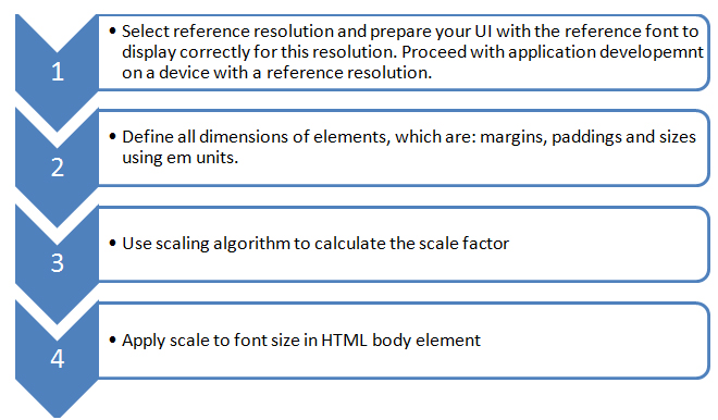 Fig 2: Development process for scalable application UI
User input handling
In order to keep your application portable you should provide different user input mechanisms for different platforms. We have decided to use two input control mechanisms:
- Keyboard and mouse for desktop user input handling.
- Gyroscope and touch events for mobile user input handling.
Desktop input handling
User input handling in case of desktop is easy. We just use the window.addEventListener method to assign proper key events to actions. We created a simple mechanism for key registration. Please refer to ./js/modules/inputHandler.js module. Below you can find a code snippet which is responsible for keys registration:
var KEY_CODES = {
    37 : 'left',
    39 : 'right',
    32 : 'fire',
    40 : 'down',
    38 : 'up',
    13 : 'enter'
};
Each key has a corresponding Boolean value entry in game.keys array defined in the game module. When key is pressed corresponding Boolean value changes to true and if it is released the Boolean value changes to false. Values stored in this array are used in step methods of all corresponding sprites. For example game.keys[‘fire’] is checked in PlayerShip step method.
Below you can find a code that is responsible for values assignment in game.keys array which correspond to the keys pressed on the keyboard.
window.addEventListener('keydown', function(e) {
    resetDirection();
    if (KEY_CODES[e.keyCode]) {
        game.keys[KEY_CODES[e.keyCode]] = true;
        e.preventDefault();
    }
}, false);

window.addEventListener('keyup', function(e) {
    resetDirection();
    if (KEY_CODES[e.keyCode]) {
        game.keys[KEY_CODES[e.keyCode]] = false;
        e.preventDefault();
    }
}, false);
We use e.preventDefault() to disable browser’s default behavior for scrolling, when the user presses the up or down buttons.
Mobile input handling
In case of mobile devices such as Tizen or Android a separate input handling mechanism had to be developed. It’s based on “deviceorientation” event defined by the W3C. Below you can find a step by step development process that we used for mobile input handling.
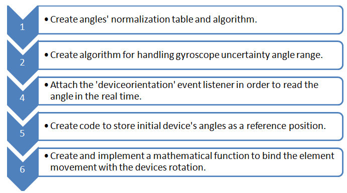
Fig 3: Development process for cross mobile input handling using deviceorientation W3C API
Create angle's normalization table and algorithm
It is important to have a universal mobile input handling mechanism for Android device, Tizen device and Tizen Simulator. Unfortunately each of these platforms returns different angle values for the same ranges. In order to make the debugging and further development easier you should normalize the rotation angle values to the appropriate ranges (ranges are described in the W3C specification):
- for gamma angle [-90, 90]
- for beta angle: [-180, 180]
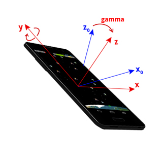 Fig 4: Device rotated by gamma angle around y axis, with previous x and z axes shown as x0 and z0.
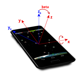 Fig 5: Device rotated by beta angle around new x axis, with previous y and z axes shown as y0 and z0.
Rotation of the device around the Y axis changes the gamma angle. The table below describes how the change of the device’s orientation affects the values returned by the gyroscope in case of: Android device, Tizen device and Tizen Simulator.
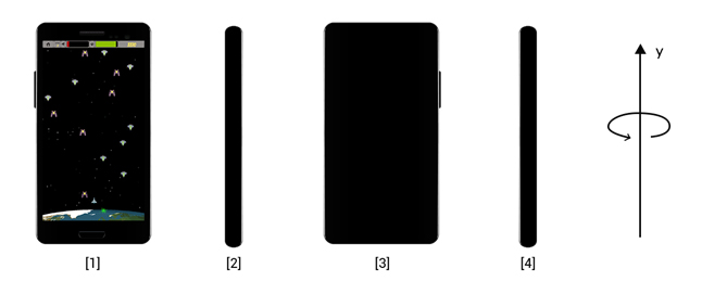 Fig 6: Device rotated by the gamma angle
|
Device position change |
(1 → 2) |
(2 → 3) |
(3 → 4) |
(4 → 1) |
|
Android Device |
[0, 90] |
[90,180] |
[180,270] |
[-90,0] |
|
Tizen Device |
[0, -90] |
[-90, -180] |
[180, 90] |
[90, 0] |
|
Tizen Simulator |
[0, 90] |
[90, 180] |
[-180, -90] |
[-90,0] |
|
Normalized |
[0, 90] |
[-90, 0] |
[0, 90] |
[-90,0] |
The “Device position change” row shows what change took place (the device’s positions are shown on the figure above the table). “Android Device”, “Tizen Device” and “Tizen Simulator” rows present the values returned by the different devices’ gyroscopes. The “Normalized” row shows values used to set direction and velocity of the ship’s movement, to which previous rows should be normalized.
Now let’s take a look at the beta angle:
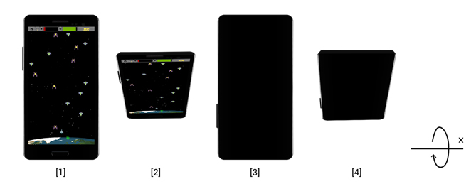
Fig 7: Device rotated by the beta angle
The first position shows a device lying on the desk. The second: the device in orthogonal position to the desk.
| Device position change |
(1 → 2) |
(2 → 3) |
(3 → 4) |
(4 → 1) |
| Android Device |
[0, 90] |
[90, 0] |
[0, -90] |
[-90, 0] |
| Tizen Device |
[0, -90] |
[-90, -180] |
[180, 90] |
[90, 0] |
| Tizen Simulator |
[0, 90] |
[90,180] |
[-180, -90] |
[-90, 0] |
| Normalized |
[0, -90] |
[-90, -180] |
[180, 90] |
[90, 0] |
We implemented a simple algorithm for angle normalization. Please refer to the ./js/modules/inputHandler.js module.
Create algorithm for handling gyroscope uncertainty angle range
In some rotation ranges the deviceorientation API returns inaccurate data, which can cause tilt or violent ship’s movement. Usually we observe that gamma values are inaccurate when normalized beta value is in the range of <65 - 115> degrees. In order to decrease the influence of inaccurate measurements on PlayerShip’s movement we decided to calculate the mean angle value and to remove the values that are much different from the mean value. Below you can find the algorithm diagram for handling gyroscope uncertainty:
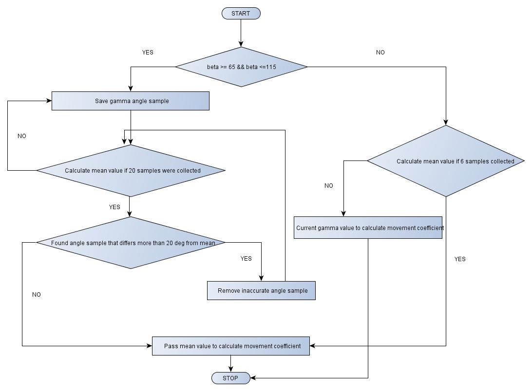
Fig 8: Mean gamma angle calculation with inaccurate angles removal
Attach the 'deviceorientation' event listener in order to read the angle in the real time
It is time to register the 'deviceorientation' in order to read the rotation angle in the real time. When the event occurs, you will get its attributes. In this case only beta and gamma attributes matter.
window.addEventListener('deviceorientation', function(e) {
    var normGamma = e.gamma;
    var normBeta = e.beta;
…
});
The normalized values are assigned to the actualAngle array:
// Set normalized values for angles
actualAngle[1] = normBeta;
actualAngle[2] = normGamma;
Create code to store initial device's angles as a reference position
Reading the initial device position (initial beta and gamma angles) is very important in order to allow the user to start the game with any horizontal or vertical orientation of the device. Without this the user would be able to start the game only if the device was placed parallel to the earth surface.
In the sample application we read the initial rotation angles in the following way:
if (startAngle[1] === undefined)
    startAngle[1] = actualAngle[1];

if (startAngle[2] === undefined)
    startAngle[2] = actualAngle[2];
The initial phone position is set when elements of the startAngle[] array are undefined. The function, which clears initial values of angles is clearStartPosition().
clearStartPosition : function() {
    startAngle[1] = undefined;
    startAngle[2] = undefined;
}
It is invoked:
- after click on “New Game” or “Resume” option in the menu,
- when the game goes into the background.
Create and implement mathematical function to bind the element movement with the angle
After normalizing the actual and initial values of angles, you should set the direction and the velocity of the ship's movement using the setDirection() function:
var setDirection = function(delta, keyOn, keyOff) {
    if (delta > 90)
        delta = 90; // 90 degrees maximum angle
    if (delta > config.angleOffset) {
        game.keys[KEY_CODES[keyOn]] = true;
        direction[KEY_CODES[keyOn]] = delta / 90;
    } else {
        game.keys[KEY_CODES[keyOn]] = false;
        direction[KEY_CODES[keyOn]] = 0;
    }
    game.keys[KEY_CODES[keyOff]] = false;
    direction[KEY_CODES[keyOff]] = 0;
};
The first parameter, “delta”, defines the difference between the initial and current value of the angle. It should be less or equal to 90 degrees. The “keyOn” and “keyOff” values represent the codes of the keys. Each key represents a direction. The direction[] array contains coefficients of velocity for the ship’s movement for a specified direction. These coefficients are used in playerShip.js class to set the position of the ship:
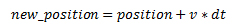
Where:
new_position – means new X or Y position,
position – means the last X or Y position,
dt = 2,5
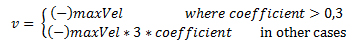
Where:
maxVel – means maximum velocity of the ship,
coefficient – means a proper coefficient taken from the direction[] array.
If the “delta” parameter is greater than config.angleOffset, the proper key (“keyOn”) is set to true and the direction value for this key is calculated. In the other case, “keyOn” is set to false and zero is assigned to the direction value. In both cases, “keyOff” is set to false and its direction is set to zero.
Function setDirection() is invoked by functions:
- setRightAndLeft()
- setUpAndDown()
Both are described below.
You can set the parameters of the vertical movement using the setUpAndDown() function:
var setUpAndDown = function() {
    var angle0 = startAngle[1]; // initial beta
    var angle1 = actualAngle[1]; // actual beta
    var delta = angle1 - angle0;

    if (Math.abs(delta) < 180){
        if (delta < 0) {
            // down
            setDirection(Math.abs(delta), key[2], key[3]);
        } else {
            // up
            setDirection(Math.abs(delta), key[3], key[2]);
        }
    } else {
        if (angle0 < 0) {
            delta += 360;
            // up
            setDirection(Math.abs(delta), key[3], key[2]);
        } else {
            delta = 360 - delta;
            // down
            setDirection(Math.abs(delta), key[2], key[3]);
        }
    }
};
You can set the parameters of the horizontal movement using the setRightandLeft() function:
var setRightAndLeft = function(angle) {
    var angle0 = startAngle[2];
    var angle1 = angle;
    var delta;

    delta = angle1 - angle0;
    if (delta > 0) {
        // left
        setDirection(Math.abs(delta), key[0], key[1]);
    } else {
        // right
        setDirection(Math.abs(delta), key[1], key[0]);
    }
}
The setRightAndLeft() function is self explainatory. The “key” means an array of KEY_CODES for ship's movement. Each element of KEY_CODES array means some direction.
/**
 * Array of key codes for ship's movement
 */
var key = [39, 37, 40, 38]; // right, left, down, up

var KEY_CODES = {
    37 : 'left',
    39 : 'right',
    32 : 'fire',
    40 : 'down',
    38 : 'up',
    13 : 'enter'
};
The setRightAndLeft() function is invoked by the setHorizontal() function:
var setHorizontal = function() {
    if (actualAngle[1] > (90 - off) && actualAngle[1] < (90 + off)) {
        // add actual angle position to gammaVec array
        gammaVec.push(actualAngle[2]);

        // if gammaVec array contains 20 elements -> count ship's movement parameter
        if (gammaVec.length == 20) {
            countsForUncertainRange(20);
        }
    } else {
        // if gammaVec array contains at least 20 elements -> count ship's movement parameter
        if (gammaVec.length >= 6) {
            countsForUncertainRange(gammaVec.length);
        } else {
            // in other case clear array
            gammaVec = [];
            setRightAndLeft(actualAngle[2]);
        }
    }
};
In the above code, the “off” variable defines half of the range where the gyroscope gives uncertain values. The setHorizontal() function checks if the actualAngle[1] value belongs to range (90 - off, 90 + off). If:
- yes - the value is pushed into gammaVec[] array. If the length of gammaVec[] array is equal to 20, the average value of gammaVec is calculated.
- not, we check the length of gammaVec[] array. If it is:
- equal to at least 6 - the average value of gammaVec is calculated,
- less than 6 - the gammaVec array is cleared and actualAngle[2] value is used as a parameter of setRightAndLeft() method.
Summary
Keeping high portability of your Tizen web applications is very important in order to increase your market share. In this article we described what concepts and approaches should be used to launch your HTML5 application on Tizen and platforms that natively support HTML5. If you’d like to know more on how to launch your applications on platforms without the native support for HTML5 please read – “Launching your Tizen application on Android platform”.