UI Components: Creating the Application Layout
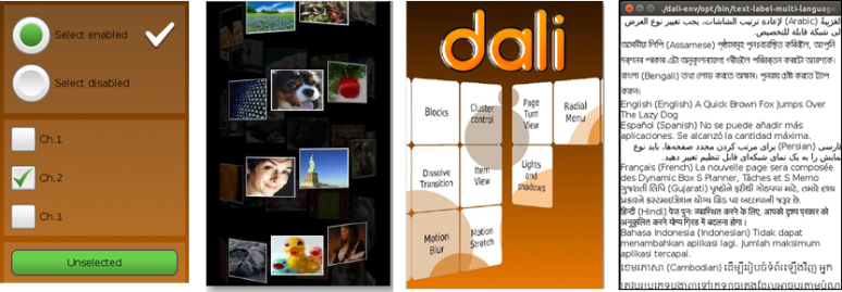
UI components are interactive components for layouting and scrolling the user interface. DALi provides UI components, such as buttons, item view, scroll view, table view, and text controls.
Figure: DALi UI components

The following table lists the available UI components.
| Control | Description | Related classes |
|---|---|---|
| Buttons | A push button that can be pressed, a checkbox button that can be checked/unchecked, and a radio button that only one option can be selected. | Button, PushButton, CheckBoxButton, RadioButton |
| ItemView | An item view that renders item sets in a scrollable layout. | ItemView, ItemFactory, ItemLayout, Scrollable |
| ScrollView | A scroll view to provide scrollable view. | ScrollView, Scrollable, ScrollViewEffect, ScrollViewPagePathEffect |
| TableView | A table view that can align child actors in a grid like layout. | TableView |
| TextField | A text field that provides a single-line editable text field. | TextField |
| TextLabel | A text label that renders a short text string. | TextLabel |
| ImageView | An image view that renders an image. | ImageView |
The base class for the components is Dali::Toolkit::Control (in mobile and wearable applications). This class can also be used to create your own custom UI components. For tips for the control class, see Control. In this UI Components guide, both the terms control and component are used to refer to a UI component.
The following figure illustrates the hierarchy of the UI components.
Figure: DALi UI component hierarchy


