Buttons: Push, Check, Select!
A button is a small object on the UI that you press in order to operate it. DALi provides button controls, such as PushButton, CheckBoxButton, and RadioButton. The base class for the button controls is Dali::Toolkit::Button. The Button class provides the disabled property and the clicked signal. The following table lists the basic signals provided by the Dali::Toolkit::Button class.
| Input signal | Description |
|---|---|
| PressedSignal() | Emitted when the button is pressed. |
| ReleasedSignal() | Emitted when the button is released. |
| ClickedSignal() | Emitted when the button is clicked. |
| StateChangedSignal() | Emitted when the button state is changed. |
PushButton
The Dali::Toolkit::PushButton class provides a button that can be pressed to operate it. A push button changes its appearance when is pressed and returns to its original appearance when is released.
Figure: PushButton

A push button emits a Button::PressedSignal() signal when the button is pressed, a Button::ClickedSignal() signal when clicked, and a Button::ReleasedSignal() signal when released or the touch point leaves the boundary of the button. The following code shows an example of a basic push button:
// This sample code is for the HelloWorldExample class
// in Creating a DALi Application
void HelloWorldExample::Create( Application& application )
{
  PushButton button = PushButton::New();
  button.SetParentOrigin( ParentOrigin::CENTER );
  button.SetLabelText( "Press" );
  Stage::GetCurrent().Add( button );

  // Connect to button signals emitted by the button
  button.ClickedSignal().Connect( this, &HelloWorldExample::OnButtonClicked );
  button.PressedSignal().Connect( this, &HelloWorldExample::OnButtonPressed );
  button.ReleasedSignal().Connect( this, &HelloWorldExample::OnButtonReleased );
}

bool HelloWorldExample::OnButtonClicked( Button button )
{
  // Do something when the button is clicked

  return true;
}

bool HelloWorldExample::OnButtonPressed( Button button )
{
  // Do something when the button is pressed

  return true;
}

bool HelloWorldExample::OnButtonReleased( Button button )
{
  // Do something when the button is released

  return true;
}
CheckBoxButton
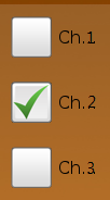
The Dali::Toolkit::CheckBoxButton class provides a check box button, which can be checked or unchecked.
Figure: CheckBoxButton

A checkbox button emits all 4 button input signals, but usually you can just use the Button::StateChangedSignal() signal to be notified when the button changes its state to selected or unselected. The following code shows an example of a basic checkbox button:
// This sample code is for the HelloWorldExample class
// in Creating a DALi Application
void HelloWorldExample::Create( Application& application )
{
  CheckBoxButton button = CheckBoxButton::New();
  button.SetParentOrigin( ParentOrigin::CENTER );
  button.SetLabelText( "Check" );
  button.SetSize( 200, 40 );
  button.SetBackgroundColor( Color::WHITE );
  Stage::GetCurrent().Add( button );

  // Connect to a button signal emitted by the button
  button.StateChangedSignal().Connect( this, &HelloWorldExample::OnButtonStateChanged );
}

bool HelloWorldExample::OnButtonStateChanged( Button button )
{
  // Do something when the button state is changed
  // You can get the state using button.IsSelected() call

  return true;
}
RadioButton
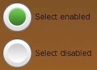
The Dali::Toolkit::RadioButton class provides a radio button with 2 states: selected and unselected.
Figure: RadioButton

Usually, radio buttons are grouped. Two or more radio buttons are in the same group when they have the same parent. In each group, only 1 radio button can be selected at a given time. You can use the Button::StateChangedSignal() signal to check which radio button is selected. The following code shows an example of a basic radio button:
// This sample code is for the HelloWorldExample class
// in Creating a DALi Application
void HelloWorldExample::Create( Application& application )
{
  Actor radioGroup = Actor::New();
  radioGroup.SetParentOrigin( ParentOrigin::CENTER );
  Stage::GetCurrent().Add( radioGroup );

  RadioButton button1 = RadioButton::New();
  button1.SetLabelText( "button1" );
  button1.SetBackgroundColor( Color::WHITE );
  button1.SetPosition( 0, -40 );
  radioGroup.Add( button1 );

  RadioButton button2 = RadioButton::New();
  button2.SetLabelText( "button2" );
  button2.SetBackgroundColor( Color::WHITE );
  button2.SetPosition( 0, 40 );
  radioGroup.Add( button2 );

  // Connect a single callback to button signals emitted by both button1 and button2
  button1.StateChangedSignal().Connect( this, &HelloWorldExample::OnButtonStateChanged );
  button2.StateChangedSignal().Connect( this, &HelloWorldExample::OnButtonStateChanged );
}

bool HelloWorldExample::OnButtonStateChanged( Toolkit::Button button )
{
  // Do something when the two buttons' states are changed
  // button parameter can be both button1 and button2
  // You can use button.GetLabelText() and button.IsSelected()
  // to know which button is selected

  return true;
}


