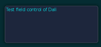
TextField: Type Your Text!
The Dali::Toolkit::TextField class is a control providing a single-line editable text field.
Figure: TextField

Creating a TextField
Before text has been entered, the Dali::Toolkit::TextField class can display a placeholder text. An alternative placeholder can be displayed when the TextField has keyboard focus. For example, a TextField used to enter a username can initially show the text Unknown Name, and the text Enter Name. when the cursor is visible.
TextField field = TextField::New();
field.SetProperty( TextField::Property::PLACEHOLDER_TEXT, "Unnamed Name" );
field.SetProperty( TextField::Property::PLACEHOLDER_TEXT_FOCUSED, "Enter Name." );
Stage::GetCurrent().Add( field );
When the TextField is tapped, it automatically gets the keyboard focus. Key events enter the text, and the placeholder text is removed. After text has been entered, it can be retrieved from the TEXT property.
Property::Value fieldText = field.GetProperty( TextField::Property::TEXT );
std::string fieldTextString =  fieldText.Get< std::string >();
Aligning Text
The Dali::Toolkit::TextField class displays a single-line of text, which scrolls if there is not enough space for the text displayed. If there is enough space, the text can be aligned horizontally to the beginning, end, or center of the available area:
field.SetProperty( TextField::Property::HORIZONTAL_ALIGNMENT, "BEGIN" ); // "CENTER" or "END"
Using Decorations
For text decorations, the following TextLabel class properties are available.
| Property | Type | Writable | Animatable |
|---|---|---|---|
| RENDERING_BACKEND | Integer | Yes | No |
| TEXT | String | Yes | No |
| PLACEHOLDER_TEXT | String | Yes | No |
| PLACEHOLDER_TEXT_FOCUSED | String | Yes | No |
| FONT_FAMILY | String | Yes | No |
| FONT_STYLE | String | Yes | No |
| POINT_SIZE | Float | Yes | No |
| MAX_LENGTH | Integer | Yes | No |
| EXCEED_POLICY | Integer | Yes | No |
| HORIZONTAL_ALIGNMENT | String | Yes | No |
| VERTICAL_ALIGNMENT | String | Yes | No |
| COLOR | Vector4 | Yes | No |
| SHADOW_OFFSET | Vector2 | Yes | No |
| SHADOW_COLOR | Vector4 | Yes | No |
| PRIMARY_CURSOR_COLOR | Vector4 | Yes | No |
| SECONDARY_CURSOR_COLOR | Vector4 | Yes | No |
| ENABLE_CURSOR_BLINK | Boolean | Yes | No |
| CURSOR_BLINK_INTERVAL | Float | Yes | No |
| CURSOR_BLINK_DURATION | Float | Yes | No |
| GRAB_HANDLE_IMAGE | String | Yes | No |
| GRAB_HANDLE_PRESSED_IMAGE | String | Yes | No |
| SCROLL_THRESHOLD | Float | Yes | No |
| SCROLL_SPEED | Float | Yes | No |
| SELECTION_HANDLE_IMAGE_RIGHT | String | Yes | No |
| SELECTION_HANDLE_PRESSED_IMAGE_LEFT | String | Yes | No |
| SELECTION_HANDLE_PRESSED_IMAGE_RIGHT | String | Yes | No |
| SELECTION_HIGHLIGHT_COLOR | Vector4 | Yes | No |
| DECORATION_BOUNDING_BOX | Rectangle | Yes | No |
| INPUT_METHOD_SETTINGS | Map | Yes | No |
To change the color of the text, use the TEXT_COLOR property. An alternative color can be used for placeholder text by setting the PLACEHOLDER_TEXT_COLOR property. Unlike the Actor::COLOR property, these properties do not affect child actors added to the TextField.
field.SetProperty( TextField::Property::TEXT_COLOR, Color::CYAN );
field.SetProperty( TextField::Property::PLACEHOLDER_TEXT_COLOR, Color::BLACK );


