UI Components: Handling Elementary UI Component Libraries
Before writing an application, you should already have an answer to the following question: What is an application? An application is a process launched by the user. Every application has at least one window for presenting its content. Users can interact with the content through events. Different sources of events can modify the life cycle of the application. The application may receive data from a network connection, and it may also receive touch and key events. From the computer's point of view, an application is a collection of code that reacts to events and displays content on the screen. Elementary bridges this divide between the user and the code.
Elementary provides a variety of pre-built UI components, such as layout objects and components, that allow you to build rich graphical user interfaces for your applications. Every Elementary application has at least one window for presenting its content. The window provides the area in which to display the content and where the Evas canvas is placed.
There are three main groups of objects provided by Elementary:
- UI components: These are the components with which you build your application UI.
- Containers: These are the containers that hold the components.
- Infrastructure: These are the modules that deal with Elementary as a whole.
Using UI Components
The Elementary library is a simple toolkit. It provides several UI components than can be used to compose the user interface of your application. UI components allow you to build your application without having to reinvent basic objects, such as buttons, lists, or text entries. UI components will often generate signals that can be caught in the application when the user interacts with the UI components. This guide teaches you the basics of Elementary, describes selected concepts of the Elementary configuration framework, and describes the most common UI components.
Figure: Elementary

Getting Started with the Elementary Library
Elementary UI components are built in a hierarchical fashion. The idea is to factorize as much code as possible between UI components that behave in a similar manner to facilitate the creation of new UI components. The Elementary UI components inherit a lot of their code from the container UI components and the layout component (a container component that takes a standard Edje design file and wraps it very thinly). You can use the container and layout functions on the Elementary UI components, as well as the Elementary object functions, such as elm_object_part_content_set(), elm_object_part_content_get(), and elm_object_part_content_unset().
To use the Elementary library:
- Initialize the Elementary library with the elm_init() function.
- Start the Elementary main loop with the elm_run() function.
The function does not return, instead, it constantly loops and runs the event and the processing tasks.
- Add Elementary UI components in the main loop.
Generally, an Elementary UI component can be added with the elm_<UI component name>_add() function, which returns an Evas object (Evas_Object*). The Evas object is passed to the functions that are used to configure the UI component.
- Stop the main loop and return to the main() function with the elm_exit() function.
- When your application terminates, shut down the Elementary library with the elm_shutdown() function.
The function frees the Elementary objects that were allocated in the main loop, so you do not need to separately deallocate them.
The following code snippet shows the main() function of a minimal Elementary application:
#include <Elementary.h>
int main(int argc, char **argv)
{
   elm_init(argc, argv);
   elm_run();
   elm_shutdown();

   return 0;
}
Elementary Objects
All objects created using Elementary are of the Evas_Object* type. This means that both Evas and Elementary functions can be used on an Elementary object. However, use Elementary functions on Elementary objects only when you do not know which API to use.
Since an Elementary object can take up a lot of memory, the Elm_Object_Item type has been created for situations where you need to use a lot of items, such as in a genlist or gengrid component, and to save memory. Using the Elm_Object_Item type, an Elementary UI component can, in theory, contain a lot of items while maintaining a small memory footprint. In practice, the Elm_Object_Item instance is bigger than expected, but can still help in saving memory.
For more information, see Evas Objects.
Elementary Callbacks
Several callbacks can be registered to handle Elementary object events:
- Evas event callback
Use the evas_object_event_callback_add() function to add a callback for input events (key up, key down, mouse wheel) on an Evas object. In case of an Elementary object, the callback is registered on the underlying Evas object without considering the Elementary object infrastructure (no event propagation).
- Evas smart callback
Use the evas_object_smart_callback_add() function to add a callback for a smart event emitted by an Elementary object. Smart callbacks can only be registered on smart objects, and the "smart event" to register must be implemented by the corresponding smart object. Otherwise, the callback does nothing. The callback does not apply to input events (keyboard or mouse).
- Edje signal callback
Use the edje_object_signal_callback_add() function to add a callback for a signal coming from an Edje object (a theme object).
- Elementary signal callback
Use the elm_object_signal_callback_add() function to add a callback for a signal coming from an Elementary UI component's theme. The callback does not apply to input events (keyboard or mouse).
- Elementary event callback
Use the elm_object_event_callback_add() function to add a callback for an input event (keyboard or mouse) coming from an Elementary object. In contrast to the Evas event callback, the Elementary event callback takes the hierarchy of the object into account: the event can be propagated to the parents of the object, and the parents can process the event.
For more information about events related to Elementary objects, see Event Handling. For more information about Evas objects and smart objects, see Evas Rendering Concept and Method.
Managing Elementary Profiles
An Elementary profile is a set of preconfigured options that affects the entire look and feel of an application. The options linked to a specific profile form an Elementary configuration, which can be used to store the desired set of options for use in multiple sessions. Once loaded, the Elementary profile configures all the options and sets the look and feel of your Elementary application.
To manage Elementary profiles:
- List the existing profiles:
Eina_List *list = elm_config_profile_list_get();
- Set a particular profile:
elm_config_profile_set("myprofile"); - Get the current profile:
char *profile = elm_config_profile_get();
- To save the current option values as an Elementary configuration for later use, use the Elementary Configuration Save function.
- To reload the Elementary configuration saved for the current profile:
elm_config_reload();
Configuring Elementary Options
You can set the following options in the Elementary configuration. In addition, you can customize themes and manage focus.
- To scale UI components:
You can configure UI component scaling in terms of both interactive and readable areas.
- Set the global scaling factor (for example, setting it to 2.0 doubles the size of all scalable UI components):
elm_config_scale_set(2.0);
- Set the finger size:
elm_config_finger_size_set(1.5);
- Set the global scaling factor (for example, setting it to 2.0 doubles the size of all scalable UI components):
- To manage caches:
- Enable the globally configured cache flush, and set the flush interval (in this example, to 60 seconds):
elm_config_cache_flush_enabled_set(EINA_TRUE);
elm_config_cache_flush_interval_set(60);
- Configure the font and image cache sizes (to 500 and 5 000 000 bytes, respectively):
elm_config_cache_font_cache_size_set(500);
elm_config_cache_image_cache_size_set(5000000);
- Set the Edje collection and Edje file cache sizes:
elm_config_cache_edje_file_cache_size_set(500);
elm_config_cache_edje_collection_cache_size_set(500);
- Enable the globally configured cache flush, and set the flush interval (in this example, to 60 seconds):
- To configure the gesture layer:
You can set the duration of the long tap and double tap events on the gesture layer objects. The following example sets the duration to 500 ms.
elm_config_glayer_long_tap_start_timeout_set(0.5);
elm_config_glayer_double_tap_timeout_set(0.5);
- To manage scrolling:
- Make the scroller bounce when it reaches its viewport's edge during scrolling by using the elm_config_scroll_bounce_enabled_set() function:
elm_config_scroll_bounce_enabled_set(EINA_TRUE);
- Control the inertia of the bounce animation by using the elm_config_scroll_bounce_friction_set() function:
elm_config_scroll_bounce_friction_set(0.5);
You can also set the friction for a page scroll, include animations, and zoom animations.
- Set the scroller to be draggable by using the elm_config_scroll_thumbscroll_enabled_set() function. You can configure several drag options, such as friction, sensitivity, acceleration, and momentum.
The following example sets the scroller to be draggable, defines that the number of pixels one must travel while dragging the scroller view to actually trigger scrolling is 20 pixels.
elm_config_scroll_thumbscroll_enabled_set(EINA_TRUE);
elm_config_scroll_thumbscroll_threshold_set(20);
- Make the scroller bounce when it reaches its viewport's edge during scrolling by using the elm_config_scroll_bounce_enabled_set() function:
- To configure long press events:
Get the current timeout before a long press event is retrieved, and modify it. The following example increases the timeout by 1 second.
double lp_timeout = elm_config_longpress_timeout_get();
elm_config_longpress_timeout_set(lp_timeout + 1.0);
- To configure tooltips:
Set the duration after which a tooltip is shown. The following example sets the delay to 2 seconds.
elm_config_tooltip_delay_set(2.0);
- To configure the password show last feature:
The password show last feature enables the user to view the last input entered for a few seconds before it is masked.
- Enable the password show last feature:
elm_config_password_show_last_set(EINA_TRUE);
- Set the visibility timeout (how many seconds the input is visible):
elm_config_password_show_last_timeout_set(5.0);
- Enable the password show last feature:
- To set the Elementary engine:
You can define the rendering engine that Elementary uses to draw the windows. The following rendering engines are supported:
- "software_x11"
- "fb"
- "directfb"
- "software_16_x11"
- "software_8_x11"
- "xrender_x11"
- "opengl_x11"
- "software_gdi"
- "software_16_wince_gdi"
- "sdl"
- "software_16_sdl"
- "opengl_sdl"
- "buffer"
- "ews"
- "opengl_cocoa"
- "psl1ght"
elm_config_engine_set("opengl_x11"); - To activate the access mode:
Set the access mode as active, so that information about an Elementary object is read when the object receives an EVAS_CALLBACK_MOUSE_IN event.
- To configure the selection mode:
Set the selection mode so that the selection is cleared when the entry component is unfocused:
elm_config_selection_unfocused_clear_set(EINA_TRUE);
- To enable mirroring:
Elementary allows UI mirroring both on a single object and on the entire UI. If mirroring is enabled, an Elementary UI component displays as if there was a vertical mirror in the middle of it. Only the controls and the disposition of the UI component are mirrored. Text is not mirrored.
elm_config_mirrored_set(EINA_TRUE);
- To set the frame rate:
Define the frames per second (FPS) value for the ecore_animator_frametime and edje_frametime calculations. This example sets the FPS 60.
elm_config_fps_set(60.0);
Customizing Themes
Elementary uses Edje to theme its UI components. Edje provides a default theme for each UI component in an application. You can change the theme using the ELM_THEME environment variable. You can also modify the theme globally with the elementary_config utility.
For custom styles, use extensions. Extensions allow you to write styles for specific UI components. Add a new extension to the list of Elementary themes with the elm_theme_extension_add() function, and apply the new style to the UI component with the elm_object_style_set() function. Once set, the extension replaces the default theme of the UI component.
| Note |
|---|
| When developing an extension, to respect the signals emitted and the elements that need to be in place, you must know how the UI component is themed. If something is missing from the extension, it can break the UI component's behavior. |
To modify Elementary themes, you can also use overlays. An overlay can replace the look of all UI components by overriding the default styles. As with extensions, you must write the correct overlay theme for a UI component. When looking for a theme to apply, Elementary first checks the list of overlays, then the set theme, and finally the list of extensions. To add or remove an overlay, use the elm_theme_overlay_add() and elm_theme_overlay_del() functions.
| Note |
|---|
| With overlays, you can replace the default view and affect every UI component. This is very similar to setting the theme for the whole application, and probably clashes with end user options. Using overlays also runs the risk of non-matching styles across the application. Unless you have a very good reason to use them, avoid overlays. |
Managing Focus
When an Elementary object has the focus, input events are directly passed to that object in the application window. The focused object can also change its decoration to show the user where the focus is. In an Elementary application, only one object can have the focus at a time.
To set the focus to a new Elementary object and take the focus away from the previous focused object, use the elm_object_focus_set() function. You can make an object unfocusable with the elm_object_focus_allow_set() function.
| Note |
|---|
| Only visible objects can have the focus. |
Elementary supports focus chains that allow you to cycle through all the focusable objects in a window. By default, the focus chain is defined by the order in which the UI components are added to the code. It is also possible to define custom focus chains, when needed.
For more information on focus, see Component Focus.
To manage the focus:
- To define a custom focus chain, create an Eina_List, and add the Elementary objects to it in the desired focus order. Use the elm_object_focus_custom_chain_set() function to set the final list as the custom focus chain of the parent object (in the following example, container_object is the parent object).
Eina_List *obj_list = NULL;

list = eina_list_append(list, obj1);
list = eina_list_append(list, obj4);
list = eina_list_append(list, obj2);
list = eina_list_append(list, obj3);

elm_object_focus_custom_chain_set(container_object, list);
- To remove the custom focus chain and use the default focus chain instead, use the elm_object_focus_custom_chain_unset() function.
- To programmatically cycle through the focus chain, use the elm_object_focus_next() function.
- To show a highlight on the focused object:
elm_config_focus_highlight_enabled_set(EINA_TRUE);
- To activate an animation when the focus shifts from one object to another:
elm_config_focus_highlight_animate_set(EINA_TRUE);
Scaling UI Components
Elementary, through its configuration API (elm_config), provides a way to scale UI components with two different parameters. Finger size parameter is used when the interactive zones (clickable, editable) of the UI components need to be scaled in order to be comfortably used with a finger. Scale parameter is responsible for scaling readable parts of a UI component (text or icons for example), so that it is more visible in the user interface.
Finger Size
Finger size parameter scales UI components based on the user's finger size. This is useful when using a touchscreen with a finger rather than with a stylus. The finger size parameter is in pixels and determines the minimum size of a square on the screen that is reliably hittable with a finger. This parameter scales the input and interactive areas.
The global finger size is set with the elm_config_finger_size_set() function. This adjusts the size and hit area of UI components so they are easy to hit with a finger. The current value is retrieved with the elm_config_finger_size_get() call. The finger size is always in pixel.
To increase the current global finger size by 20px:
Evas_Coord finger_size;

// Get the current finger size
finger_size = elm_config_finger_size_get();

// Add 20px to finger size parameter and set it
// to the global Elementary configuration
elm_config_finger_size_set(finger_size + 20);
Scale
This parameter only scales the readable areas of the UI component (text, icons). Parts that must stay pixel-perfect like the highlights, shading, textures and decorations stay as they are.
elm_config_scale_set() function is used to set the global scaling factor, that affects to all the UI components. It is also possible to use elm_object_scale_set() to set the scaling factor on a given Elementary UI component and all its children.
| Note |
|---|
| The scaling factor is multiplicative, if a child already has a scale size set, it is multiplied by its parent's scale size. |
The following example sets the global scaling factor to 2.0. Then, the scaling factor of an existing Elementary object is set to 2.0, meaning that this object appears as if it had a 4.0 scale factor, the rest of the application is displayed with a 2.0 scaling factor:
Evas_Object *button;

// The button object is created and configured

// Set the global scale factor to 2.0
elm_config_scale_set(2.0);

// Set the scaling factor of the button component to 2.0, this component
// appears 4 times bigger than its initial size
elm_object_scale_set(button, 2.0);
Example
This chapter shows the visual result of finger size and scaling factors modification.
Figure: elementary_config application
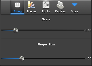
The previous picture shows the elementary_config application that enables the user to set global scale factor and finger size parameter. As the user drags the sliders, the UI is updated, directly showing the result of the new parameter value.
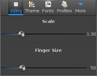
The next picture shows the behavior when the finger size parameter has been increased to 1.30. The text of the sliders and the text of the items in the toolbar are bigger.
Figure: Scale increased (1.30)
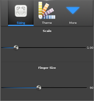
A finger size increase is showed in the image below (increase from 50px to 90 px). Now, the buttons in the toolbar are bigger, so the user can more reliably hit them with a big finger.
Figure: Finger size increased (90px)
| Note |
|---|
| It is up to the theme (Edje file) to set the parts that are scalable. This is something that needs to be taken into account when developing a new Edje theme. This can be done in EDC with the scale parameter. For more information on how to do that, see Introduction to EDC Programming. |
Creating Scalable EDC Objects
Scale Parameter
This chapter explains how to make a scalable Edje object and give hints how to write an EDC file that is scalable. The example shows a basic button that is composed of a background image part and a swallow part that can receive some content.
group
{
   name: "button";
   images
   {
      image: "bg.png" COMP;
   }
   parts
   {
      part
      {
         name: "bg";
         type: IMAGE;
         description
         {
            state: "default" 0.0;
            image.normal: "bg.png";
         }
      }
      part
      {
         name: "elm.swallow.content";
         type: SWALLOW;
         description
         {
            state: "default" 0.0;
            visible: 0;
         }
         description
         {
            state: "visible" 0.0;
            visible: 1;
         }
      }
   }
}
To have a scalable object, set the scale parameter to 1 on the parts you want to be scalable. Here the bg and elm.swallow.content parts must be scalable.
group
{
   name: "button";
   images
   {
      image: "bg.png" COMP;
   }
   parts
   {
      part
      {
         name: "bg";
         type: IMAGE;
         scale: 1;
         description
         {
            state: "default" 0.0;
            image.normal: "bg.png";
         }
      }
      part
      {
         name: "elm.swallow.content";
         type: SWALLOW;
         scale: 1;
         description
         {
            state: "default" 0.0;
            visible: 0;
         }
         description
         {
            state: "visible" 0.0;
            visible: 1;
         }
      }
   }
}
Image Set
If your application needs to be used at different resolutions it is recommended to have 2 images for the background image bg.png. Here the bg_low.png is added to the application. It is used when the size of the image is under 500 px, and a bg_high.png image is for higher resolutions. Use a set on the bg.png image.
group
{
   name: "button";
   images
   {
      set
      {
         name: "bg.png";
         image
         {
            image: "bg_low.png" COMP;
            size: 0 0 200 100;
         }
         image
         {
            image: "bg_high.png" COMP;
            size: 201 101 5000 5000;
         }
      }
   }
   // Other blocks or properties for the group
}
The image below shows three buttons with only a background part visible (the SWALLOW part is empty).
Figure: Image set example
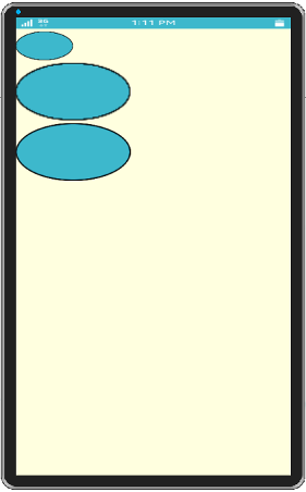
The first button's size is 100x50 pixels, the background image (bg_low.png) is the same size. The second button is twice bigger than the first one (200x100 pixels). The image is scaled and it does not render well, the borders are quite blurry.
To prevent this, the image set has a bigger image to use when the size is bigger than 200x100 pixels (bg_high.png). The third button size is 201x101 pixels and it uses the new image, which has a better quality than the scaled image.
Image Borders
When the button is resized, the image part is also resized because it is marked as scalable. To get the image resized but to keep the image border as it is, use the border parameter. It specifies the border size which is not resized even if the image is.
To add a 40 pixel border on the left and right part of the bg image and a 20 pixel border on top and bottom borders:
parts
{
   part
   {
      name: "bg";
      type: IMAGE;
      scale: 1;
      description
      {
         state: "default" 0.0;
         image.normal: "bg.png";
         image.border: 40 40 20 20;
      }
   }
   // Other parts
}
The image below shows that when resizing the button, the corners keep their initial ratio. Only the middle part of the button is resized.
Figure: Border example
| Note |
|---|
| Except as noted, this content is licensed under LGPLv2.1+. |


