Working with CSS3 Filter Effects
PUBLISHED
Note: This article describes the W3C Filter Effects 1.0 API that isn’t fully standardized for now and isn’t fully supported by Tizen. Its documentation (the editor’s draft actually) is available at this page.
Introduction to CSS3 Filter Effects
What is the Filter Effect?
Due to the W3C Filter Effects 1.0 specification: “A filter effect is a graphical operation that is applied to an element as it is drawn into the document. It is an image-based effect, in that it takes zero or more images as input, a number of parameters specific to the effect, and then produces an image as output. The output image is either rendered into the document instead of the original element, used as an input image to another filter effect, or provided as a CSS image value.”
Filter effects can be applied to images, videos, texts and canvas elements with proper values of conversion parameters. This article focuses on applying these effects to images. CSS3 filter effects work only with WebKit based browsers (e.g. Chrome). Compatibility tables for support of CSS3 in mobile browsers can be checked on this page.
More information about filter properties (described in this article) can be found at: W3C Filter Effects 1.0, chapter 5.
PhotoEditorFilterEffects sample application
The PhotoEditorFilterEffects sample application demonstrates how to use CSS3 Filter Effects to enhance the attraction of your Tizen Web Application. The UI consists of: an image, a field displaying the applied filter effects, two sets of filters’ menus, a button responsible for changing the menu set and a button that restores the original input image (“Restore default”). The first set gives access to such filters as: grayscale, sepia, saturation, hue rotation (color shifting), inversion, opacity, brightness, contrast and blurring. The second set is responsible for the properties of the drop shadow filter. You can use these sets of filters to modify the input image.
The sample application uses the full viewport on Tizen (720×1280) and includes jQuery 1.9.0 library. The PhotoEditorFilterEffects application was tested on Tizen SDK 2.1.0 final.
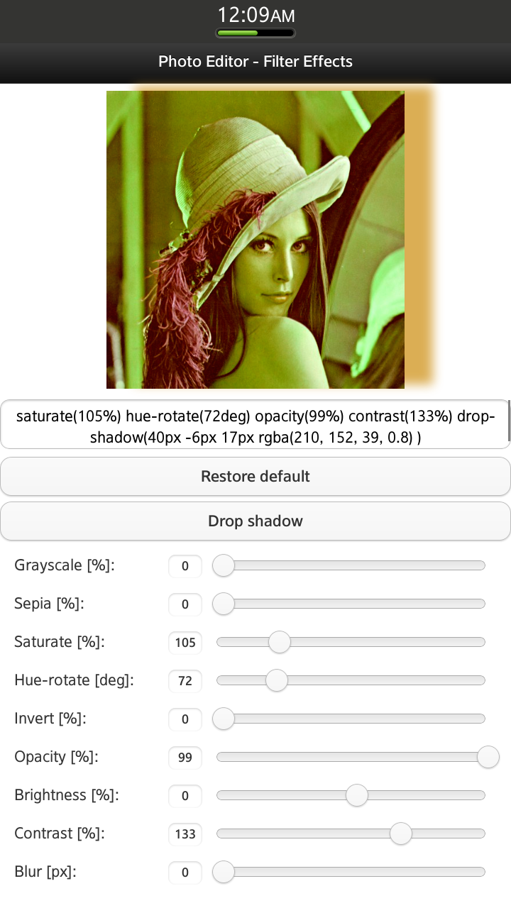
Figure 1 Sample application screen shot: First set of CSS3 filter effects
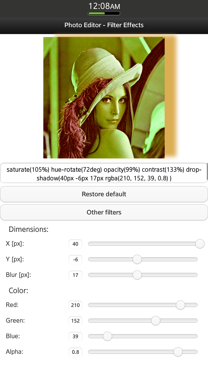
Figure 2 Sample application screen shot: Second menu – Drop Shadow CSS3 filter effect properties
Using CSS3 Filter Effects
First, you need to specify the input image to which you want the filter effects applied:
<img src="./css/images/lena.jpg" width="520" id="filtered-image">
To apply a CSS3 Filter Effect, you need only one line of CSS code added to the image element, which you want to modify. Add the following to your .css file:
#filtered-image {
    -webkit-filter: [<filter-function>]*;
}
The filter-function takes several different parameters with diverse formats: percentage (%), number, degrees (deg), pixels (px), etc. All available filter-functions and their parameters will be described later on.
Grayscale (<number> | <percentage>)
The filter causes the conversion of the input image to grayscale.
-webkit-filter: grayscale(10%);
If the value applied to the filter is:
0% – the input image doesn’t change (figure 3),
100% – the output image is completely grayscale (figure 4).
 Figure 3 grayscale(0%)
 Figure 4 grayscale(100%)
Sepia (<number> | <percentage>)
The input image is converted to sepia.
-webkit-filter: sepia(100%);
If the value applied to the filter is:
0% – the input image doesn’t change (figure 5),
100% – the output image is completely sepia (figure 6).
Figure 5 sepia(0%)
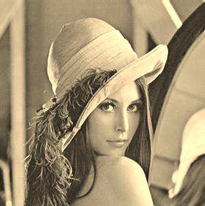 Figure 6 sepia(100%)
Saturate (<number> | <percentage>)
The filter changes the saturation of the input image.
-webkit-filter: saturate(100%);
If the value applied to the filter is:
0% – the output image is completely un-saturated,
100% – the input image doesn’t change (figure 7),
more than 100% – the output image is super-saturated (figure 8).
Figure 7 saturate(100%)
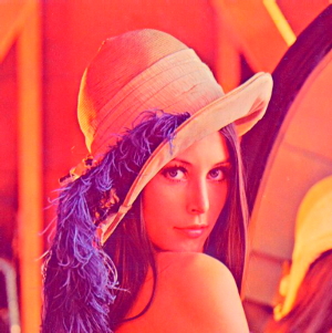 Figure 8 saturate(200%)
Hue-rotate (<angle>)
The filter causes hue rotation for each pixel of the input image. The angle defines the number of degrees around the color wheel from the initial color.
-webkit-filter: hue-rotate(0deg);
How does it work? For example, the hue angle for the pixel in the input image is around 30 degrees. After applying ‘hue-rotate(150deg)’ filter, the hue angle in the output image will be around 180 degrees (figure 11).
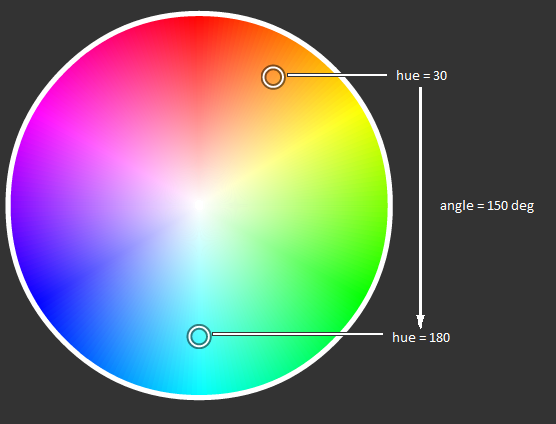 Figure 9 How the hue-rotate filter works
If the value applied to the filter is:
0 deg = 360 deg – the input image doesn’t change (figure 10)
Figure 10 hue-rotate(0deg)
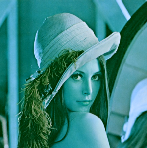 Figure 11 hue-rotate(150 deg)
Invert (<number> | <percentage>)
The filter assigns the opposite color values for each pixel of the input image.
-webkit-filter: invert(0%);
If the value applied to the filter is:
0% – the input image doesn’t change (figure 12)
100% – the output image’s color values are completely inverted (figure 13).
Figure 12 invert(0%)
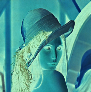 Figure 13 invert(100%)
Opacity (<number> | <percentage>)
The filter applies transparency for each pixel of the input image.
-webkit-filter: opacity(100%);
If the value applied to the filter is:
0% – the output image is completely transparent,
100% – the input image doesn’t change (figure 14).
Figure 14 opacity(100%)
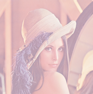 Figure 15 opacity(40%)
Brightness (<number> | <percentage>)
The filter sets the intensity and brightness for each pixel of the input image.
-webkit-filter: brightness(0%);
If the value applied to the filter is:
-100% – the output image is completely black,
0% – the input image doesn’t change (figure 16),
100% – the output image is completely white.
Figure 16 brightness(0%)
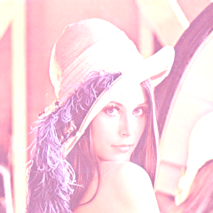 Figure 17 brightness(50%)
Contrast (<number> | <percentage>)
The filter adjusts the contrast of the input image.
-webkit-filter: contrast(100%);
If the value applied to the filter is:
0% – the output image is completely gray,
100% – the input image doesn’t change (figure 18),
more than 100% – increases the difference between dark and light colors.
Figure 18 contrast(100%)
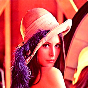 Figure 19 contrast(200%)
Blur (<length>)
The Gaussian blur effect is applied to the input image.
-webkit-filter: blur(0px);
If the value applied to the filter is:
0px – the input image doesn’t change (figure 20),
more than 0 – blurs out the input image with the specified intensity (figure 21).
Figure 20 blur(0px)
 Figure 21 blur(5px)
Drop Shadow ([<length>{2,3} && <color>?]#)
The filter applies a drop shadow effect to the input image.
-webkit-filter: drop-shadow(30px 20px 20px rgba(0, 143, 199, 0.8));
The first and second parameters define the horizontal and the vertical distance. Both are required. The third parameter is optional and defines the blur’s intensity. It must be greater than or equal to zero. The last parameter specifies the color of the shadow.
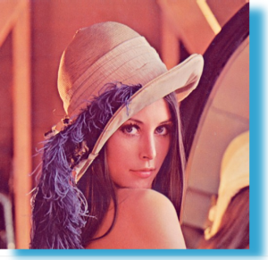 Figure 22 drop-shadow(30px 20px 20px rgba(0, 143, 199, 0.8));
Using more than one Filter Effect
We can use more filters simultaneously, separating each one by a space, e.g.
-webkit-filter: sepia(75%) saturate(160%) opacity(60%) contrast(150%);
The effect is shown below:
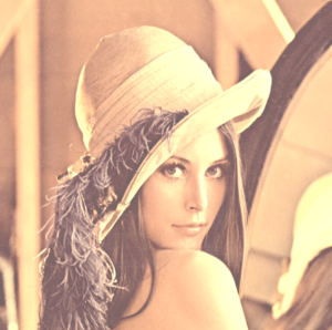 Figure 23 sepia(75%) saturate(160%) opacity(60%) contrast(150%)
How does the Sample Application work?
Now that you know how to use CSS3 filter effects, it’s time to demonstrate how to use them in your Tizen Web Application. We’ll use the PhotoEditorFilterEffects sample application as example.
The application layout is defined in the index.html file. As mentioned before, the application includes only one view, which consists of: an image, a field displaying the applied filter effects, two sets of filters’ menus, a button responsible for changing the menu set and a button that restores the original input image (“Restore default”). When the application starts, all visible sliders are set to their default values, the ‘slidestop’ event handler is attached to them. Each time the ‘slidestop’ event is triggered, the following callback function is invoked:
$('.filter-range').on("slidestop", function() {
    /**
     * On 'slidestop' event updates value of filter and refreshes image
     */
    setSlideValue(this.name);
    changePhoto();
});
The setSlideValue() method (according to the slider, which was changed) sets the proper value of the filter like this:
switch (slider) {
    case "grayscale-range":
        filterValues.grayscale = $('#grayscale-range').val();
        break;

    (...)
The most important part of the application is the changePhoto() function responsible for setting up the proper value to ‘-webkit-filter’ and changing the css of the image element.
var changePhoto = function() {
    var css = "";

    if (filterValues.grayscale !== 0)
        css += "grayscale(" + filterValues.grayscale + "%) ";
    if (filterValues.sepia !== 0)
        css += "sepia(" + filterValues.sepia + "%) ";
    if (filterValues.saturate !== 100)
        css += "saturate(" + filterValues.saturate + "%) ";
    if (filterValues.hueRotate !== 0)
        css += "hue-rotate(" + filterValues.hueRotate + "deg) ";
    if (filterValues.invert !== 0)
        css += "invert(" + filterValues.invert + "%) ";
    if (filterValues.opacity !== 100)
        css += "opacity(" + filterValues.opacity + "%) ";
    if (filterValues.brightness !== 0)
        css += "brightness(" + filterValues.brightness + "%) ";
    if (filterValues.contrast !== 100)
        css += "contrast(" + filterValues.contrast + "%) ";
    if (filterValues.blur !== 0)
        css += "blur(" + filterValues.blur + "px)";
    if (shadowOn)
        css += "drop-shadow(" + filterValues.dropShadow.x + "px "
        + filterValues.dropShadow.y + "px "
        + filterValues.dropShadow.z + "px "
        + "rgba(" + filterValues.dropShadow.r + ", "
        + filterValues.dropShadow.g + ", "
        + filterValues.dropShadow.b + ", "
        + filterValues.dropShadow.a + ") "
        + ") ";

    $('#filtered-image').css('-webkit-filter', css);
    // Display filters applied to photo (below this photo)
    $('#used-filters').val(css);
};
Summary
In this article you learned how to use CSS3 Filter Effects to spice up the appearance of the image. We hope this article will help you create Tizen Web Applications allowing operations on images (like applying filter effects) and to enhance the attraction of your Tizen Web Applications.
Was this document helpful?
We value your feedback. Please let us know what you think.