Using CSS3 units to support low and high density screens
PUBLISHED
Introduction
Designing applications that look the same on different screen resolutions has always been painful. At the beginning there were screens with a 800×600 pixels resolution. They became standard and everyone was designing websites and applications to support them. When higher resolution screens emerged it turned out that a huge amount of screen space was being wasted, but designers quickly adjusted themselves to the new reality. Unfortunately, everything got worse with the beginning of smartphones. We got back to the point when we had to take into account that our application may be displayed on many different screen resolutions.
This is only one side of the problem. It may be fixed by providing different layouts for some common screen resolutions. The second big issue is pixel density of display (PPI – Pixels/Points Per Inch), which refers to how many pixels can fit in one inch of a screen. We got used to displays with PPI level around 100. Such a value means that text written with 16px font size would have around 0.16 inches (4 mm) height, which is enough for text to be easily readable. The PPI level of screens had been increasing to reach the level of around 300. Studies show that this value is the limit for the human eye – most people just can’t see points smaller than 1/300 of inch with a naked eye.
But what does it actually mean for a developer: “pixel density independent applications”? Text written with a 16px font will look good on a 100 PPI display, having 4 mm height, but it’s going to be only 1.4 mm high on a 300 PPI screen. It is definitely too small. The developer has to figure out the solution that will guarantee the same reading experience on every screen. Fortunately we have a good solution for you. I’m going to describe it in this article.
Sample applications were tested on Tizen SDK 2.1.0.
New CSS3 units
With the third specification of CSS we got a bunch of new units that can be handy in mobile apps development. In this article I will focus only on five of them: rem, vw, vh, vmin and vmax. There are a few more units, but they are not really useful in building scalable user interfaces.
Rem unit
Rem is actually a better version of em unit which is correlated with the font-size value. According to the definition from the W3C specification:
“em unit is equal to the computed value of ‘font-size’ property of the element on which it is used.”
For example, if some element has font-size set to 16px, then 1em is going to be equal 16px, 2em = 32px etc. Now let’s consider rem unit definition:
“rem unit is equal to the computed value of ‘font-size’ on the root element.”
Pixel value of 1em could vary across the document depending on what font-size is set on the element, while 1rem always stays the same across the whole document. In other words, when we take two em values we can’t compare them until we check the font-size property set on the element. It’s not a problem when using the rem unit. 2rem is always two times bigger than 1rem. The picture below presents the difference between rem and em units.
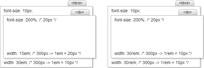
Fig 1. Comparision of using em and rem units (em – on the left, rem – on the right).
By the root element we mean the very first element in document which is the html tag, not the body. Remember that to avoid confusion, because you’re probably not accustomed to setting font size on the html tag.
Vw, vh, vmin, vmax units
Vw and vh are two of the most powerful units when it comes to scalable user interfaces. Unfortunately it isn’t well supported by browsers, especially mobile (http://caniuse.com/viewport-units). However, it’s present in Tizen’s WebKit engine and you can use it in your applications. I will show you how to use it in the following paragraphs.
Vw and vh stand for the percentage of the viewport width and the viewport height accordingly. 1vw (vh) is equal to 1% of the viewport width (height). When our application has to scale to the screen width or height it’s the best unit to choose.
The difference between vw/vh and % unit is similar to the difference between rem and em units. The % unit relates to the parent’s element size, while vw/vh relates to the “root” element size which is the viewport size. When developing for a desktop browser, viewport means a client area of the browser, not the whole window or screen.
The next useful units are vmin and vmax, which are the percentage of the shorter (vmin) or longer (vmax) viewport/client area side.
Designing UI with em and percentage units
When developing an application, we want to support as many platforms as possible so I decided to focus on em and % units. They’ve been supported by all browsers for a long time. You can use vw and vh units if your target platform is Tizen and you don’t want to support older mobile and desktop browsers. In the following example I’m going to demonstrate how to design a simple game menu that looks the same on all screen pixel densities. The menu will be displayed in the portrait mode (for now we don’t write code to support different screen orientations, this will be discussed in future articles). The picture below shows a screenshot taken from the application.
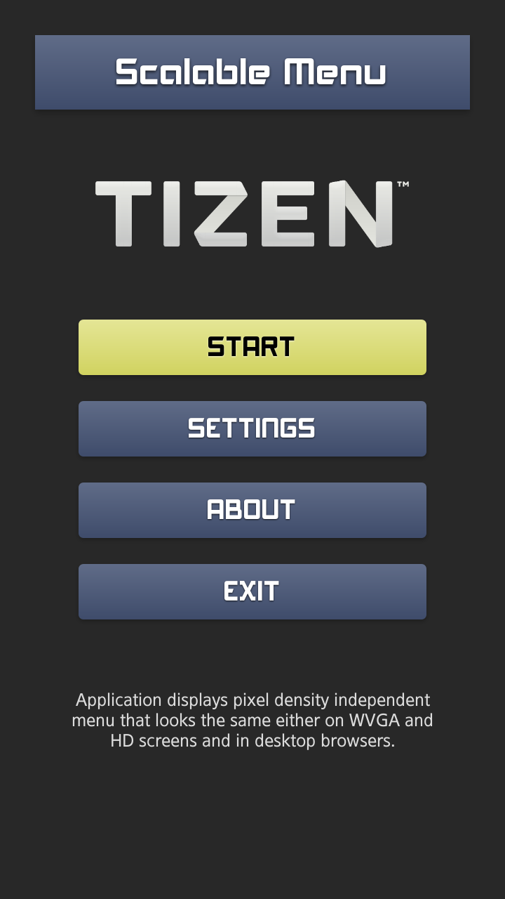
Fig 2. Screenshot taken from the application.
Calculating the font size
|
Note
The following section describes computations I made to calculate the initial font size that is going to be used in the application. If you don’t want to do the entire math or even think about the way it was calculated you can leave this section. However, I recommend reading it if you are a curious designer.
|
At the beginning we have to determine the font size which, applied to the text, will guarantee the best reading experience. To do that, you have to calculate a few things. First, decide what font height (in millimeters) is most readable. By displaying different font sizes on different screens I assumed that letters between 2 and 3 millimeters high are big enough. You shouldn’t use font sizes that are smaller than 2 millimeters.
Afterwards, I calculated font sizes (in pixels) on different screens with different pixel densities. The most common pixel densities of mobile screens are those between 200 and 300 PPI. You can determine that by dividing the display size in pixels by the display size in inches or just check the specification of a few devices.
Next, we have to multiply the font size (in inches) by screen’s DPIs. Of course, before that we have to change it from millimeters to inches. Now we got the range of good font sizes. So, I took the average value and rounded it, what gave me 25px. The table below sums up all the calculations.
| font height (mm) | font height (inch) | PPI | font size/height (px) |
|---|---|---|---|
| = font height (mm) / 10 / 2,54 | = font height (inch) * PPI | ||
| 2 | 0,0787 | 200 | 15,7480 |
| 3 | 0,1181 | 200 | 23,6220 |
| 2 | 0,0787 | 300 | 23,6220 |
| 3 | 0,1181 | 300 | 35,4331 |
| average (px): | 24,6063 ≈ 25 | ||
Using the calculated font size
What exactly is the font size we got? It will guarantee that the real font height won’t be smaller than 2 mm on devices with the PPI we want to support. But, it’s not the end of the work.
We have to consider different devices on which our application is going to be run with the 25px base font size that we’ve just calculated. Let’s take a smartphone with HD screen (1280x720px). Its screen’s pixel density is probably around 300 PPI, so text written with a 25px font will be between 2 and 3 mm high which is perfect. But what about WVGA screens (840x480px – around 200 PPI) or screens with even smaller PPI? On a 200 PPI screen, the same text will be 1.5 times bigger, and on a 100 PPI screen 3 times bigger. We can deal with it by reducing font size for screens with smaller PPI.
To do that, we need to get the PPI value for the screen on which application is running. How to get it? There are a couple of ways to estimate it, but none of them is perfect and cross platform compatible. What I suggest is to base our solution on the screen width or height, instead of depending on the PPI. Two 4-inch displays, one with 200 PPI and the second with 300 PPI, will have different screen resolutions. Smaller PPI value will result in a smaller screen resolution. It’s an attribute on which we can depend.
How it’s going to look like? First, we need to address our main platform. Let’s assume that we design our application for HD (1280x720px) screens with 300 PPI. For any smaller screen resolution we will calculate a scale factor that will be used to reduce the font size. If the resolution is two times smaller, the scale factor equals 0.5. By multiplying this value by the 25px font size we will get 12.5px, which is what we expect. One question remains: which edge of the screen should we use for computations? The answer is the height. Why? It’s related to the portrait orientation mode in which our application will be working. We also want to display our application in desktop browsers that are in the landscape mode and we want application to scale to the client browser area height, not width. Scaling to the width would cause application to overflow outside the browser’s client area. The picture below shows that difference.
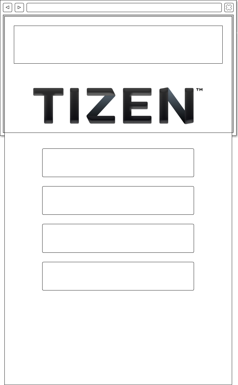
Fig 3. Scaling to browser’s width.
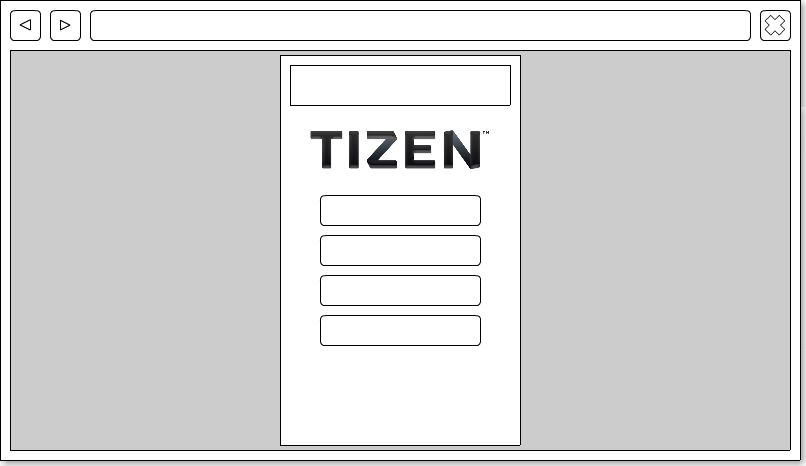
Fig 4. Scaling to browser’s height.
Writing code
At the beginning, we have to declare the base viewport’s resolution in the head section. As I mentioned the base viewport size is 1280x720px and we can declare it with a meta tag.
<meta name="viewport" content="user-scalable=no, width=720, height=1280">
For desktop browsers we have to put application’s HTML code in the container we’re going to scale depending on a browser’s client area height. We are doing this because of the difference in screen orientation. Even when we run our application in a desktop browser (landscape mode) we want it to remain in the portrait mode.
To make everything simple, there are only few lines of HTML code for UI structure.
Application displays pixel density independent menu that looks the same on WVGA screens, HD screens and in desktop browsers.
<div id="container">
    <h1>Scalable Menu</h1>
    <img src="images/tizen.png" />
    <ul>
        <li>Start</li>
        <li>Settings</li>
        <li>About</li>
        <li>Exit</li>
    </ul>
    <p> Application displays pixel density independent menu that looks the same on WVGA screens, HD screens and in desktop browsers.</p>
</div>
The most important operation is scaling the container and the font size. We do it in a function called calculateFontSize. We are going to invoke it in a window resize and load event listeners.
// Initial sizes.
var initialFontSize = 25,
    initialWidth    = 720,
    initialHeight   = 1280,
    calculateFontSize;

calculateFontSize = function () {
    var currentHeight,
        scaleFactor,
        fontSize,
        scaledWidth,
        scaledHeight,
        container;

    // Get current client/screen height.
    currentHeight = window.innerHeight;

    // Calculate scale factor and scaled font size.
    scaleFactor = currentHeight / initialHeight;
    fontSize    = initialFontSize * scaleFactor;

    // Calculate scaled container size.
    scaledHeight = currentHeight;
    scaledWidth  = initialWidth * scaleFactor;

    // Set scaled container and font size.
    container = document.getElementById('container');
    container.style.width        = scaledWidth + 'px';
    container.style.height       = scaledHeight + 'px';
    document.body.style.fontSize = fontSize + 'px';
};

window.addEventListener('resize', calculateFontSize, false);
window.addEventListener('load', calculateFontSize, false);
Let’s work a little bit on the style sheet. In the document’s body we defined the 25px font size for the initial 1280x720px resolution. Now, for any element that is placed inside the body, 1em is equal to 25px. We can change this relation by changing the font size. For example, consider a div element with font size set to 200%. How many pixels will fit in 1em? You’re right, now 1em is 50px. If you want to place another element inside the previously discussed div with the 1em value equal 25px you have to change its font size to 50%. Why is that? It’s specific for cascade style sheets. Every child element inherits parameter’s values from its parent (if they’re not overwritten). So, any element in that div will have the same font size as its parent.
Let’s say we need to expand an element to the screen’s width. How many em’s should it have? You have to do some simple math. Just divide 720px (width) by the pixel value of 1em, which is 25px for the body. 720px / 25px = 28,8em – it’s the value that will make element fit perfectly to the screen’s width.
For images you should prepare a file that will look well on the highest resolution and just scale it down for the other screens. In the sample application I didn’t set any pixel properties using em values. I focused on making the design clean, by using padding and margins properly. You can find many articles describing good practices for designing interfaces in the Internet, but it’s not the subject of this article.
In the sample application I used three different font-sizes: 200% for a header with the application name, 150% for menu buttons and 100% for the text under the menu. By setting different font sizes, I’ve changed the 1em pixel value for each context. Now they’re 50px for the 200% font size, 37,5px for the 150% and 25px for the 100%. Of course any device/browser which screen/client area resolution differs from our base 1280x720px is going to have different values for the 1em (calculated by multiplying that value by the scale factor). If we take an element from the body and its font size hadn’t been overwritten it’s going to have value of 100%. It happens, for example, with the image tag, whose width was set to 18em giving us 450px for the HD screen. If we don’t want to support bigger screens we can prepare an image that is exactly 450px wide and the rendering engine will scale it down to any lower resolution.
Investigate the sample application’s styles file, included with this article, and play around with a desktop’s browser size to see the user interface scaling in action. Try to run application on Tizen emulator and simulator with different resolutions.
Designing UI with vw and vh units
Let’s consider using vw and vh units to create the same sample application I presented in the previous chapter. We have to choose which of them would be better suited. As we stated before, in desktop browsers we scale everything to fit the client area’s height, so the choice is the vh unit.
On a 1280px high screen we want a text to be written with the 25px font size. To calculate a vh value we have to divide the font size by the screen height, which gives a value of around 0,0195vh. In other words, it’s equal to 1,95% of the screen height, which is enough.
If we want to convert pixel values to vh we can go even further in simplification. We can compute the vh value of a single pixel and then multiply any pixel value by this number to get the value in vh units: 100 / 1280 = 0,078125. Let’s calculate some values for practice:
- Entire screen width: 0,078125 * 720 = 56,25vh,
- 25px font size: 0,078125 * 25 = 1,953125vh. Notice that for the font size we got the same value as in the previous paragraph so everything looks correct.
When using vh units the container is the only element that needs our attention. We have to set its width and height properties. Unfortunately WebKit engine doesn’t render properly borders and shadows that were set in vw or vh units.
#container {
    margin: auto;
    overflow: hidden;
    width: 56.25vh; height: 100vh;
}
You can also download the example application from previous chapter with vh units.
Summary
In this article I’ve described CSS3 units that are useful in building scalable user interfaces for Tizen applications and other platforms. I’ve also shown how to write code that will work on all platforms and browsers and will guarantee that application will always look the same. I hope, that now you have all necessary knowledge to write applications with scalable UI.
Was this document helpful?
We value your feedback. Please let us know what you think.