UI Design with EDC for Tizen Wearable
PUBLISHED
Introduction
EDC (Edje data collection) file is a text file which contains description about position, size, and other parameters of graphical elements. It is mainly used to build application view for user. EDC is a description language where the objects of an interface are described by using a text description. The EDC file has the .edc file extension. The syntax for the EDC files follows a simple structure of blocks that can contain properties and other blocks. This tutorial will help to design user interface of an application by providing guideline about creating different UI components with Edje Data Collections (EDC) and Edje API. In this tip document, designing approach of two UI components will be described.
Creating Main UI:
Main UI of the sample application is created using Genlist. All of those two UI components are added as items into Genlist. To know in detail about Genlist please refer to below link:
Two UI components will be designed during this tutorial. Those are –
- Entry
- Scroller
Creating a simple entry design:
Definition of Entry list will be found in the entry.c file (attachment).
In this sample application, two types of entry design is done using edc file. Entry design types are –
- Single Line Entry.
- Password Entry.
Both of the above types are added as an item into Entry Genlist. Each of these items is registered with corresponding callback. In entry.c file, these callbacks are defined as _single_line_entry_cb and _password_entry_cb. Here, in this sample app both of the entry types are using same EDC file named entry.edc.
This EDC file starts with Group block. It contains parts and programs. In this app, group name is set to “entry_layout” as below:
group {
   name: "entry_layout";
/…
…
…/
}
This name is used by application to load the resulting Edje object. Inside both of the callbacks this name is used in below line of code:
elm_layout_file_set(layout, ELM_DEMO_EDJ, "entry_layout");
This group block contains six part blocks. Each part is given name which is used as a reference for relative positioning system. The part name must be unique within same group.
In this entry.edc file, name of first part block is “bg”. It’s written as below:
part { name: "bg";
         type: RECT;
         scale: 1;
         description { state: "default" 0.0;
            color: 0 0 0 0;
         }
      }
type of this part block is RECT. It creates a rectangle object in the screen.
scale attribute of this part block is set to 1 to make it scalable. Scalability is important when building user interfaces for different resolutions (WVGA – XQXGA) with the same layouts and resources. To know more about scaling refer to below links:
- https://developer.tizen.org/ko/development/guides/native-application/user-interface/efl/scaling?langredirect=1
- https://developer.tizen.org/dev-guide/2.4/org.tizen.ui.practices/html/native/efl/edje_scaling_n.htm
description block is used to define the style and layout properties of a part in a given state. Every part can have 1 or more description blocks.
- State is used to identify a description inside a given part. All state declarations are also coupled with an index number between 0.0 and 1.0. All parts must have at least one description named default 0.0 as it is set for this description state.
- Color sets the part to use the color values of the named color_class. It is set to 0 0 0 0 for this description.
Name of second part block is “top_padding”. It’s written as below:
part { name: "top_padding";
         type: RECT;
         scale: 1;
         /…
         …
        …/
}
description block of this part block is written as below:
description { state: "default" 0.0;
            min: 0 30;
            align: 0.5 0.0;
            fixed: 0 1;
            color: 0 0 0 0;
            /…
             …
            …/
         }
min [width] [height] sets minimum horizontal and vertical size of the state. It is set to 0 30 which denotes minimum width of the state is 0 and minimum height of the state is 30.
align [X axis] [Y axis] moves the object relatively along both axes inside it’s container if object’s size is smaller or bigger than it’s container. It is set to 0.5 0.0 here.
fixed sets that this part does not change size in width or height (1 for it does not, 0 for it does). It is set to 0 1 here.
rel1 and rel2 blocks are used to define each corner’s position of part’s container. rel1 refers to the top-left corner and rel2 to the bottom-right corner. It is set as below:
rel1 {
         relative: 0 0;
         to: "bg";
     }
rel2 {
         relative: 1 0;
         to: "bg";
     }
In this sample app, this part block is relative to “bg” part’s container.
Part blocks named “left_padding”, “right_padding” and “bg_entry” are written as described above.
Last part block name is “entry_part”. It is written as below:
part { name: "entry_part";
         type: SWALLOW;
         scale: 1;
         /…
         …
         … /
      }
It’s type is set to SWALLOW. It means that an object can be added into this block.
description block of this part block is written as below:
description { state: "default" 0.0;
            min: 0 39;
            max: -1 39;
            fixed: 1 0;
            /…
            …
            … /
            align: 0 0;
            }
max [width] [height] sets maximum horizontal and vertical size of the state. It is set to -1 39. Here -1.0 means that it is ignored in one direction.
rel1 and rel2 blocks are set as below:
  rel1 {
	   relative: 1 0;
	   to_x: "left_padding";
	   to_y: "bg_entry";
	}
	rel2 {
	   relative: 0 0;
	   to_x: "right_padding";
	   to_y: "bg_entry";
	}
rel1 block’s X axis value is set to 1 relative to “left_padding” part block and Y axis value is set to 0 relative to “bg_entry” part block.
Accordingly, rel2 block’s X axis value is set to 0 relative to “right_padding” part block and Y axis value is set to 0 relative to “bg_entry” part block.
Creating a simple scroller design:
Definition of Scroller will be found in the scroller.c file. According to “entry_layout” scroller layout made using EDC is added using below line:
elm_layout_file_set(layout, ELM_DEMO_EDJ, "elmdemo-test/scroller");
group block of scroller layout is written as below:
group {
   name: " elmdemo-test/scroller";
/…
…
…/
}
This group block contains two part blocks. In the scroller.edc file, name of first part block is “bg”. It’s written as below:
part { name: "bg";
         type: RECT;
         scale: 1;
         /…
         …
        …/
}
It is a RECT type scalable part. description block of this part block is written as below:
description { state: "default" 0.0;
            rel1.relative: 0 0;
            rel2.relative: 1 1;
            color: 0 0 0 255;
         }
Second part block is named as “scroller”. It is written as below:
part { name: "scroller";
         type: SWALLOW;
         scale: 1;
         description { state: "default" 0.0;
            rel1.relative: 0 0;
            rel2.relative: 1 1;
         }
      }
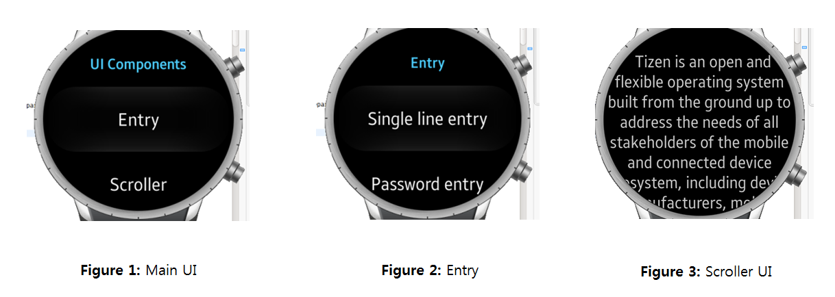
Running the sample application
Sample application will show the UI according to images below:
Was this document helpful?
We value your feedback. Please let us know what you think.