Tizen UX Conversion Tutorial:Springboard-Based Navigation Tutorial
PUBLISHED
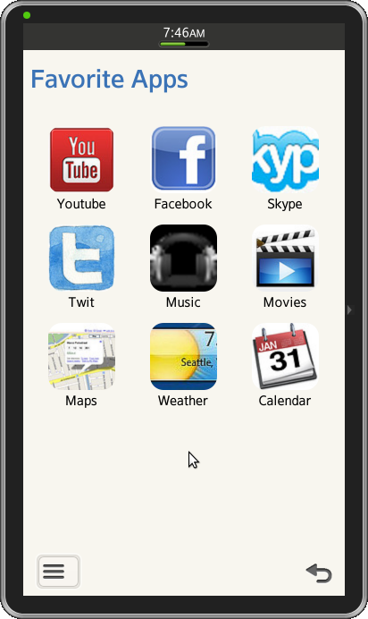
Springboard Menu
Overview
In this tutorial we’ll learn how to design “Springboard” based nagivation using Tizen UI framework. We’ll touch upon important aspects of the sample application.
The Springboard sample application is based of Tizen Web UI framework multi page application. The application demonstrates how the Springboard navigation menu can be designed for the Tizen applications. Let’s get into the various sections of the application to understand the implimentation.
Springboard Navigation Menu
The application home page layout consists of custom icons positioned using jQuery Mobile’s layout grids. A div with a class of “ui-grid-b “(a/b/c/d) creates a layout grid based on three columns. Each column is designated by a child div with a class of ui-block-a(/b/c/d/e), ordered alphabetically from left to right, up to the number of columns dictated by the parent ui-grid configuration. Similarly, the grid wraps around to a new row by repeating the sequence of columns.
 <div id="top" class="ui-grid-b springboard">
   <!-- row 1, column 1 -->
   <div id="Youtube" class="ui-block-a">
     <a href="#popup" data-position-to="window" data-rel="popup">
       <img src="WebContent/Youtube.png" class="springboard-portrait-img"></img>
     </a> <p>Youtube</p>
   </div>

   <!-- row 1, column 2/3 -->
   <!-- row 2, column 1/2/3 -->
   <!-- row 3, column 1 -->
	Code here

   <!-- row 3, column 2 -->
   <div id="Weather" class="ui-block-b">
     <a href="#popup" data-position-to="window" data-rel="popup">
       <img src="WebContent/weather.png" class="springboard-portrait-img"></img>
     </a> <p>Weather</p>
   </div>

   <!-- row 3, column 3 -->
   <div id="Calendar" class="ui-block-c">
     <a href="#popup" data-position-to="window" data-rel="popup">
       <img src="WebContent/calendar.png" class="springboard-portrait-img"></img>
     </a> <p>Calendar</p>
   </div>
 </div>
Customizing Header/Footer
Unlike other platforms, Tizen does not regulate the area for headers and footers, but regards them a part of the whole body. Tizen differentiates headers and footers by font colors. The header fonts have blue color tones that are well harmonized with the main ivory color.
- Application Header
The header enables navigation within the application using tabs, and, in special cases, provides a Back button.
The default header has just a string inside, located at the top of the screen. When needed, the header can also provide other elements, such as icons or buttons. Our sample application just uses the default header, so no extra elements added to the header.
<div data-role="header">
   <h1> Favorite Apps </h1>
</div><!-- /header -->
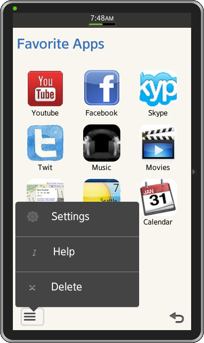
- Custom Footer
As per Tizen UX guidelines, all screens of the application must offer a return path to the previous page in the form of Back or Cancel button in the footer. These button should be located on the right edge of the footer. For adding a back button in footer, we just need to add data-add-back-btn=”true in the first page.
If we have more functions to be offered in the footer, then we should be implimenting the context pop-up with the button “More”. And per the UX guidelines, the More button should be placed on the left edge of the footer.
Note: If there is no function to offer in the More button, the space should be left empty.
Below code shows how to offer 2 or more functionalities,
 <div data-role="footer" data-position="fixed">
   <div class="springboard-more-icon">
     <a href="#options" data-role="button" data-icon="home" data-rel="popup"></a>
   </div>

   <div id="options" data-role="popup" class="vertical popup-layout">
     <ul data-role="listview">
       <li class="text popup-pos">
         <a href="#settings" data-inline="true" data-role="button" data-icon="gear"
                       data-iconpos="left">Settings
         </a>
       </li>

       <li class="text popup-pos">
	 <a href="#help" data-inline="true" data-role="button" data-icon="info"
                       data-iconpos="left">Help<span class="popup-helptext"></span>
         </a>
       </li>

       <li class="text popup-pos">
	 <a href="#delete" data-inline="true" data-role="button" data-icon="delete"
                       data-iconpos="left">Delete<span class="popup-deletetext"></span>
         </a>
       </li>
     </ul>
   </div>
   <h4 class="springboard-footer"></h4>
  </div><!-- /footer -->
CSS Classes
- CSS for Springboard Container
/* Springboard Container  */
.springboard-container {
     text-align: center;
}
.content-centered {
     vertical-align: middle;
     margin-left: auto;
     margin-right: auto;
     margin-top: 30px;
}

/* Captions close to the application icon */
.springboard p {
     margin-top: -3px !important;
     color: black;
     font-size: 15px;
}

.img-round-corner {
     border-radius: 15px;
}
- CSS for Context Popup
Below is CSS for positioning the context popup.
.popup-layout {
     width:250px;
     height:150px;
}

.popup-helptext {
     display:inline-block;
     width:30px;"
}

.popup-deletetext {
     display:inline-block;
     width:15px;"
}

.popup-pos {
     padding-top:15px;
}
Deleting applications from Springboard (Using JavaScript)
You can delete the application from the Springboard when not needed.
The below code snippet from the sample application demonstrates the deletion of the applications using the JavaScript.
// Function to remove the application from the springboard
function removeApp(pDiv){
   var appname = document.getElementById('AppNameText').value;
   if (document.getElementById(appname)) {
         var child = document.getElementById(appname);
         var parent = document.getElementById(pDiv);
         parent.removeChild(child);
         alert("Application Deleted");
    }
    else {
         alert("Application removed or does not exist.");
         return false;
    }
}
Snapshot:
License:
The icons used in the applications are licensed under Creative Commons License Attribution-ShareAlike 2.0.
Development Environment:
Tizen SDK
Version : 2.0.0
Build id : 20130214-1647
Note:
The sample application is available for reference (See under File Attachment section).
Was this document helpful?
We value your feedback. Please let us know what you think.