Developer Application Case Study: TenFrame
PUBLISHED
Developer Application Case Study: TenFrame
Overview
Tenframe is an interactive math game, making learning a fun for the kids. The game is targeted for young kids to practice math skills,such as addition and subtraction. The user can play 3 games – pirates, rocket fuel,or bowling – testing the math skills. This app extensively and creatively uses CSS animation, combination of CSS and JavaScript animation, chaining of animations using webkitTransitionEnd.
Table of Content
- Features
- Controlling Elements in the DOM Dynamically
- CSS3 Alternative to jQuery fadeIn(), fadeOut() methods
- CSS3 Animation
- CSS3 Classes
- JS Prototype
- Screenshots
Features
From a web application developers perspective , the features of interest are:
- Adding visual elements to the DOM dynamically.
- FadeIn and fadeOut effects are achieved using CSS, rather than using JQuery
fadeIn(), fadeOut()methods. - Extensive use of CSS techniques for animations and minimizing the JavaScript.
- Use of JS prototypes
- Use of CSS3 classes
Controlling elements in the DOM dynamically
In some cases, we might need to make changes to DOM objects dynamically with the images. Here, we can see how the game menu slide class is used.
#game_menu.slide {
    opacity: 1;
    -webkit-transform: translate(0px, 195px);
}
We can use this to control DOM objects display on screen (with the Jquery Javascript library) like this.
function closeMenu() {
        $("#game_menu").removeClass("slide");
        $("#game_menu_border").css("pointer-events", "none");
        setTimeout(function () {menushown = false;}, 400);
    }

function openMenu() {
        $("#game_menu").addClass("slide");
        $("#game_menu_border").css("pointer-events", "auto");
        setTimeout(function () {menushown = true;}, 400);
    }
In Tenframe, these techniques are used at large. For example, in js/bowling.js, when displaying the correct and incorrect dialogs.
var correct = data.gamethrow(0) + data.gamethrow(1);
        if(val == correct)
        {
            $("#bowling_dialog").removeClass("incorrect");
            $("#bowling_dialog").addClass("correct");
            sounds.correct.play();
            data.answers[idx] = true;
        }
        else
        {
            $("#bowling_dialog").removeClass("correct");
            $("#bowling_dialog").addClass("incorrect");
            sounds.incorrect.play();
            data.answers[idx] = false;
        }
This code in css/main.css,
#bowling_dialog {
    position: absolute;
    pointer-events: none;
    background:url(../images/bowling/great_job_bkgrd.png) no-repeat;
    width: 687px;
    height: 499px;
    top: 50px;
    left: 168.5px;
    opacity: 0;
    -webkit-transition: opacity 0.5s ease-in-out;
}
When the value is evaluated against the game score, user will be prompted with the correct or incorrect dialog. If the value is correct, then the dialog with “correct” class is used, else “incorrect” class is used.
CSS3 Alternative to jQuery fadeIn(), fadeOut() methods
When a image with some opacity(transparency), is to be animated (with easing/smoothing effect) to none opacity, we often use jQuery to achieve it. But this can be done using CSS instead of jQuery.
For CSS , transition tags can be used to achieve this. Using CSS instead of jQuery has many obvious advantages and one of them is faster load time of the application.The effect achieved by using CSS is absolutely same as jQuery.
Below is how its defined in css/main.css file,
.fade {
    opacity: 0;
    -webkit-transition: opacity 0.5s linear;
}
More information on these techniques can be referred here CSS3 fadeIn/feadOut.
CSS3 Animation
An animation is an effect that lets an element gradually change from one style to another.Using CCS3 animation, we can minimize the JavaScript coding and make it possible to animate transitions from one CSS style configuration to another. Animations consist of two components, a style describing the CSS animation and a set of keyframes that indicate the start and end states of the animation’s style,as well as possible intermediate waypoints along the way.
The below steps need to be followed for using CCS3 animation.
Configuring the animation:
To create a CSS animation sequence, you style the element you want to animate with the animation property or its sub-properties. This lets you configure the timing and duration of the animation, as well as other details of how the animation sequence should progress.
Note: This does not configure the actual appearance of the animation, which is done using the @keyframes.
Define animation sequence using keyframes:
Once you’ve configured the animation’s timing, you need to define the appearance of the animation. This is done by establishing two or more keyframes using the @keyframes at-rule. Each keyframe describes how the animated element should render at a given time during the animation sequence.
In css/main.css, we can see below code for the bowling pins animation.
@-webkit-keyframes pinflyleft {
    0% { -webkit-transform: translate(0px, 0px) rotate(0deg);}
    10% { -webkit-transform: translate(-30px, -31px) rotate(90deg);}
    20% { -webkit-transform: translate(-60px, -57px) rotate(180deg);}
    30% { -webkit-transform: translate(-90px, -77px) rotate(270deg);}
    40% { -webkit-transform: translate(-120px, -91px) rotate(360deg);}
    50% { -webkit-transform: translate(-150px, -97px) rotate(450deg);}
    60% { -webkit-transform: translate(-180px, -91px) rotate(540deg);}
    70% { -webkit-transform: translate(-210px, -77px) rotate(630deg);}
    80% { -webkit-transform: translate(-240px, -57px) rotate(720deg);}
    90% { -webkit-transform: translate(-270px, -31px) rotate(810deg);}
    100% { -webkit-transform: translate(-300px, 0px) rotate(900deg);}
}

@-webkit-keyframes pinflyright {
    0% { -webkit-transform: translate(0px, 0px) rotate(0deg);}
    10% { -webkit-transform: translate(30px, -31px) rotate(-90deg);}
    20% { -webkit-transform: translate(60px, -57px) rotate(-180deg);}
    30% { -webkit-transform: translate(90px, -77px) rotate(-270deg);}
    40% { -webkit-transform: translate(120px, -91px) rotate(-360deg);}
    50% { -webkit-transform: translate(150px, -97px) rotate(-450deg);}
    60% { -webkit-transform: translate(180px, -91px) rotate(-540deg);}
    70% { -webkit-transform: translate(210px, -77px) rotate(-630deg);}
    80% { -webkit-transform: translate(240px, -57px) rotate(-720deg);}
    90% { -webkit-transform: translate(270px, -31px) rotate(-810deg);}
    100% { -webkit-transform: translate(300px, 0px) rotate(-900deg);}
}

#bowling_pin1 {top: 120px; left: 100px;}
#bowling_pin1.flyleft {-webkit-animation: pinflyleft 1.5s linear 1 1.1s;}
#bowling_pin1.flyright {-webkit-animation: pinflyright 1.5s linear 1 1.1s;}
#bowling_pin2 {top: 120px; left: 143px;}
#bowling_pin2.flyleft {-webkit-animation: pinflyleft 1.5s linear 1 1.1s;}
#bowling_pin2.flyright {-webkit-animation: pinflyright 1.5s linear 1 1.1s;}
Similarly , below animation code for pirates arms (in pirates game mode).
@-webkit-keyframes bluepiratelarm_wave {
    0%, 100% { -webkit-transform: rotate(20deg); }
    50% { -webkit-transform: rotate(-40deg); }
}

@-webkit-keyframes bluepiraterarm_wave {
    0%, 100% { -webkit-transform: rotate(-40deg); }
    50% { -webkit-transform: rotate(40deg); }
}

@media (orientation: landscape) {
.stranded .bluepiratelarm {-webkit-animation: bluepiratelarm_wave 4s ease-in-out infinite;}
.stranded .bluepiraterarm {-webkit-animation: bluepiraterarm_wave 4s ease-in-out infinite;}
.flying .bluepiratelarm {-webkit-animation: bluepiratelarm_wave .1s ease-in-out infinite;}
.flying .bluepiraterarm {-webkit-animation: bluepiraterarm_wave .1s ease-in-out infinite;}
.saved .bluepiratelarm {-webkit-animation: bluepiratelarm_wave 1s ease-in-out infinite;}
.saved .bluepiraterarm {-webkit-animation:;-webkit-transform: rotate(65deg);}
}
> Use of CSS3 Classes
At times the built-in CSS styles are not exactly what we need. So we create our own CSS rule with the CSS3 classes. The CSS rule will be independent of any one HTML tag allowing us to use it on any HTML tags. In fact, it’s kind of a generic rule, where you can,
- Use the same class on multiple elements.
- Use multiple classes on the same element.
In Tenframe, let’s understand how the classes have been used in “Rocket” game mode. Defining class properties,
.rocketicon {
    position: absolute;
    background:url(../images/rockets/rocket_icon_blue.png) no-repeat;
    width: 38px;
    height: 83px;
    top: 15px;
}

.rocketicon.highlight {
    background:url(../images/rockets/rocket_icon_yellow.png) no-repeat;
}
Defining ID properties,
#rocketicon1 {left: 15px;}
#rocketicon2 {left: 64px;}

#rockets_rocket {
    position: absolute;
    width: 400px;
    height: 769px;
    left: 656px;
    top: 0px;
}

#rockets_rocket.launch {
    -webkit-transition: all 1.5s ease-in;
    top: -800px;
}
Below is the lauchRocket function (in js/rockets.js file), which uses the above classes.
function launchRocket() {
        sounds.ignite.play();
        setTimeout(function(){sounds.launch.play();}, 3000);
        var tgt = data.currtarget + 1;
        $("#rocketicon"+tgt).addClass("highlight");
        $("#rockets_smoke").addClass("launch");
        $("#rockets_msg2 b").html(tgt.toLocaleString());
        $("#rockets_status").addClass("show");
        timerLaunch = setTimeout(function () {
            $("#rocket_flame").addClass("launch");
            $("#rockets_rocket").addClass("launch");
        }, 3300);
        timerNext = setTimeout(function () {nextRocket();}, 7000);
    }
Similarly, the other classes used in the function have been defined in the css/main.css file.
JS prototype
The prototype property allows you to add properties and methods to an object. The prototype property is initially an empty object, and can have members
added to it – as you would with any other object.
The below example uses prototype property to add methods to an object(s). We now add begin/clear methods to Animation here.
Animation.prototype.begin = function() {
    var self = this;
    self.phase = "starting";
    setTimeout(function(){self.elem.className = self.onclass;}, 0);
};

Animation.prototype.clear = function() {
    var self = this;
    if(self.timer)
        clearTimeout(self.timer);
    self.phase = "off";
    self.elem.className = self.offclass;
    if(self.next&&self.next.clear)
        self.next.clear();
};
Now, let’s create an object of Animation,
rockets_msg1 = new Animation("rockets_msg1a", "show", 2600, "opacity");
Now access the methods (clear/begin) added earlier using the object created rockets_msg1 in the reset function.
function reset() {
        if(timerLaunch)
		.
		.
       rockets_msg1.clear();

       $("#rockets_status").removeClass("show");
       $("#rockets_fuellight").removeClass("green");
		.
		.
       }
Every object within JavaScript has a hidden property added to it when it is defined or instantiated, named __proto__. Based on __proto__ property, prototype chain is accessed. However, it is not a good idea to access __proto__ within your application, as it is not available in all browsers.
If you create a new object via new Animation, the object’s prototype property will be set to the object referenced by Animation.prototype.
You’ll find a lot more information about prototype at Read more.
Sceenshots
Below are the screenshots of the Tenframe application.
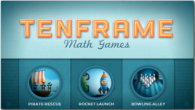
Fig 1: Game mode selection, when the application is loaded.
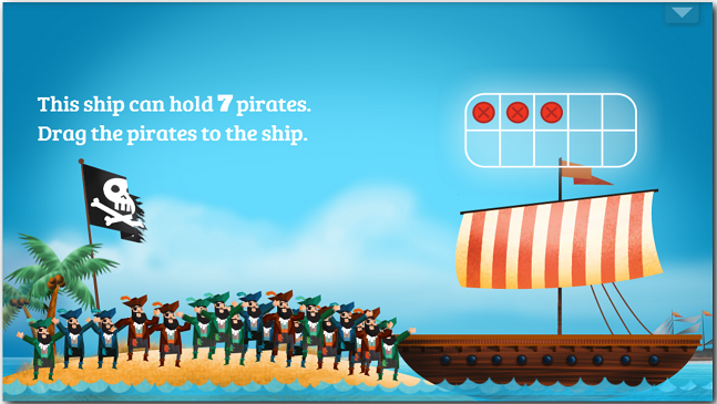
Fig 2: “Pirates” game mode selected.
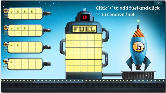
Fig 3: “Rocket” game mode selected.
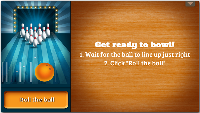
Fig 4: “Bowling” game mode selected.
Was this document helpful?
We value your feedback. Please let us know what you think.