CSS 3D transforms for Tizen Web Application
PUBLISHED
1. Introduction
This document describes how to use CSS 3D transforms in your Web application.
3D transforms allow Web page elements to be displayed and transformed on a three-dimensional plane. CSS transforms are implemented using a set of CSS properties that let you apply affine linear transformations to HTML elements. These transformations include rotation, skewing, scaling, and translation both in the plane and in the 3D space.
3D transforms are often used to rearrange elements into geometric shapes.
In our example, we form the 3D cube from six cube faces using 3D transforms.
Target environment:
- Target Device: Samsung Z3
- Target SDK: Tizen SDK 2.4 Rev4
2. 3D cube
2.1. Create markup
Create a markup for our future 3D cube – block container. Each of the six cube faces is given a .side class relating to its number. These six faces sit within a cube container and centered all our elements with it (“2D cube” from 5 sides, add a sixth later).
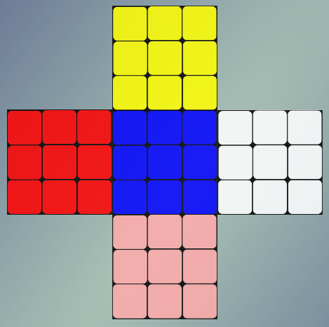
Figure 1
Faces are the resources (.png images) that will be added as the background for the div`s block container.
HTML markup for cube:
|
<div class=“cube”> <div class=“side1”></div> <div class=“side2”></div> <div class=“side3”></div> <div class=“side4”></div> <div class=“side5”></div> <div class=“side6”></div> </div> |
CSS for .cube class:
|
.cube { position: absolute; width: 200px; height: 350px; margin: 0 auto; left: 0; right: 0; } |
Face class (side1 class is for the blue central element in this sample):
|
.cube .side1 { position: absolute; width: 100px; height:100px; background: url(“../images/drawing_blue.png”) no-repeat; background-size: 100px 100px; top: 125px; margin: 0 auto; left: 0; right: 0; opacity: 0.85; } |
The rest faces are butted using markup with absolute position.
Faces are placed around the central element. Red and white elements are placed on one horizontal line with a central element but on opposite side (left and right) of it. Yellow and pink elements are placed on one vertical line with a central element but above and below it are respectively.
For this purpose uses absolute positioning with the following properties for the positioning elements: top, left, right and bottom.
Class side2 has red element in this sample:
|
cube .side2 { position: absolute; width: 100px; height:100px; background: url(“../images/drawing_red.png”) no-repeat; background-size: 100px 100px; top: 125px; left: -50px; opacity: 0.85; } |
2.2. How to create 3D cube
2.2.1. Preparation (transform style and perspective)
First af all, for cube need to specify ”transform-style” property:
|
-webkit-transform-style: preserve-3d; |
This property determines whether child elements lie flat against their parent (flat) or remain in 3D space (preserve-3d). Without it, they would appear flat in front of their parent because it`s default.
Also, add “perspective” property:
|
-webkit-transform: perspective(900px); |
This property defines the depth of the Z-plane and relative sizes of elements above and below it. Takes a single value, which is a length unit greater than 0 (zero). Explaining this is a little complicated; the length is like a distance between you and the object that you’re watching.
For our purposes, just need to know that if you use small number, the more extreme the 3D effect will appear; any value below 200px, for example, will make the transformation appear like very exaggerated, and any value of 1000px or more will seem to have no effect at all.
Property applies only to the children of the element that it’s used on, not the element itself.
For our example, we use the value of 900px, and it give a moderate effect.
2.2.2. How to bend and stick it
To turn our markup into the likeness of a cube, need to “bend” along the lines of its adjacency to the outer faces of the side1.
Firstly, set for each face the axis around which it rotates. The default units are rotated around its center, we need a slightly different behavior:
The Figure 2 shows, that the element 3 to be rotated around the black line.
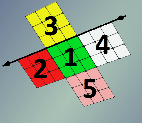
Figure 2
For this purpose use the “transform-origin” property:
|
-webkit-transform-origin: 0 100%; |
Using this property changing point around which will be transformation. In our example, for element 3 Y-axis should be moved to the bottom face, respectively, second value transform-origin should be 100% (transform-origin: 0100%). The value of Y-axis in this case does not matter, because rotate this side we exclusively about a horizontal axis.
Accordingly, for element 2, rotation should be around X-axis, and it should be moved to the right edge:
|
-webkit-transform-origin: 100% 0; |
And so on for all elements.
Secondly, and for this guide, “in-principal”, for direct rotating of elements use “rotate3D(x,y,z,deg)” property:
|
-webkit-transform: rotate3d(x,y,z,deg); |
This property defines the rotation around a vector-axis. First we will determine a vector by setting its x, y, and z values. The 4-th value determines the angle of the rotation (rotation around vector). Degrees (deg) and radian(rad) are allowed as units for the angle.
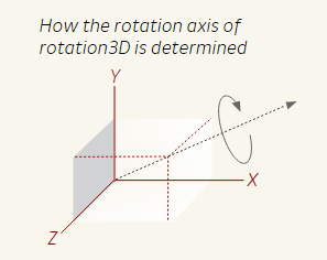
Figure 3 [3]
In our example, for element 3:
|
-webkit-transform: rotate3d(1,0,0,-90deg); |
This rotate element -90 degrees around the X-axis (toward the viewer).
For element 2:
|
-webkit-transform: rotate3d(0,1,0,-90deg); |
This rotate element -90 degrees around the Y-axis.
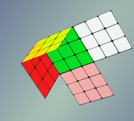
Figure 4
The rest faces are rotated on -90 degrees around respective axes.
Now the cube is rotated to us a single face. To make it looks like a three-dimensional object, rotate the cube itself.
For this purpose add following property to .cube class:
|
-webkit-transform: rotate3d(1,1,1,-45deg); |
This rotate cube on -45 degrees around the vector with coordinates x=1, y=1, z=1
After bending elements and rotation of the cube, it will make a result like in below Figure 5:
Figure 5
3D cube is almost ready now, it remains only to “close” it.
For this purpose, place the last face (with class .side6) to the same place where the central element:
|
.cube .side6 { position: absolute; width: 100px; height:100px; background: url(“../images/drawing_green.png”) no-repeat; background-size: 100px 100px; top: 125px; margin: 0 auto; left: 0; right: 0; opacity: 0.85; } |
And move it “above” the screen on 100px along Z-axis (the size of the cube faces).
We can do this by using “translate3d(x, y, z)” property:
|
-webkit-transform: translate3d(0,0,100px); |
This property moves element along z-axis by the given values. In our example, on 100px toward the viewer.
Below Figure 6 is a 3D cube in this sample.
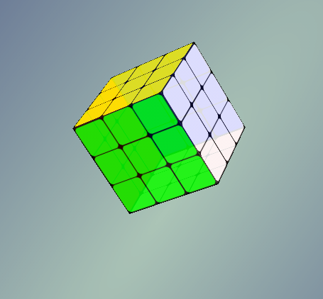
Figure 6
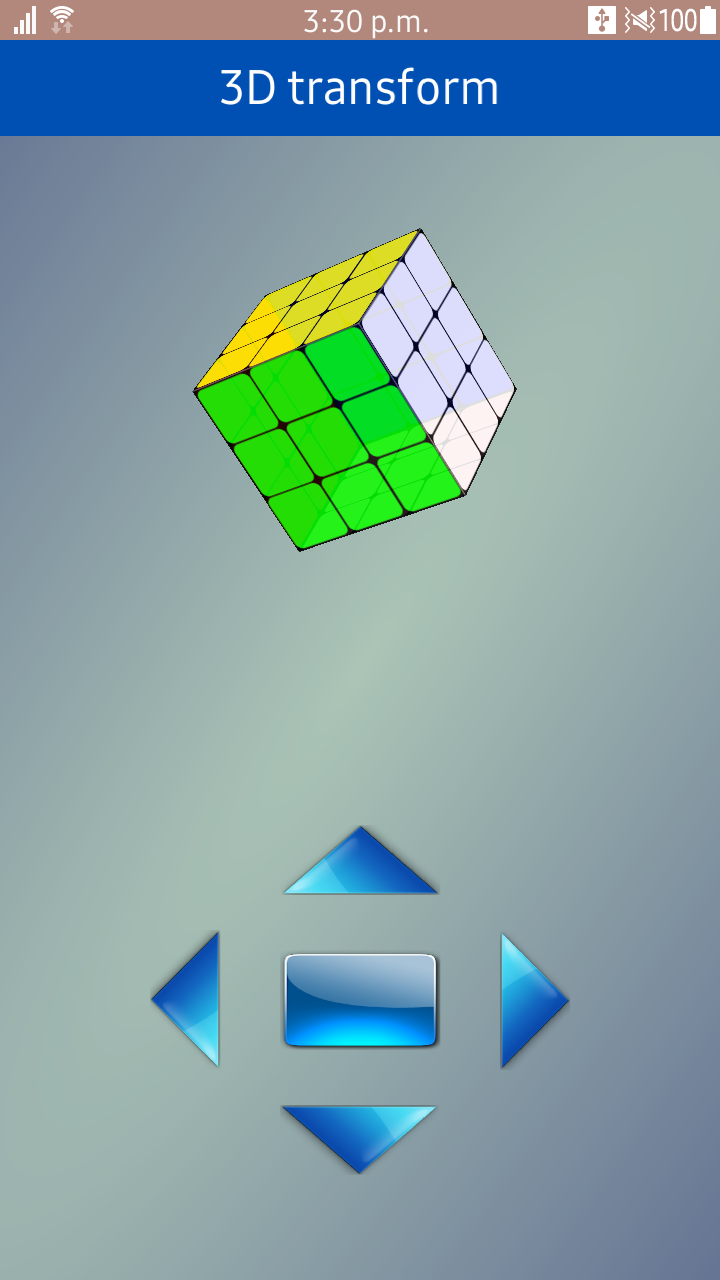
2.2.3. How to rotate 3D Cube
Our cube is ready. Now let’s make it rotate.
Add a buttons, clicking on which our cube will rotate in the appropriate direction.
HTML:
|
<div class=“button button_center”></div> <div class=“button button_up”></div> <div class=“button button_bottom”></div> <div class=“button button_left”></div> <div class=“button button_right”></div> |
Using absolute positioning to place them below our cube.
For rotation use “rotate3D” property:
|
.button_up:active ~ .cube { -webkit-transform: perspective(900px) rotate3d(5,1,0, 140deg); } |
In this case, when pressing and holding the UP button cube is rotated 140 degrees around the vector with coordinates x=5, y=1, z=0.
Also use “perspective” property here, if you do not declare this property again when the cube will be rotated to the desired angle, then perspective distortion will not apply to cube and we will see the cube without perspective effect. It looks strange, so we will appoint a new perspective at every rotate.
For our cube to shift from one position to another “smoothly”, add the following property:
|
-webkit-transition: all 1s ease; |
CSS3 transitions allows you to change property values smoothly (from one value to another), over a given duration. In our example, “all” – defines that it is necessary to change all css properties of a cube; “1s” – transition-duration – specifies the duration over which transitions should occur; “ease” – transition-timing-function – specifies a function to define how intermediate values for properties are computed. Timing functions determine how intermediate values of the transition are calculated, in our case “ease” – transition effect with a start slightly faster than end, be fastest at the middle of the animation, and finish slowly.
One more thing:
The rotation is around the center of the element 1, instead of the center of the cube. To solve this problem, use “translate3d” property:
|
-webkit-transform: translate3d(0,0,-50px); |
This property moves an element on x-axis, y-axis and z-axis by the given values. In our example, just need to move all faces “deeper” (50px on Z-axis) into the screen so that the center of rotation coincides with the center of the cube.
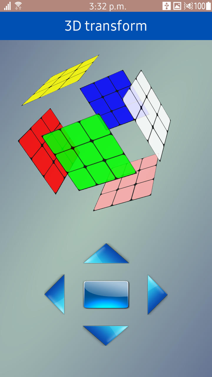
Well, and finally add another effect – expansion faces of the cube by holding the center button.
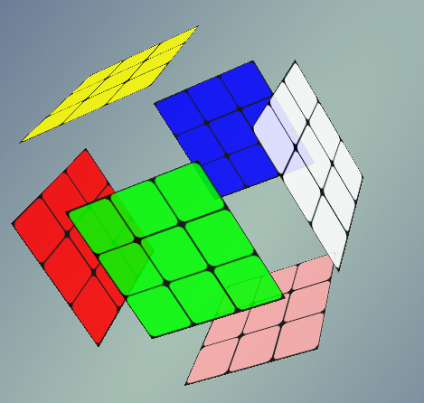
Figure 7
For this purpose, use “translate3d” property again – move each face of the respective axis.
|
.button_center:active ~ .cube .side5 { -webkit-transform: perspective(900px) translate3d(0,50px,0) rotate3d(1,0,0,90deg); } |
Also, use “perspective” property in order to change the size of the face when approaching or depart from the viewer.
And “rotate3D” property with the same value that we used when rotating the faces to create a cube. This is necessary to preserve the face of a rotating angle when moving.
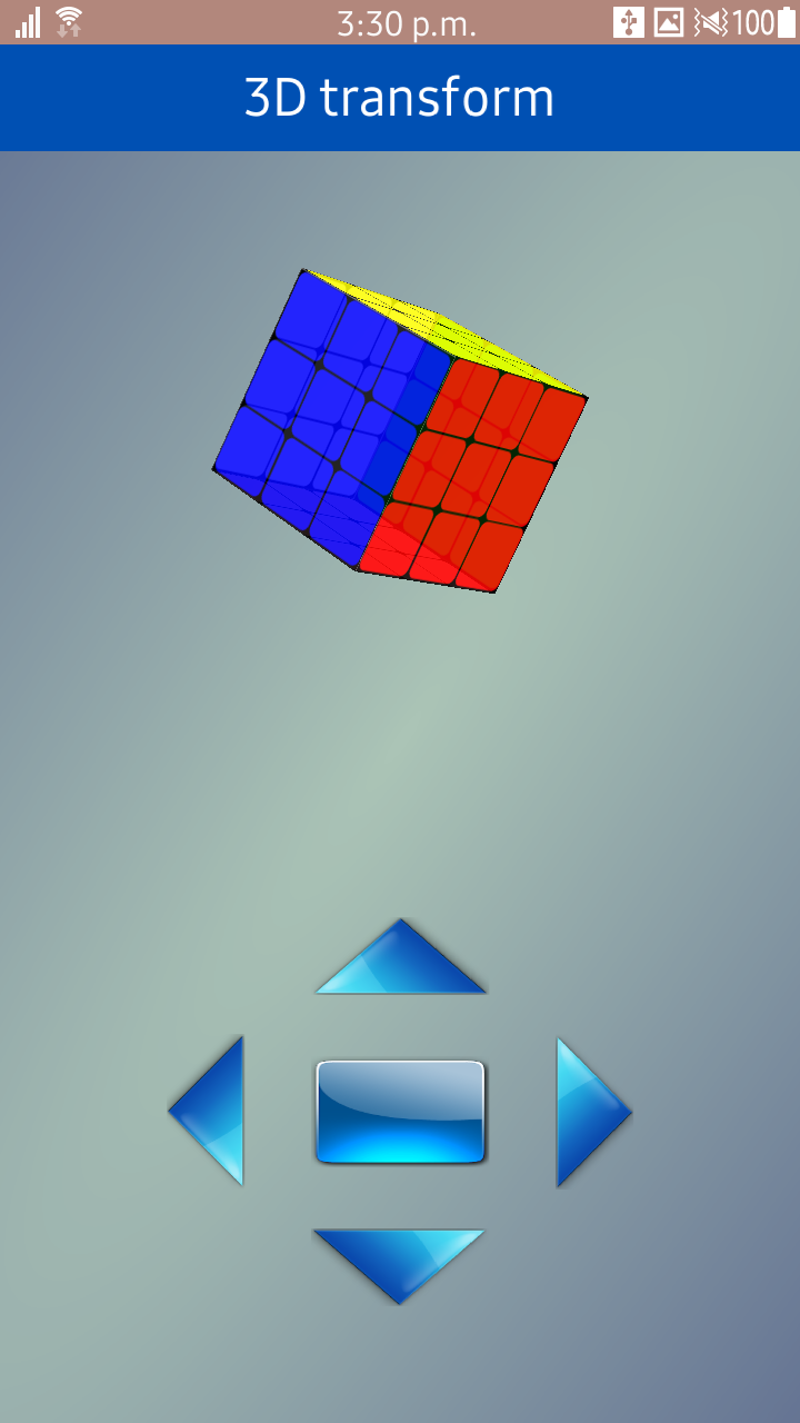
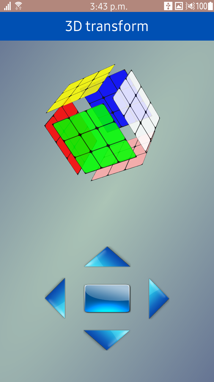
3. Screenshots of sample
Figure 8
4. Conclusion
Based on this sample, we have seen how can use CSS transform property to apply 3D transformation to a 2D element and creating animation based on this for achievement 3D effect.
Hope this article can help you understand CSS transform theory and you can create more complex and amazing 3D objects and animation using that knowledge.
References
|
[1] |
http://www.w3.org/TR/css3-transforms/ |
|
[2] |
http://www.w3.org/Talks/2012/0416-CSS-WWW2012/Demos/transforms/demo-rotate3d.html |
|
[3] |
http://www.eleqtriq.com/2010/05/understanding-css-3d-transforms/ |
Was this document helpful?
We value your feedback. Please let us know what you think.