Creating UI elements for a game menu in Unity3D for Tizen
PUBLISHED
Introduction
Unity3D plays nowadays a key role in the world of mobile gaming. At this moment it seems to be the fastest way to deploy games across platforms and devices. Therefore we could not omit writing about it as a game delivery platform for Tizen.
In this article we will focus on how to create basic UI elements in the Unity3D game creation software basing on a game deployed for the Tizen Platform, which can be found on the Tizen Store under the name “Sub Explorer”.
IMPORTANT!
If you want to deploy your own Unity3D application on Tizen then we encourage you to read First Steps with Unity in Tizen – Part 1 article.
The main menu
The image below shows what we want to achieve.
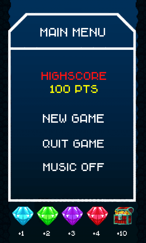
Figure 1 – the main menu of the Sub Explorer game for Tizen
It is a main game menu consisting of:
- A title text (Unity3D UI Image component + bitmap)
- A high score indicator (Unity3D UI Text component)
- A new game button (Unity3D UI Button component + bitmap)
- A quit game button (Unity3D UI Button component + bitmap)
- A music toggle ON / OFF button (Unity3D UI Text component)
- A darkened background (Unity3D UI Image component + bitmap)
- Menu borders (Unity3D UI Image component + bitmap)
- Game collectibles legend with points (Unity3D UI Image component + bitmap)
As this menu building guide is very practical we will focus directly on what we want to achieve in the simplest possible manner. First of all you need to create a Canvas object which will serve as the container for all of our UI components.
You can do it by going into the upper Unity3D editor menu and clicking GameObject -> UI -> Canvas.
After doing that we are ready to put some UI elements on the Canvas. We will start for example with the Quit Game button. Below (fig. 2) click and enlarge the scheme describing what is needed to do in order to place properly a bitmap based button on the Canvas and follow the description beneath.
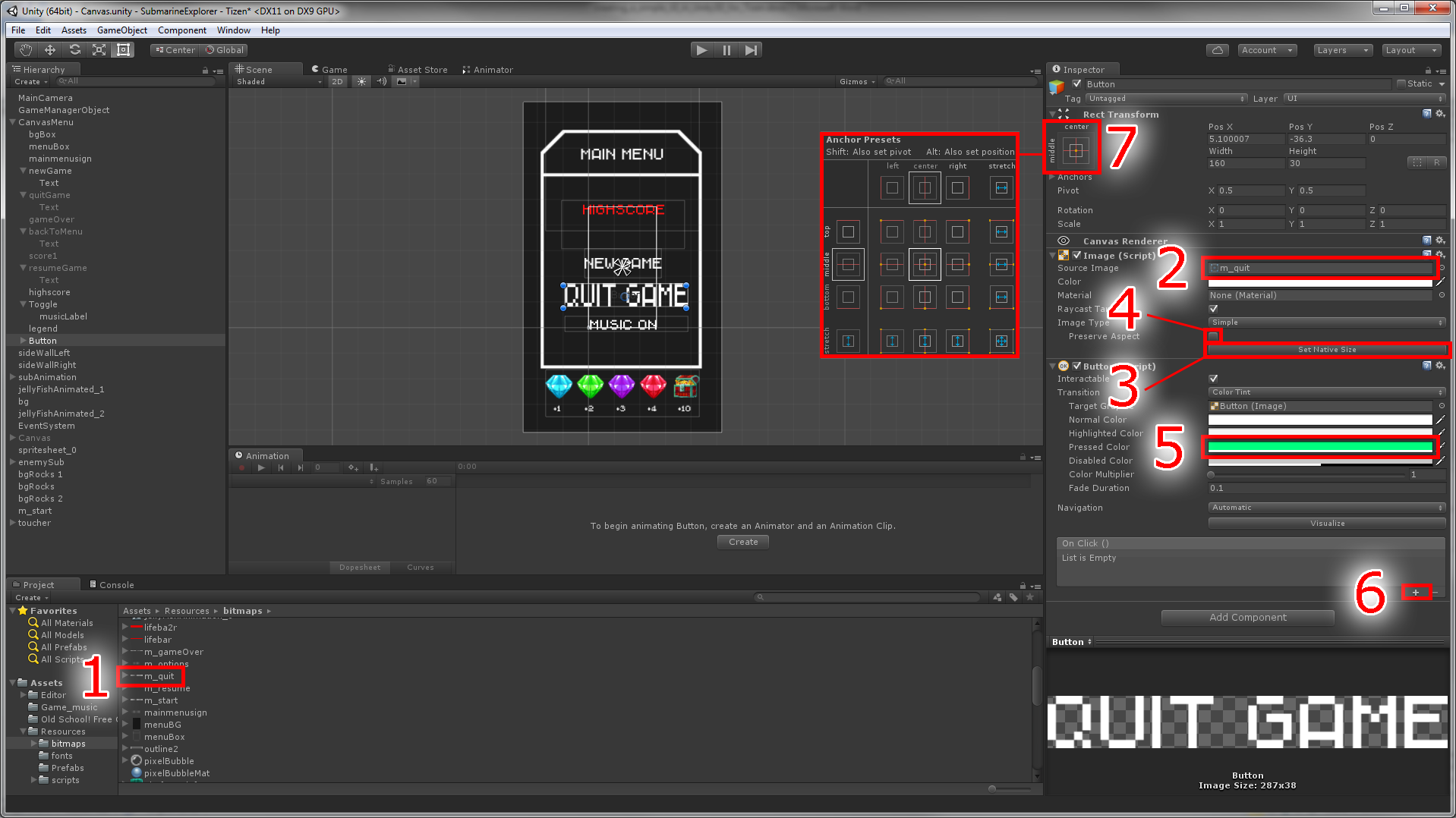
Figure 2 – creating a bitmap based button in Unity3D
Description of the steps needed to create a bitmap button from figure 2:
- You need to have your graphics in the asset window. Then drag your button graphics from the asset window…
- And let it go over the inspector window over the source image slot in the Image (Script) component.
- At this moment you may encounter that your bitmap is stretched in a non-uniform manner. In order to change the bitmap proportions to its original values please click the Set Native Size button.
- After that you would probably want to scale the bitmap to a desired size. But just before doing that please tick the Preserve Aspect checkbox.
- Next you would probably want to change the color when you tap the bitmap. You can do it by changing the pressed color field and choosing from the color palette the desired color.
- Then the time has come to handle the tap event of our bitmap button. Just use the plus button then choose the desired script and the function you want to invoke when the button will be tapped.
- Finally you should position the button on the canvas and then set its’ align. And also you can change the scale of our bitmap button to a desired value.
There is one last thing to do. While placing the button on the Canvas you have probably noticed that the button component in the hierarchy panel can be unfolded. Please do that now. Unfold it and click the Text component of the button. In the inspector panel you must delete the Text value, so it stays blank. Now there is no text seen on the button component in the Scene window.
At this point you should have a fully working bitmap button ready to be tapped and perform actions.
If you want to create a text based button turn off in the Unity3D Inspector window the Image (script) (fig.3). Just uncheck the tick in the checkbox next to it. Then in the hierarchy panel unfold the button and click the Text component. Then in the Inspector change the Text value and choose your desired color of the text. The rest of the steps are the same like in a bitmap based button.
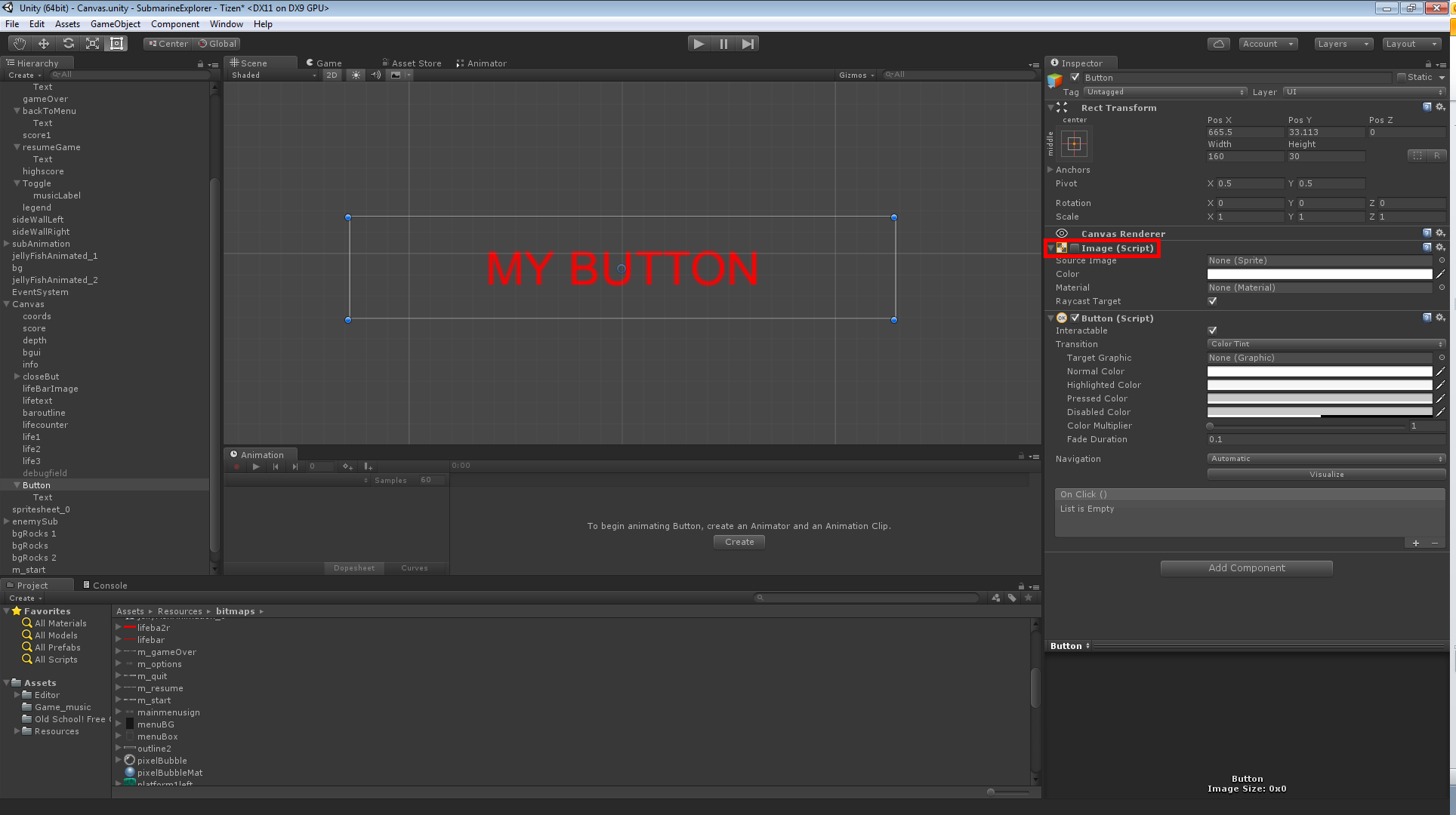
Figure 3 – turning off the button graphic in Unity3D
To indicate the players’ high score in our main menu we have used a typical Unity3D UI Text component (fig.4). You create one by selecting from the upper Unity3D menu GameObject -> UI -> Text.
Then in the Unity3D Inspector window you can change various details of the Text component. You can of course choose a font for the Text component. You can set its style, size and line spacing. You can also specify if the field can support Rich text, which means the possibility of using colors and emoticons from the Unity3D editor.
As for the paragraph options you can align the text in the bounding box to left, right or center it. There is also a possibility of aligning by geometry. This method uses the geometry of the glyphs itself, not the metrics. You can also specify the horizontal overflow of the text to wrap or overflow. The first one will move the text to the next line when it reaches the end of the bounding box, while the last one will let the text go out of the bounding box. Vertical overflow does the same but vertically. Selecting truncate will hide the text and prevent from going out the bounding box and overflow will let the text go out if it won’t fit in. The last option in the paragraph section is best fit. Best fit lets you specify the minimum and maximum font size and between these two values it will try to fit the glyphs in the bounding box.
The last options in the Text component are Color, which is quite self-explanatory and Material, which gives you the possibility to attach a shader to the text. We have also raycast target. This option tells Unity3D if it will be possible to use this text component in the process of raycasting. More about raycasting can be found in dedicated Unity tutorials section.

Figure 4 – Unity3D UI Text component
It is also worth noting that our Text component is being updated with the current high score. We have achieved that by attaching a C# script file with the following code:
[…]

    void getHighScore()
    {
        var currentHiScore = PlayerPrefs.GetInt("highscore");
        var highscoreText = highscore.GetComponent<Text>();
            highscoreText.text = "HIGHSCORE\n<color=yellow>" + currentHiScore + " pts</color>";
    }

[…]
What this code does is create the getHighScore() function. Inside the function in the first line we create a currentHiScore variable which reads from the player preferences object the last known high score. Then in the highscoreText variable we store the reference to the highscore Text component. And then we set its text value to show the high score stored in the currentHiScore variable. As you can see we have used also a special color tag and a new line break – \n. This lets us easier control the appearance of the text directly from the code.
The last type of element which is used in our Unity3D simple game menu is the UI Image Component. The principal of working with it is the same as working with the Image (script) from the earlier described UI Button component with bitmap (fig.2). So basically you just drag from the asset window the graphic to the Source Image slot. Then you click the Set Native Size button. After that you tick the Preserve Aspect check box. Finally, you can scale and position your UI image as you wish.
By using the graphical assets created in an external graphic suite and three UI components and some C# code we were able to achieve a fully functional game menu for the Sub Explorer.
Summary
As you see by utilizing only few Unity3D UI components we have created a simple game menu for a Tizen game. First we have showed how to create bitmap based buttons, then text based buttons and we made an overview of their options. Finally we showed how to create a UI Text component which can be used to show high score stored in the player preferences of a Unity3D based application. As for the assets for your own menus, please keep in mind that you need an external graphic editor in order to create bitmaps for them. We hope that this article will be helpful in making your own main menu UIs for your Tizen games.
Was this document helpful?
We value your feedback. Please let us know what you think.