Navigation Views on a Circular Type Wearable Device
PUBLISHED
You can choose to use one of the four navigation views to design your app pages: Vertical, horizontal, anchored, and freeform views.
 |
 |
 |
 |
| Vertical view | Horizontal view | Anchored view | Freeform view |
Vertical View
The following are examples of screen types that you can refer to when designing vertical navigation views.
List Type
The list type screen is well suited for a list of text-focused information. Each item in the list usually comes with subscreens. A list type screen can provide a good overview of the items on a page, and is suitable when quick navigation is required for multiple items. This type of navigation design is presented with a circular scroll bar to indicate which part of the content is currently viewed.

Card Type
The card type screen is ideal for providing information that can be presented on a single card. The card type screen does not allow continuous scrolling of the contents, but users can tap on the card to view the detailed information on a subscreen. As you navigate up or down the screen, the next card or the previous card snaps into the screen.

Body Text Type
The body text type screen is ideal when you present information in a long text format. Users can scroll up or down the screen to read the text. This type of navigation design is presented with a circular scroll bar to indicate which part of the content is currently viewed.

Horizontal View
The following are examples of screen types that you can refer to when designing horizontal navigation views.
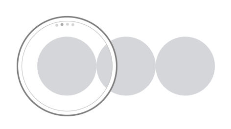
Pages Type
The pages type screen is ideal for presenting multiple cards. As you navigate to the left or right on the screen, the next page or the previous page snaps into the screen.

This type of navigation design has a page indicator at the top of the screen to indicate how many pages are available and which page is currently viewed.
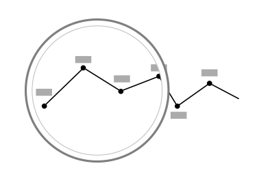
Continuous Type
The continuous type screen is ideal when you present information that is closely related to time-oriented progress, such as a trend graph, or a progress report. Users can scroll to the right or left on the screen to follow or track back the flow of information. This type of navigation design is presented with a circular scroll bar to indicate which part of the content is currently viewed.
Anchored View
The following are examples of screen types that you can refer to when designing anchored navigation views.
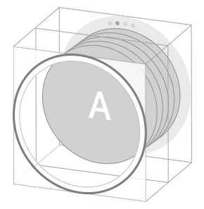
Stack Type
The stack type screen is useful when you design your app pages to display multiple cards with shallow depth of information. This type of navigation design has a page indicator at the top of the screen to indicate how many pages are available, and which page is currently viewed.
Dial Type
By displaying an index-type indicator around the screen, the dial type screen provides a simple and easy way to select and display specific information. When users rotate the bezel on a circular type wearable device, the indicator moves around the screen changing the selections, and the information corresponding to the selection is automatically displayed.

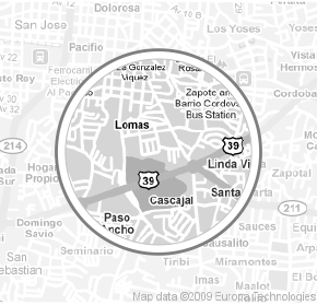
Freeform View
The freeform view screen is ideal when you need to display large content, such as maps, through the circular screen.

Temporary Views
Temporary views are used for the context screen design to allow users to carry out simple tasks, or to take subsequent actions to the currently viewed content or notification.
Examples of temporary view screen designs include 'More' menu, pop-ups, pickers, and user control menus where value change or adjustment is allowed for users.