Toolbar
PUBLISHED

Dependencies
- Tizen 2.4 and Higher for Mobile
Content
Related Info
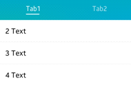
The toolbar UI component has a scrollable list of items which can be selected. Only one item can be selected at a time. For more information, see the Toolbar API.
This feature is supported in mobile applications only.
Basic Usage
To use a toolbar component in your application:
- Add a toolbar with the
elm_toolbar_add()function:Evas_Object *toolbar; toolbar = elm_toolbar_add(parent);
- Configure the toolbar options.
- Append items to the toolbar with
elm_toolbar_item_append()function. The function takes 5 parameters: the pointer of the toolbar, a file path of an icon, a text, a callback function to call when the item is clicked, and the parameter passed to the callback.elm_toolbar_item_append(toolbar, "icon.png", "Tab", _item_selected_cb, NULL);
The following example shows how to add 2 items and define callbacks for when they are clicked:
Elm_Object_Item *home_it; Elm_Object_Item *help_it; home_it = elm_toolbar_item_append(toolbar, "home", "Home", _home_item_pressed_cb, NULL); help_it = elm_toolbar_item_append(toolbar, "help", "Help", _help_item_pressed_cb, NULL); static void _home_item_pressed_cb(void *data, Evas_Object *obj, void *event_info) { dlog_print(DLOG_INFO, LOG_TAG, "Home item clicked \n"); } static void _help_item_pressed_cb(void *data, Evas_Object *obj, void *event_info) { dlog_print(DLOG_INFO, LOG_TAG, "Help item clicked \n"); } - Set the toolbar as the content of a container component. A toolbar is usually used to show a menu inside a naviframe.
- Register the callback functions.
The following example shows how to define and register a callback for the
clickedsignal:evas_object_smart_callback_add(toolbar, "clicked", clicked_cb, data); /* Callback for the "clicked" signal */ /* Called when a toolbar item is double-clicked and selected */ void clicked_cb(void *data, Evas_Object *obj, void *event_info) { Elm_Toolbar_Item * item = event_info; dlog_print(DLOG_INFO, LOG_TAG, "Item clicked\n"); }
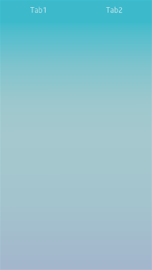
The following example shows a simple use case of the toolbar component.
Example: Toolbar use case
|
|
Evas_Object *win; Evas_Object *conf; Evas_Object *nf; Evas_Object *tb; Elm_Object_Item *nf_it; /* Starting right after the basic EFL UI layout code */ /* win - conformant - naviframe */ /* Add a toolbar */ tb = elm_toolbar_add(nf); evas_object_show(tb); /* Configure the toolbar */ elm_toolbar_shrink_mode_set(tb, ELM_TOOLBAR_SHRINK_EXPAND); elm_toolbar_transverse_expanded_set(tb, EINA_TRUE); /* Append items */ elm_toolbar_item_append(tb, NULL, "Tab1", NULL, NULL); elm_toolbar_item_append(tb, NULL, "Tab2", NULL, NULL); /* Set the toolbar as a part of the naviframe item */ nf_it = elm_naviframe_item_push(nf, "Test", NULL, NULL, NULL, "tabbar/notitle"); elm_object_item_part_content_set(nf_it, "tabbar", tb); |
Options
You can set the shrink and select mode of the toolbar, and set the items to be displayed homogeneously. You can also define a state for the toolbar item.
Shrink Mode
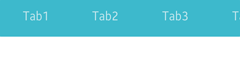
The toolbar offers the following options for shrinking its content:
ELM_TOOLBAR_SHRINK_NONE: Set a minimum size to the toolbar so that all of them fit without scrolling.ELM_TOOLBAR_SHRINK_HIDE: Hide excess items that do not fit.ELM_TOOLBAR_SHRINK_SCROLL: Scroll to show the items that do not fit.ELM_TOOLBAR_SHRINK_MENU: Insert a button to pop up a menu with hidden items.ELM_TOOLBAR_SHRINK_EXPAND: Expand all items according to the size of the toolbar.
To set the shrinking mode:
elm_toolbar_shrink_mode_set(toolbar, ELM_TOOLBAR_SHRINK_EXPAND);
The following examples illustrate the shrink modes.
Table: Shrink mode example
| Mode | Example |
|---|---|
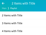
ELM_TOOLBAR_SHRINK_EXPAND |
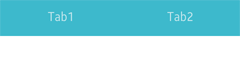 |
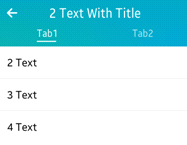
ELM_TOOLBAR_SHRINK_SCROLL |
 |
Select Mode
The following select modes are available:
ELM_OBJECT_SELECT_MODE_DEFAULTELM_OBJECT_SELECT_MODE_ALWAYSELM_OBJECT_SELECT_MODE_NONEELM_OBJECT_SELECT_MODE_DISPLAY_ONLY
To set a select mode:
elm_toolbar_select_mode_set(toolbar, ELM_OBJECT_SELECT_MODE_ALWAYS);
Homogeneous
A toolbar displays items homogeneously by default, with long label items occupying a lot of space.
To avoid that, disable the homogeneous mode:
elm_toolbar_homogeneous_set(toolbar, EINA_FALSE);
Item State
You can define 2 or more states for an item. Each state has its own icon, label, and function to call when an item is clicked.
To create 2 states for an item with the same icon but 2 different labels:
Elm_Object_Item *it;
it = elm_toolbar_item_append(toolbar, NULL, "Tab1", NULL, NULL);

elm_toolbar_item_state_add(it, "icon.png", "State 1", _item_pressed_cb, NULL);
elm_toolbar_item_state_add(it, "icon.png", "State 2", _item_pressed_cb, NULL);
You can cycle through the item states to set the state you want:
elm_toolbar_item_state_set(it, elm_toolbar_item_state_next(it));
Styles
To set the style to navigationbar:
elm_object_style_set(toolbar, "navigationbar");
The following table lists the available component styles.
Table: Toolbar styles
| Style | Sample | Text part | Swallow part | Notes |
|---|---|---|---|---|
elm/toolbar/base/default |
 |
N/A | N/A | N/A |
elm/toolbar/base/navigationbar |
 |
N/A | N/A | N/A |
elm/toolbar/base/tabbar_with_title |
 |
N/A | N/A | N/A |
elm/toolbar/item/tabbar
|
– | elm.text |
elm.swallow.icon |
This style is for the toolbar’s item. Use the elm_toolbar_item_append() function to set the text and the icon. |
elm/toolbar/item/navigationbar |
– | elm.text |
N/A | This style is for the toolbar’s item. Use the elm_toolbar_item_append() function to set the text and the icon. |
Callbacks
You can register callback functions connected to the following signals for a toolbar object.
Table: Toolbar callback signals
| Signal | Description | event_info |
|---|---|---|
clicked |
The toolbar item is double-clicked and selected. | Elm_Toolbar_Item |
clicked,double |
The toolbar item is double-clicked. | Elm_Toolbar_Item |
longpressed |
The toolbar is pressed for a certain amount of time. | Elm_Toolbar_Item |
language,changed |
The program language changes. | – |
item,focused |
The item is highlighted. | Elm_Toolbar_Item |
item,unfocused |
The highlight is removed from the item. | Elm_Toolbar_Item |
scroll |
The toolbar scrolls. | NULL |
scroll,anim,start |
The toolbar scrolling animation starts. | NULL |
scroll,anim,stop |
The toolbar scrolling animation stops | NULL |
scroll,drag,start |
The user starts dragging the toolbar. | NULL |
scroll,drag,stop |
The user stops dragging the toolbar. | NULL |
Was this document helpful?
We value your feedback. Please let us know what you think.