TextLabel
PUBLISHED


Dependencies
- Tizen 2.4 and Higher for Mobile
- Tizen 3.0 and Higher for Wearable
Content
Related Info
The Dali::Toolkit::TextLabel class provides a control that renders a short text string. The text labels are lightweight, non-editable, and do not respond to user input.
Figure: TextLabel
In this tutorial, the following subjects are covered:
Creating a TextLabel
The following example shows how to create a TextLabel instance:
TextLabel label = TextLabel::New();
label.SetProperty( TextLabel::Property::TEXT, "Hello World" );
Stage::GetCurrent().Add( label );
Selecting Fonts
By default, the TextLabel automatically selects a suitable font from the platform. Note that the selected font may not support all characters in your input text. For example, Latin fonts often do not provide Arabic glyphs.
Alternatively, you can request a font using the FONT_FAMILY, FONT_STYLE, and POINT_SIZE properties:
label.SetProperty( TextLabel::Property::FONT_FAMILY, "HelveticaNue" );
label.SetProperty( TextLabel::Property::FONT_STYLE, "Regular" );
label.SetProperty( TextLabel::Property::POINT_SIZE, 12.0f );
The TextLabel falls back to using the default font if the requested font does not support the required scripts.
Aligning Text
Wrapping can be enabled using the MULTI_LINE property:
label.SetProperty( TextLabel::Property::MULTI_LINE, true );
The text can be aligned horizontally to the beginning, end, or center of the available area:
// "CENTER" or "END"
label.SetProperty( TextLabel::Property::HORIZONTAL_ALIGNMENT, "BEGIN" );
Managing the Layout
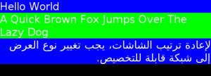
There are several resize policies commonly used with TextLabels. The following examples show the actual size by setting a colored background, whilst the black area represents the size of the parent control.
Natural Size Policy
In its natural size, the TextLabel is large enough to display the text without wrapping, and does not have extra space to align the text within. In the following example, the same result is displayed regardless of the alignment or multi-line properties:
TextLabel label = TextLabel::New( "Hello World" );
label.SetAnchorPoint( AnchorPoint::TOP_LEFT );
label.SetResizePolicy( ResizePolicy::USE_NATURAL_SIZE, Dimension::ALL_DIMENSIONS );
label.SetBackgroundColor( Color::BLUE );
Stage::GetCurrent().Add( label );
Height-for-width Policy
To lay out text labels vertically, a fixed (maximum) width must be provided by the parent control. Each TextLabel reports the desired height for the given width. The following example uses TableView as the parent:
TableView parent = TableView::New( 3, 1 );
parent.SetResizePolicy( ResizePolicy::FILL_TO_PARENT, Dimension::WIDTH );
parent.SetResizePolicy( ResizePolicy::USE_NATURAL_SIZE, Dimension::HEIGHT );
parent.SetAnchorPoint( AnchorPoint::TOP_LEFT );

Stage::GetCurrent().Add( parent );

TextLabel label = TextLabel::New( "Hello World" );
label.SetAnchorPoint( AnchorPoint::TOP_LEFT );
label.SetResizePolicy( ResizePolicy::FILL_TO_PARENT, Dimension::WIDTH );
label.SetResizePolicy( ResizePolicy::DIMENSION_DEPENDENCY, Dimension::HEIGHT );
label.SetBackgroundColor( Color::BLUE );

parent.AddChild( label, TableView::CellPosition( 0, 0 ) );
parent.SetFitHeight( 0 );

label = TextLabel::New( "A Quick Brown Fox Jumps Over The Lazy Dog" );
label.SetAnchorPoint( AnchorPoint::TOP_LEFT );
label.SetResizePolicy( ResizePolicy::FILL_TO_PARENT, Dimension::WIDTH );
label.SetResizePolicy( ResizePolicy::DIMENSION_DEPENDENCY, Dimension::HEIGHT );
label.SetBackgroundColor( Color::GREEN );
label.SetProperty( TextLabel::Property::MULTI_LINE, true );

parent.AddChild( label, TableView::CellPosition( 1, 0 ) );
parent.SetFitHeight( 1 );

label = TextLabel::New( "لإعادة ترتيب الشاشات، يجب تغيير نوع العرض إلى شبكة قابلة للتخصيص" );
label.SetAnchorPoint( AnchorPoint::TOP_LEFT );
label.SetResizePolicy( ResizePolicy::FILL_TO_PARENT, Dimension::WIDTH );
label.SetResizePolicy( ResizePolicy::DIMENSION_DEPENDENCY, Dimension::HEIGHT );
label.SetBackgroundColor( Color::BLUE );
label.SetProperty( TextLabel::Property::MULTI_LINE, true );

parent.AddChild( label, TableView::CellPosition( 2, 0 ) );
parent.SetFitHeight( 2 );
In the example, the “Hello World” text label has been given the full width, not the natural width.
TextLabel Properties
Using Decorations
For text decorations, TextLabel provides several properties. All properties are writable and none are animatable.
Table: TextLabel properties
| Property | Type | Description |
|---|---|---|
TEXT |
STRING | The text to display in UTF-8 format |
FONT_FAMILY |
STRING | The requested font family |
FONT_STYLE |
STRING or MAP | The requested font style |
POINT_SIZE |
FLOAT | The size of font in points |
MULTI_LINE |
BOOLEAN | The single-line or multi-line layout option |
HORIZONTAL_ALIGNMENT |
STRING | The line horizontal alignment |
VERTICAL_ALIGNMENT |
STRING | The line vertical alignment |
ENABLE_MARKUP |
BOOLEAN | Whether the mark-up processing is enabled |
ENABLE_AUTO_SCROLL |
BOOLEAN | Starts or stops auto scrolling |
AUTO_SCROLL_SPEED |
INTEGER | Sets the speed of scrolling in pixels per second |
AUTO_SCROLL_LOOP_COUNT |
INTEGER | Number of complete loops when scrolling enabled |
AUTO_SCROLL_GAP |
INTEGER | Gap before scrolling wraps |
LINE_SPACING |
FLOAT | The default extra space between lines in points |
UNDERLINE |
MAP | The default underline parameters |
SHADOW |
MAP | The default shadow parameters |
EMBOSS |
MAP | The default emboss parameters |
OUTLINE |
MAP | The default outline parameters |
PIXEL_SIZE |
FLOAT | The size of font in pixels |
ELLIPSIS |
BOOLEAN | Whether we should show the ellipsis if it is required |
AUTO_SCROLL_LOOP_DELAY |
FLOAT | The amount of time to delay the starting time of auto scrolling and further loops |
AUTO_SCROLL_STOP_MODE |
INTEGER or STRING | The auto scrolling stop behavior |
LINE_COUNT |
INTEGER | The line count of text |
LINE_WRAP_MODE |
INTEGER or STRING | Line wrap mode when text lines are greater than the layout width |
TEXT_COLOR |
VECTOR4 | The color of the text |
TEXT_COLOR_RED |
FLOAT | The red component of the text color |
TEXT_COLOR_GREEN |
FLOAT | The green component of the text color |
TEXT_COLOR_BLUE |
FLOAT | The blue component of the text color |
TEXT_COLOR_ALPHA |
FLOAT | The alpha component of the text color |
Color
To change the color of the text, use the TEXT_COLOR property. Unlike the Actor::COLOR property, this does not affect child actors added to the TextLabel.
label.SetProperty( TextLabel::Property::TEXT, "Red Text" );
label.SetProperty( TextLabel::Property::TEXT_COLOR, Color::RED );
Drop Shadow
To add a drop shadow and put a color to the text, set the SHADOW property with a non-zero values.
stage.SetBackgroundColor( Color::BLUE );
label1.SetProperty( TextLabel::Property::TEXT, "Plain Text" );
label2.SetProperty( TextLabel::Property::TEXT, "Text with Shadow" );
Property::Map shadowMap2;
shadowMap2.Insert( "offset", Vector2( 1.0f, 1.0f ) );
shadowMap2.Insert( "color", Color::BLACK );
label2.SetProperty( TextLabel::Property::SHADOW, shadowMap2 );

label3.SetProperty( TextLabel::Property::TEXT, "Text with Bigger Shadow" );
Property::Map shadowMap3;
shadowMap3.Insert( "offset", Vector2( 2.0f, 2.0f ) );
shadowMap3.Insert( "color", Color::BLACK );
label3.SetProperty( TextLabel::Property::SHADOW, shadowMap3 );

label4.SetProperty( TextLabel::Property::TEXT, "Text with Color Shadow" );
Property::Map shadowMap4;
shadowMap4.Insert( "offset", Vector2( 1.0f, 1.0f ) );
shadowMap4.Insert( "color", Color::RED );
shadowMap4.Insert( "blurRadius", 2.0f );
label4.SetProperty( TextLabel::Property::SHADOW, shadowMap4 );
Underlining
The text can be underlined by setting the UNDERLINE property. By default, the underline height is based on the font metrics. This can be overridden using ‘UNDERLINE’ property, too.
label1.SetProperty( TextLabel::Property::TEXT, "Text with Underline" );
Property::Map underlineMap;
underlineMap.Insert( "enable", "true" );
label1.SetProperty( TextLabel::Property::UNDERLINE, underlineMap );

label2.SetProperty( TextLabel::Property::TEXT, "Text with Color Underline" );
Property::Map underlineMap2;
underlineMap2.Insert( "enable", "true" );
underlineMap2.Insert( "color", "green" );
underlineMap2.Insert( "height", "1" );
label2.SetProperty( TextLabel::Property::UNDERLINE, underlineMap2 );
Was this document helpful?
We value your feedback. Please let us know what you think.