Grouped Row Table
PUBLISHED
Grouped Rows Form
Overview
TableForm HTML Page
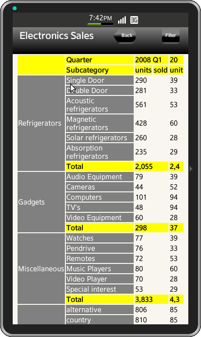
Grouped Rows is an appplication to display the product sale transport. In this form, buttons in header is customised. Table is created along with all the categories and sub-categories of the fields and the amount of units that were sold in the product sale.
TableForm Header
In this Application header, table with one row and three columns is used to place header buttons and a title to align horizontally, style has been defined and applied to buttons and title as shown below
<div id="ui-table-header" data-role="header" data-position="fixed">
  <table>
    <tbody>
      <tr>
        <td style="width:25%" ><a id="ui-back-button" data-role="button">Back</a></td>
        <td style="width:50%"><span class="ui-hdr-title-text">Product Sales Transport</span></td>
        <td style="width: 25%" ><a id="ui-filter-button" data-role="button">Filter</a></td>
      </tr>
    </tbody>
  </table>
</div>
TableForm Content
To create the table view as shown in attached screenshot, a table is used with nine rows, four columns merged accordingly. To create the title for rows as shown in the screenshot use colspan and rowspan for merging rows and columns to form one entity
<table class="ui-tableBorder">
  <tr class="ui-table-row">
    <td style="width: 20%" rowspan="2"></td>
    <td>Quater</td>
    <td colspan="2">2008 Q1 </td>
    <td>20</td>
  </tr>
  <tr class="ui-table-row">
    <td>Subcategory </td>
    <td>units </td>
    <td>sold </td>
    <td>unit </td>
  </tr>
  <tr>
    <td rowspan="7" class="ui-table-row1">Books</td>
    <td class="ui-table-row1">Arts & architecture</td>
    <td colspan="2">39</td>
  </tr>
</table>
Grouped rows-Table Form CSS File
The css for Grouped rows-table application is shown below
Header Style
The css for header text, button and customized button with triangle edge as shown below
#ui-table-header{
	background-image: -webkit-linear-gradient(top, grey 0%, #000 100%);
}
#ui-back-button {
	position: relative;
	width: 40%;
	border: 0px;
	border-right: none;
	background:-webkit-linear-gradient(grey, grey 43%, black 63%, black);
	cursor: pointer;
	font-size: 10px;
	font-weight:bold;
	color:white;
	text-align: center;
	left:35px;
	vertical-align: middle;
	text-overflow:ellipsis;
	border-top-right-radius: 10px;
	border-bottom-right-radius: 10px;
	border-top-left-radius: 0px;
	border-bottom-left-radius: 0px;
	box-shadow: 0 4px 2px -2px grey;
}
#ui-back-button:before {
	position: absolute;
	top: 6px;
	left: -12px;
	width: 20px;
	height: 17px;
	-webkit-transform: rotate(-44deg) skewX(-10deg) skewY(-10deg);
	background: -webkit-linear-gradient(-136deg, grey, grey 40%, black 63%, black);
	content: '';
	z-index: 0;
}
#ui-filter-button {
	position: relative;
	width: 40%;
	border: 0px;
	border-right: none;
	background:-webkit-linear-gradient(grey, grey 43%, black 63%, black);
	cursor: pointer;
	font-size: 10px;
	font-weight:bold;
	color:white;
	text-align: center;
	left:35px;
	vertical-align: middle;
	text-overflow:ellipsis;
	border-top-right-radius: 10px;
	border-bottom-right-radius: 10px;
	border-top-left-radius: 0px;
	border-bottom-left-radius: 0px;
	box-shadow: 0 4px 2px -2px grey;
}
.ui-hdr-title-text {
	text-align: center;
	vertical-align: middle;
	font-size: 20px;
	font-weight: bold;
	color: white;
}
Content Table Style
Following css has been defined for table border, title and column, applying background to the specific rows and merging rows and columns
table {
	width: 100%;
	height: 100%;
}
td{
	font-size: 15px;
}
.ui-table-border {
	border: 1px solid black;
	border-collapse: collapse;
	width: 100%;
}
.ui-table-row{
	background: yellow;
	font-size: 15px;
	font-weight: bold;
}
.ui-table-row1{
	background: grey;
	border-style:none;
	font-size: 15px;
	color: white;

}
.ui-table-border-color{
	border-right-width:1px;
  border-right-style:solid;
  border-right-color:black;
}
Screenshots
Below is the screenshot of the table View