Gestures
PUBLISHED
The following are the basic actions used for navigating the Tizen wearable UI. When designing the apps, note that these basic system actions are reserved for the system and cannot be used for any other interactions.
Tap
Users can tap the elements on the current screen (for example, lists and pop-ups) to move from one screen to another, open a new screen for more details, and proceed with tasks.
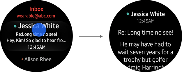
Tapping on the screen
Tapping is also used to make selections on lists containing radio buttons or checkboxes.
Tapping a radio button
Tapping a checkbox
Two-finger Double Tap
On rectangular and square type wearable devices, a two-finger double tap displays the control panel. On a circular type wearable device, however, this interaction is not supported.
Tapping on the screen
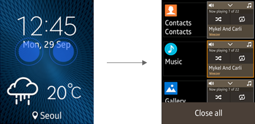
Two-finger Double Touch and Hold
On rectangular and square type wearable devices, a two-finger double touch and hold displays the recent apps screen. On a circular type wearable device, however, this interaction is not supported.
Two-finger double touch and hold
Bezel Swipe Down (Back)
Users can swipe downwards from the top edge of the screen to return to the previous step or screen.
When designing any additional interactions for your app, be careful not to include interactions that conflict with this basic interaction (for example, interactions for swiping downwards from the header).
'Back' interaction
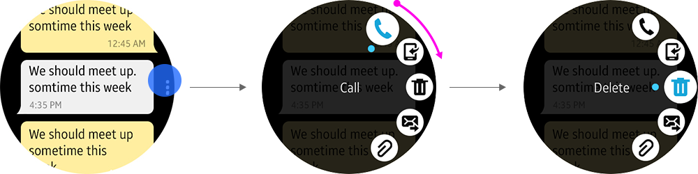
Touch and Hold (Contextual Menu / Select Menu)
On rectangular and square type wearable devices, users can touch and hold an item to view additional options or contextual menu. Once the option menu is displayed, users can tap each option to perform a task.
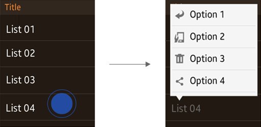
Touch and hold
On a circular type wearable device, users can touch and hold an item to enter the Select menu. The Select menu enables users to select or deselect multiple items at once. When users select one or more items in the list, the number of items selected appears in a button at the top, and a visual cue is displayed on the right edge of the screen.
Users can tap the button at the top to view the 'Select all'/'Deselect all' menu.
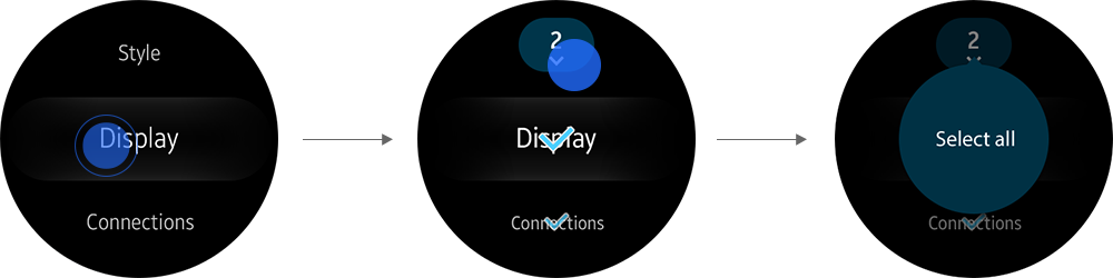
Accessing Select menu on a circular type wearable device
Swipe (Page Navigation)
Users can swipe to the left or right from the Watch Face to move to other Home components, such as the Widget Board and Rich Notification Board. Swiping is also one of the major interactions inside apps composed of full screen sections and pages.
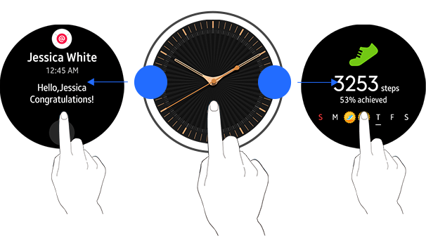
Navigation via swiping
Rotary Action for Circular Type Wearable Devices
The rotating bezel on a circular type wearable device works as a physical input device. Depending on the design of the apps, it may be used to navigate across pages horizontally, scroll up and down on a page, or to increase or decrease setting values.
On a circular type wearable device, both the touch input and rotary action can be used for navigation. Refer to Navigation Views to decide which type of input option is available for your app design.
The following are general rules and guidelines to avoid conflicting interactions when you design your Apps.
- Allow the rotary action to control navigation on all pages.
- Design the app’s navigation to be either horizontal or vertical, and avoid navigations in both directions.
- If your app requires navigation in both directions, use the rotary action for the primary navigation and the touch input for the secondary navigation.
- Avoid user interface flows that require frequent switching between the rotary action and touch input.
- The rotary action may be used for primary navigations in horizontal, vertical, or circular directions depending on the design of your app.
- On each screen, do not place more than one element that is controlled by the rotary action. If an additional element must be provided, allow users to tap the element to enter a separate screen to control it with the rotary action
Vertical Scrolling of List Items (Vertical View)
If your app page needs to contain multiple items, list the items vertically and design your app to use both the touch input and rotary action to scroll the list items.
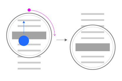
Vertically scrolling list items with touch input and the rotary action
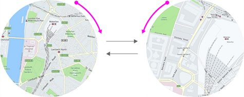
Navigating across Cards (Horizontal View)
If your app has multiple cards or pages, you can design your app to take both the touch input and rotary action to navigate through cards in your app.
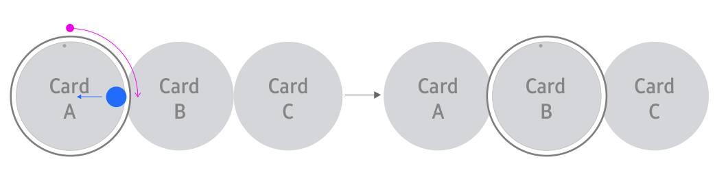
Navigating through cards with touch input and the rotary action
UI Component for App-specific Features (Anchored View)
A circular type wearable device provides circular menus on the screen that can transform long lists into a simple index to increase the ease of use. Index screens designed in the anchored view can only use the rotary action for navigation.
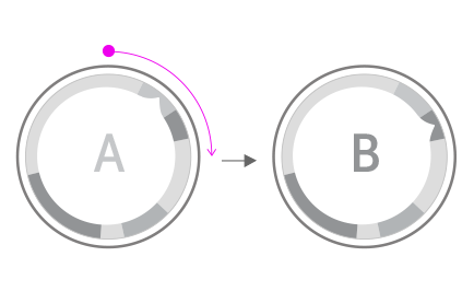
Accessing an index with the rotary action
The rotary action changes the indicator position and shifts the focus onto another indexed item.
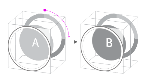
Zoom In and Zoom Out (Freeform View)
You can develop an app that uses the rotary action to zoom in or zoom out from images on the screen. Rotation has always been an action required to zoom in or zoom out the images or views in cameras or binoculars, so users will feel comfortable using this feature.
Zoom in and zoom out using the rotary action
Other Controls by the Rotary Action
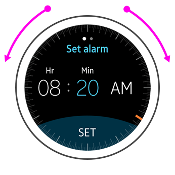
Changing Setting Values
If your app has setting pages or menus, you can design your app to accept the rotary action to increase or decrease setting values.
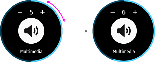
Adjusting volume with the rotary action
Navigating through the 'More menu' Items
If a page in your app contains the 'More' menu page, you can allow users tap the visual cue to open it and navigate through the items with the rotary action.
Navigating through More menu items with the rotary action.