Tizen Advanced UI Framework Guide for Mobile - Part 2
PUBLISHED
Introduction
The Tizen Advanced UI Framework allow creating and managing various kinds of UI components. The components represent a visual UI element, such as a button or slider, which gives you interaction and manipulation features.
This is the 2nd part of a two part article.
In this document, User Input Components are discussed.
User Input Components
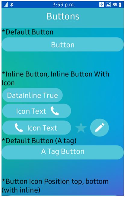
a. Button
The button component shows on screen a control that can be used to generate an action event when it is pressed and released.
The component is coded with standard HTML anchor and input elements.
*Default Button
<button>Button</button>
<br/><br/>
*Inline Button, Inline Button With Icon <br/>
<button data-inline="true">DataInline True</button>
<button data-inline="true" data-icon="call" data-iconpos="right">Icon  Text</button>
<button data-inline="true" data-icon="call" data-iconpos="left">Icon Text</button>
<button data-inline="true" data-icon="star" data-style="nobg"></button>
<button data-inline="true" data-icon="rename" data-style="circle"></button><br/>
*Default Button (A tag)
<a href="#buttonTest" class="ui-btn">A Tag Button</a>
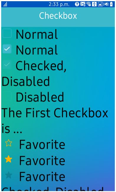
b. Check Box
The checkbox component shows on screen a list of options where 1 or more can be selected. To add a checkbox component to the application, use the following code:
<input type="checkbox" name="checkbox-1" id="checkbox-1"/>
<label for="checkbox-1">Normal</label><br>

<input type="checkbox" name="checkbox-2" id="checkbox-2" checked="checked"/>
<label for="checkbox-2">Normal</label><br>

<input type="checkbox" name="checkbox-3" id="checkbox-3" checked="checked" disabled="disabled" />
<label for="checkbox-3">Checked, Disabled</label><br>

<input type="checkbox" name="checkbox-4" id="checkbox-4" disabled="disabled" />
<label for="checkbox-4">Disabled</label><br>

<div class="checkbox-result">The First Checkbox is ...</div>
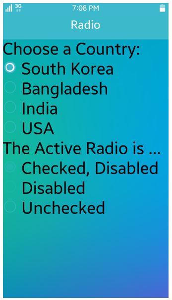
c. Radio Button
The radio button component shows a list of options on the screen where only 1 option can be selected. To add a radio button component, use the following code:
<div>Choose a Country: < /div>
<div class="choosepet" >
<input type="radio" name="radio-choice" id="South Korea" value="choice-1" checked="checked" />
<label for="South Korea">South Korea </label><br>

<input type="radio" name="radio-choice" id="Bangladesh" value="choice-2" />
<label for="Bangladesh">Bangladesh </label><br>

<input type="radio" name="radio-choice" id="India" value="choice-3" />
<label for="India">India</label><br>

<input type="radio" name="radio-choice" id="USA" value="choice-4" />
<label for="USA">USA</label>
</div>
<div class="radio-result">The Active Radio is ... </div>
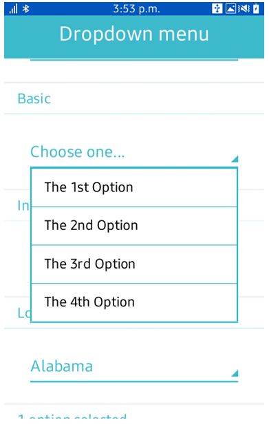
d. Dropdown
This dropdown component allows creating a component in the form of drop-down list and managing its operation.
<li class="ui-group-index" > Basic < /li>
<li class="ui-li-static" >
	<select name="select-custom-1" id="select-custom-1" data-native-menu="false" >
		<option value="choose-one" data-placeholder="true">Choose one... < /option>
		 <option value="1">The 1st Option < /option>
		 <option value="2">The 2nd Option < /option>
		<option value="3" >The 3rd Option < /option>
		 <option value="4">The 4th Option < /option>
	< /select >
< /li >
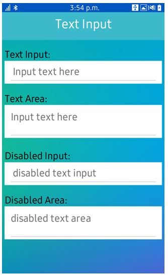
e. Text Input
Text input allows user to write text.
<div class="textinput-box" >
            <label for="texttype">Text Input: < /label >
            <input type="text" name="texttype" id="texttype" placeholder="Input text here" data-clear-btn="true"/ >
        < /div>
       <div class="textinput-box" >
            <label for="texttype2" > Disabled Input: < /label>
            <input type="text" name="texttype2" id="texttype2" placeholder="disabled text input" disabled="disabled"/ >
        < /div >
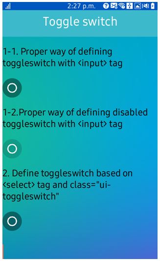
f. Toggle
The toggle switch component shows on screen a 2-state switch. It is used as 2-state switch for on/off or true/false data input. To identify individual toggle Unique ID and name is used.
<p>1-1. Proper way of defining toggleswitch with <input> tag < /p>
<input type="checkbox" name="toggle-1" id="toggle-1" class="ui-toggleswitch"/ >

<p>1-2.Proper way of defining disabled toggleswitch with <input> tag < /p>
<input type="checkbox" name="toggle-2" id="toggle-2" class="ui-toggleswitch" disabled/ >

<p>2. Define toggleswitch based on <select> tag and class="ui-toggleswitch" < /p>
<select name="flip-1" id="flip-1" class="ui-toggleswitch" >
	< option value="off" > < /option>
	< option value="on" > < /option>
< /select>
Reference:
[1] https://developer.tizen.org/dev-guide/2.4/org.tizen.ui.practices/html/web/tau/guides_tau_w.htm