FlexContainer
PUBLISHED


Dependencies
- Tizen 3.0 and Higher for Mobile
- Tizen 3.0 and Higher for Wearable
Content
Related Info
The Dali::Toolkit::FlexContainer class provides a control that implements a subset of the CSS Flexible Box Layout Module Level 1 specification (defined by W3C).
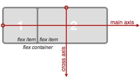
The flexible box (flexbox) is a CSS3 Web layout model, which allows responsive elements within a container, automatically arranged to different size screens or devices. The following figure illustrates the various directions and terms applied to a flex container with the “flex direction” defined as “row”.
Figure: Flex container terms
In this tutorial, the following subjects are covered:
Creating a Flexbox Layout with FlexContainer
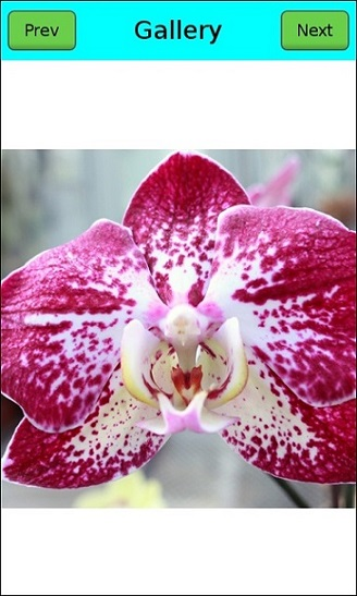
The following basic example shows how to create a gallery-like flexbox layout using the Dali::Toolkit::FlexContainer object.
Figure: Flex container example
- Create a flex container as the whole view and set its resize policy to fill its parent (the stage):
// Create the main flex container
FlexContainer flexContainer = FlexContainer::New();
flexContainer.SetParentOrigin( ParentOrigin::TOP_LEFT );
flexContainer.SetAnchorPoint( AnchorPoint::TOP_LEFT );
flexContainer.SetResizePolicy( ResizePolicy::FILL_TO_PARENT, Dimension::ALL_DIMENSIONS );
// Set the background color to be white
flexContainer.SetBackgroundColor( Color::WHITE );
// Add the container to the stage
Stage::GetCurrent().Add( flexContainer );
- Set the flex direction of the main container to “column” to make the toolbar and the actual content display vertically:
// Display toolbar and content vertically
flexContainer.SetProperty( FlexContainer::Property::FLEX_DIRECTION, FlexContainer::COLUMN );
- Create a new flex container as the toolbar and add it to the main container. Because the flex direction in the main container is column, the toolbar is arranged at the top of the main container.
// Create the toolbar
FlexContainer toolBar = FlexContainer::New();
toolBar.SetParentOrigin( ParentOrigin::TOP_LEFT );
toolBar.SetAnchorPoint( AnchorPoint::TOP_LEFT );
// Set the background color for the toolbar
toolBar.SetBackgroundColor( Color::CYAN );
// Add it to the main container
flexContainer.Add( toolBar );
flexContainer.SetProperty( FlexContainer::Property::FLEX_DIRECTION, FlexContainer::COLUMN );
-
To make the buttons and title display horizontally and be vertically aligned to the center of the toolbar, set the toolbar flex direction to “row” and set its
ALIGN_ITEMSproperty to center. Set theFLEXproperty to make the toolbar and the actual content share the height of the main container, so that the toolbar occupies 10 percent of the whole vertical space and the content occupies the rest of the vertical space.// Display toolbar items horizontally toolBar.SetProperty( FlexContainer::Property::FLEX_DIRECTION, FlexContainer::ROW ); // Align toolbar items vertically center toolBar.SetProperty( FlexContainer::Property::ALIGN_ITEMS, FlexContainer::ALIGN_CENTER ); // 10 percent of available space in the cross axis toolBar.SetProperty( FlexContainer::ChildProperty::FLEX, 0.1f );
- Create a third flex container as the content area to display the image. It is displayed at the bottom of the main container.
Make the item inside the content area container horizontally and vertically centered, so that the image is always at the center of the content area.
// Create the content area
FlexContainer content = FlexContainer::New();
content.SetParentOrigin( ParentOrigin::TOP_LEFT );
content.SetAnchorPoint( AnchorPoint::TOP_LEFT );
// Display items horizontally
content.SetProperty( FlexContainer::Property::FLEX_DIRECTION, FlexContainer::ROW );
// Align items horizontally center
content.SetProperty( FlexContainer::Property::JUSTIFY_CONTENT, FlexContainer::JUSTIFY_CENTER );
// Align items vertically center
content.SetProperty( FlexContainer::Property::ALIGN_ITEMS, FlexContainer::ALIGN_CENTER );
// 90 percent of available space in the cross axis
content.SetProperty( FlexContainer::ChildProperty::FLEX, 0.9f );
// Add it to the main container
flexContainer.Add( content );
- Add items to the toolbar.
The toolbar has 1 button on the left, 1 button on the right, and a title always in the center (regardless of the screen size). To achieve that, make the title flexible so that it automatically takes all the available horizontal space left. To make the layout look nicer, also add some space around the items.
// Add a button to the left of the toolbar
PushButton prevButton = PushButton::New();
prevButton.SetParentOrigin( ParentOrigin::TOP_LEFT );
prevButton.SetAnchorPoint( AnchorPoint::TOP_LEFT );
// Minimum size the button must keep
prevButton.SetMinimumSize( Vector2( 100.0f, 60.0f ) );
// Set 10 pixel margin around the button
prevButton.SetProperty( FlexContainer::ChildProperty::FLEX_MARGIN, Vector4( 10.0f, 10.0f, 10.0f, 10.0f ) );
toolBar.Add( prevButton );
// Set the button text
Property::Map labelMap;
labelMap["text"] = "Prev";
labelMap["textColor"] = Color::BLACK;
prevButton.SetProperty( Button::Property::LABEL, labelMap );
// Add a title to the center of the toolbar
TextLabel title = TextLabel::New( "Gallery" );
title.SetParentOrigin( ParentOrigin::TOP_LEFT );
title.SetAnchorPoint( AnchorPoint::TOP_LEFT );
title.SetResizePolicy( ResizePolicy::USE_NATURAL_SIZE, Dimension::ALL_DIMENSIONS );
title.SetProperty( TextLabel::Property::HORIZONTAL_ALIGNMENT, "CENTER" );
title.SetProperty( TextLabel::Property::VERTICAL_ALIGNMENT, "CENTER" );
// Take all the available space left apart from the 2 buttons
title.SetProperty( FlexContainer::ChildProperty::FLEX, 1.0f );
// Set 10 pixel margin around the title
title.SetProperty( FlexContainer::ChildProperty::FLEX_MARGIN, Vector4( 10.0f, 10.0f, 10.0f, 10.0f ) );
toolBar.Add( title );
// Add a button to the right of the toolbar
PushButton nextButton = PushButton::New();
nextButton.SetParentOrigin( ParentOrigin::TOP_LEFT );
nextButton.SetAnchorPoint( AnchorPoint::TOP_LEFT );
// Minimum size the button must keep
nextButton.SetMinimumSize( Vector2( 100.0f, 60.0f ) );
// Set 10 pixel margin around the button
nextButton.SetProperty( FlexContainer::ChildProperty::FLEX_MARGIN, Vector4( 10.0f, 10.0f, 10.0f, 10.0f ) );
toolBar.Add( nextButton );
// Set the button text
labelMap["text"] = "Next";
nextButton.SetProperty( Button::Property::LABEL, labelMap );
The above settings are very convenient when running the application on different size devices or when changing the screen orientation, because the toolbar expands or shrinks based on the available space and the title is always at the center, keeping the layout of the toolbar the same.
- Add the image to the content area:
// Add an image to the center of the content area
ImageView imageView = ImageView::New( "image.jpg" );
imageView.SetParentOrigin( ParentOrigin::TOP_LEFT );
imageView.SetAnchorPoint( AnchorPoint::TOP_LEFT );
content.Add( imageView );
FlexContainer Properties
You can modify the flex container appearance and behavior through the following properties:
-
CONTENT_DIRECTION: This property specifies the primary direction in which content is ordered on a line.Figure: CONTENT_DIRECTION LTR
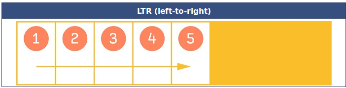
Figure: CONTENT_DIRECTION RTL
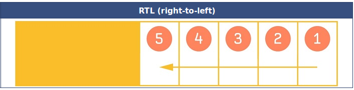
Table: CONTENT_DIRECTION values
Property value Description INHERITInherits the parent’s direction LTRFrom left to right RTLFrom right to left -
FLEX_DIRECTION: This property specifies the direction of the main axis, which determines the direction in which the flex items are laid out.Figure: FLEX_DIRECTION
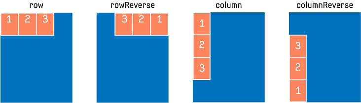
Table: FLEX_DIRECTION values
Property value Description COLUMNFlex items are laid out vertically as a column COLUMN_REVERSEFlex items are laid out vertically as a column, but in a reverse order ROWFlex items are laid out horizontally as a row ROW_REVERSEFlex items are laid out horizontally as a row, but in a reverse order -
FLEX_WRAP: This property specifies whether the flex items must wrap if there is not enough room for them on 1 flex line.Figure: FLEX_WRAP
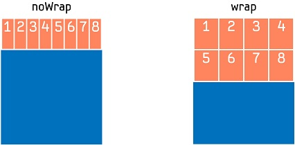
Table: FLEX_WRAP values
Property value Description NO_WRAPFlex items laid out in a single line (shrunk to fit the flex container along the main axis) WRAPFlex items laid out in multiple lines, if needed -
JUSTIFY_CONTENT: This property specifies the alignment of flex items when they do not use all available space on the main axis.Figure: JUSTIFY_CONTENT
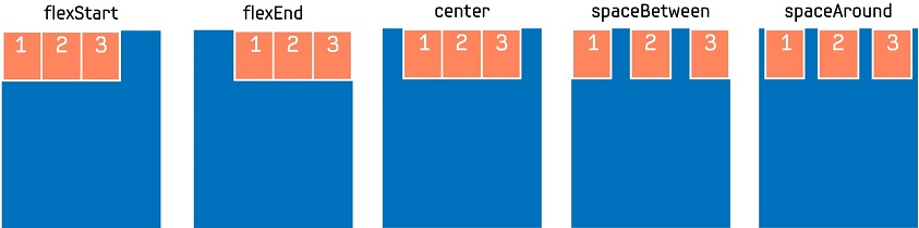
Table: JUSTIFY_CONTENT values
Property value Description JUSTIFY_FLEX_STARTItems are positioned at the beginning of the container JUSTIFY_CENTERItems are positioned at the center of the container JUSTIFY_FLEX_ENDItems are positioned at the end of the container JUSTIFY_SPACE_BETWEENItems are positioned with equal space between the lines JUSTIFY_SPACE_AROUNDItems are positioned with equal space before, between, and after the lines -
ALIGN_ITEMS: This property specifies the alignment of flex items when they do not use all available space on the cross axis.Figure: ALIGN_ITEMS
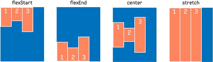
Table: ALIGN_ITEMS values
Property value Description ALIGN_FLEX_STARTItems are aligned at the beginning of the container ALIGN_CENTERItems are aligned at the center of the container ALIGN_FLEX_ENDItems are aligned at the end of the container ALIGN_STRETCHItems are stretched to fit the container -
ALIGN_CONTENT: This property specifies the alignment of flex lines when they do not use all available space on the cross axis, so only works when there are multiple lines.Figure: ALIGN_CONTENT
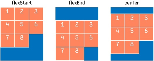
Table: ALIGN_CONTENT values
Property value Description ALIGN_FLEX_STARTItems are aligned at the beginning of the container ALIGN_CENTERItems are aligned at the center of the container ALIGN_FLEX_ENDItems are aligned at the end of the container
FlexItem Properties
The flex item properties are non-animatable properties registered dynamically to each child that is to be added to the flex container, and once added, their values cannot be changed. When an actor is added to the flex container, these properties are checked to decide how to lay out the actor inside the flex container.
-
FLEX: By default, the items in the flex container are not flexible. If set, this property makes the item flexible, which means the item can alter its width and height in order to receive the specified proportion of the free space in the flex container. If all items in the flex container use this pattern, their sizes are proportional to the specified flex factor. Flex items do not shrink below their minimum size (if set using theDali::Actor::SetMinimumSize()function).Figure: FLEX
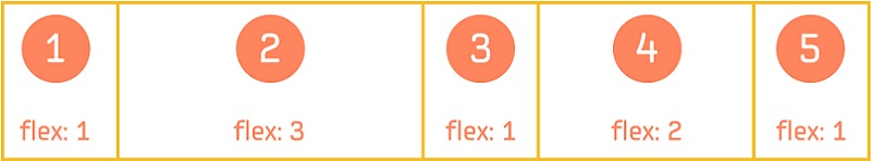
The following example shows how the items achieve the proportion of free space as illustrated in the above figure:
// Create the flex container
FlexContainer flexContainer = FlexContainer::New();
// Set the flex direction to lay out the items horizontally
flexContainer.SetProperty( FlexContainer::Property::FLEX_DIRECTION, FlexContainer::ROW );

// Create flex items and set the proportion
Control item1 = Control::New();
item1.SetProperty( FlexContainer::ChildProperty::FLEX, 1.0f );
flexContainer.Add( item1 );
Control item2 = Control::New();
item2.SetProperty( FlexContainer::ChildProperty::FLEX, 3.0f );
flexContainer.Add( item2 );
Control item3 = Control::New();
item3.SetProperty( FlexContainer::ChildProperty::FLEX, 1.0f );
flexContainer.Add( item3 );
Control item4 = Control::New();
item4.SetProperty( FlexContainer::ChildProperty::FLEX, 2.0f );
flexContainer.Add( item4 );
Control item5 = Control::New();
item5.SetProperty( FlexContainer::ChildProperty::FLEX, 1.0f );
flexContainer.Add( item5 );
-
ALIGN_SELF: This property specifies how the item aligns along the cross axis. If set, this property overrides the default alignment for all items defined by the container’sALIGN_ITEMSproperty.Figure: ALIGN_SELF
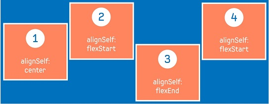
The following example shows how the items achieve the alignment on the cross axis as illustrated in the above figure:
// Create the flex container
FlexContainer flexContainer = FlexContainer::New();
// Set the flex direction to lay out the items horizontally
flexContainer.SetProperty( FlexContainer::Property::FLEX_DIRECTION, FlexContainer::ROW );
// Set the items to be aligned at the beginning of the container
// on the cross axis by default
flexContainer.SetProperty( FlexContainer::Property::ALIGN_ITEMS, FlexContainer::ALIGN_FLEX_START );

// Create flex items and add them to the flex container
Control item1 = Control::New();
// Align item1 at the center of the container
item1.SetProperty( FlexContainer::ChildProperty::ALIGN_SELF, FlexContainer::ALIGN_CENTER );
flexContainer.Add( item1 );
Control item2 = Control::New();
// item2 is aligned at the beginning of the container
flexContainer.Add( item2 );
Control item3 = Control::New();
// Align item3 at the bottom of the container
item3.SetProperty( FlexContainer::ChildProperty::ALIGN_SELF, FlexContainer::ALIGN_FLEX_END );
flexContainer.Add( item3 );
Control item4 = Control::New();
// item4 is aligned at the beginning of the container
flexContainer.Add( item4 );
-
FLEX_MARGIN: Each flex item inside the flex container is treated as a box (in CSS term) that is made up of:- Content: The content of the item
- Padding: The space around the content (inside the border) of the item
- Border: The border that goes around the padding and the content of the item
- Flex margin: The space outside the border
Figure: FLEX_MARGIN
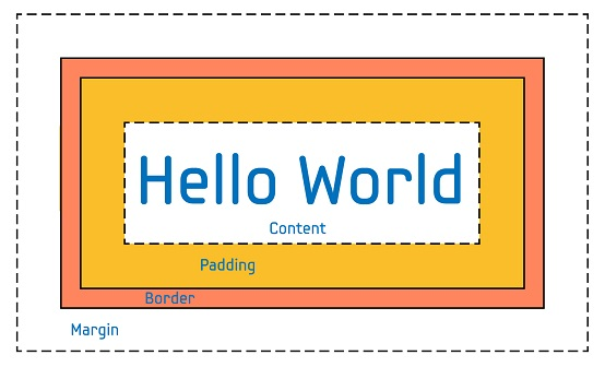
In DALi, the size of the flex item = content size + padding + border. The flex margin specifies the space around the flex item.
The following example shows how to add some space around the items.
// Create the flex container
FlexContainer flexContainer = FlexContainer::New();
// Create flex item
Control item = Control::New();
// Add the margin around the item
item.SetProperty( FlexContainer::ChildProperty::FLEX_MARGIN, Vector4( 10.0f, 10.0f, 10.0f, 10.0f ) );
// Add the item to the container
flexContainer.Add( item );
Was this document helpful?
We value your feedback. Please let us know what you think.