CSS Multi-column Layout Module: Creating Multi-column Layouts
This feature is supported in mobile applications only.
This tutorial demonstrates how you can create a layout with multiple columns in your application.
Warm-up
Become familiar with the CSS Multi-column Layout API basics by learning about:
-
Creating a Basic Layout
Build a basic graphic user interface (GUI) that uses the CSS column properties.
Follow-up
Once we have learned the basics of CSS Multi-column Layout API, we can now move on to more advanced tasks, including:
-
Creating a Layout with Dynamic Content
Build a GUI with a changing amount of data displayed in multiple columns.
Creating a Basic Layout
To enhance the user experience of your application by providing a consistent behavior across a wide range of displays with different resolution and orientation, you must learn to create a basic layout using CSS:
-
Create the HTML layout, defining separate sections for the column content and including an image file:
<body>
   <article id="article">
      <section>
         <header>
            <h1>Section 1</h1>
         </header>
         <p>Lorem ipsum dolor (...), id.</p>
         <img src="images/pinwheel_green.png" alt="">
         <p>Maecenas at (...)tortor.</p>
      </section>
      <section>
         <header>
            <h1>Section 2</h1>
         </header>
         <img src="images/Tizen_Pinwheel_Secondary_Confetti.png" alt="">
         <p>Nullam bibendum (...) Curabitur.</p>
         <img src="images/Tizen_WhiteFold_4.png" alt="">
      </section>
      <section>
         <header>
            <h1>Section 3</h1>
         </header>
         <p>Sed sagittis, (...) Vivamus sed est sit amet.</p>
         <img id="figure" src="images/pinwheel_yellow.png" alt="">
         <p>Pellentesque habitant (...). Duis lobortis, nibh.</p>
      </section>
   </article>
</body>
- Set the CSS column properties:
-
The article element acts as a multi-column container. Set the column-width (or -webkit-column-width) property to enable the multi-column layout:
article
{
   width: 80vw;
   column-width: 119px;
   -webkit-column-width: 119px;

   margin: 2vh 5vw;
   padding: 2vh 5vw;
   background: #c3c8ca;
The column-width property defines the default column width but the visible width is not always similar. An algorithm calculates the width according to available space. Normally, a column has a different display width from the one set in the property because as the columns are sized to fill all available space.
For example, on a 480 x 800 display with portrait orientation, the device width is 123 px, whereas on a 720 x 1280 display with a landscape orientation, the width is 120 px. The space available for columns is the width attribute value reduced by padding, in this case 80vw - (2 * 5vw) = 70vw, which means 70/100 width of the device display.
-
Use the column-gap (or -webkit-column-gap) property to set the distance between columns:
   column-gap: 10px;
   -webkit-column-gap: 10px;
-
Use the column-rule (or -webkit-column-rule) property to draw a vertical line between columns. Define the width, color, and style of the rule:
   -webkit-column-rule-width: 1px;
   -webkit-column-rule-color: #677784;
   -webkit-column-rule-style: solid;
   column-rule-width: 1px;
   column-rule-color: #677784;
   column-rule-style: solid;
}
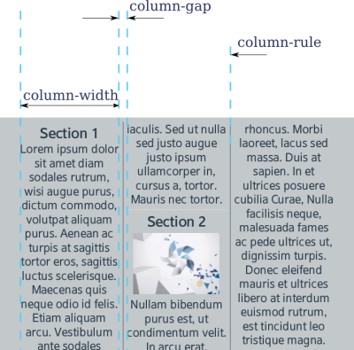
The rule width does not increase the distance between columns. It is drawn under the column gap and can be even wider than the gap.
The figure below shows the layout with the column-rule width set to 40 px and the column-gap set to 10 px.
Figure: Column settings
-
-
Define the footer element with the display height set to 5/100 and padding set to 2 * 2vh:
footer { padding: 2vh; height: 5vh; background: rgba(103, 119, 132, 0.2); } -
Define the section elements setting the border-bottom and vertical padding values. It is not necessary to define horizontal padding, as it has been defined for the article element.
article>section { border-bottom: 1px solid #d8d9d4; padding: 4px 0; text-align: center; } -
Set image elements to have an automatic margin to center them within the column.
In case of the image whose id attribute is set to figure, set it to be a floating element with text drawn around it.
img{
   display: block;
   margin: 4px auto;
}

#figure
{
   float: right;
   margin: 4px;
}
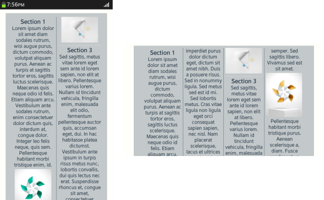
The following figures illustrate the created layout in different display sizes and orientations.
Figure: Basic layout on a 480 x 800 display
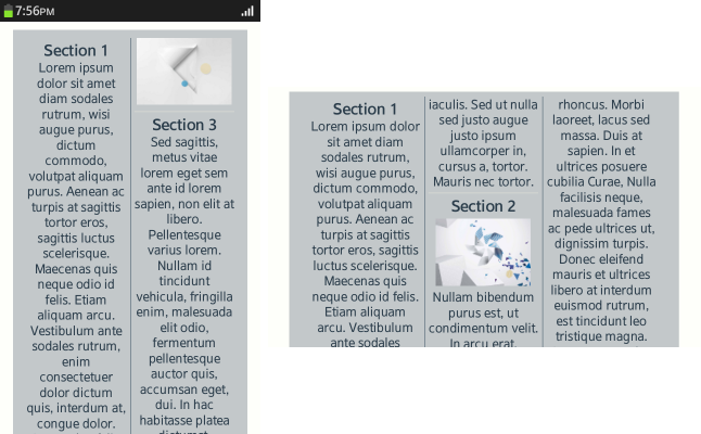
Figure: Basic layout on a 720 x 1280 display
Source Code
For the complete source code related to this use case, see the following files:
- renamed_index.html
- style.css
- pinwheel_green.png
- pinwheel_yellow.png
- Tizen_Pinwheel_Secondary_Confetti.png
- Tizen_WhiteFold_4.png
Creating a Layout with Dynamic Content
To enhance the user experience of your application by providing a consistent behavior across a wide range of displays with different resolution and orientation, you must learn to create a layout displaying a varying amount of content using CSS:
-
Create the HTML layout. The article element displays the columns, and the nav element contains buttons to add and remove content in the columns.
<body>
   <article id="article">
   </article>
   <nav>
      <a id="addSections" href="#">Add images</a>
      <input type="number" id="howMany" value="3">
      <a id="removeGroup" href="#">Remove last Group</a>
   </nav>
   <footer> Multicolumn Layout Tutorial 02</footer>
</body>
- Set the CSS properties:
-
Define the CSS display and column properties:
body { display: flex; display: -webkit-flex; flex-direction: column; -webkit-flex-direction: column; background: #fefffa; } -
Set the article, nav and footer elements in one column using the flexible box layout.
The nav element is also a flexible box layout container to set UI elements in.
nav { height: 20vh; padding-left: 20%; padding-top: 10px; display: flex; display: -webkit-flex; flex-flow: row wrap; -webkit-flex-flow: row wrap; flex: none; -webkit-flex: none; justify-content: space-around; -webkit-justify-content: space-around; align-items: center; -webkit-align-items: center; background: url(../images/white_logo.png) no-repeat; background-position: 2%; background-size: auto 70%; } -
Define the styles for the a elements within the nav element to make them appear as buttons:
nav a
{
   margin: 3px;
   border-radius: 5px;
   padding: 5px 15px;
   background: rgba(103, 119, 132, 0.2);
   text-align: center;
   font-weight: bold;
}
When the user taps the Add images button, the images and their descriptions are displayed.
-
Define the input element (with the property type set to number) style with an increased height to match the buttons around it:
nav input { width: 50px; height: 2em; } -
The article element contains the column properties. Use the -webkit-column-width property to set the column width. The real width is calculated based on available space.
article { width: 90vw; column-width: 136px; -webkit-column-width: 136px; margin: 1vh 2vh; padding: 1vh; background: #c3c8ca; } -
Set the images within the article element with a block display to separate them from text:
article img { margin: 0 auto; display: block; } -
Define the column-span property as all for the h1 elements:
article>h1
{
   background: rgba(103, 119, 132, 0.5);
   padding: 4px;
   text-align: center;
   color: #eed484;
   column-span: all;
   -webkit-column-span: all;
}
As a result, the h1 elements are spread across the columns. When the column-span property is used, you cannot have more columns than can fit in the available horizontal space.
-
Define the break-inside property as avoid to avoid breaking elements between columns:
article>section { break-inside: avoid; -webkit-column-break-inside: avoid; border-bottom: 1px solid #d8d9d4; padding: 4px 0; text-align: center; } -
Set the footer size:
footer
{
   padding: 2vh;
   height: 5vh;
   background: rgba(103, 119, 132, 0.2);
}
-
- Add the JavaScript code to make the content dynamic:
-
Declare a variable for the images. Elements included in the variable amount to data displayed in a column layout, such as a newsfeed:
var images = ["images/pinwheel_green.png",
              "images/Tizen_Pinwheel_Secondary_Confetti.png",
              "images/Tizen_WhiteFold_4.png",
              "images/pinwheel_yellow.png"];
-
Declare a variable for the input element for selecting the number of images added to the content:
var howManyInput;
-
Use the addGroup() method with the input parameter value to add random images to the column layout and initialize the button events:
window.onload = function() { addGroup(4); howManyInput = document.getElementById('howMany'); var addBtn = document.getElementById('addSections'); addBtn.onclick = function() { addGroup(howManyInput.value); return false; }; var removeBtn = document.getElementById('removeGroup'); removeBtn.onclick = function() { removeGroup(); return false; }; }; -
Declare the h1No variable containing the number of h1 elements included in the article elements, and one added to next lines.
Declare the newHTML variable to add new content to the column layout. Each added element contains an h1 element as a header, and section elements. Include an img element with a text description in each section element to display a random image. The art variable is initialized, and new HTML code (newHTML) is concatenated with the existing one (innerHTML):
function addGroup(howMany) { var h1No = document.querySelectorAll('article>h1').length + 1; var newHTML = "<h1>Group " + h1No + "</h1>"; var i; for (i = 0; i < howMany; ++i) { newHTML += "<section><img alt='' src='"; newHTML += images[Math.floor(Math.random() * 4)]; newHTML += "'>Lorem ipsum dolor sit amet diam sodales rutrum.</section>"; } var art = document.getElementById("article"); art.innerHTML += newHTML; } -
When the user taps the Remove last Group button, the removeGroup() method is called to remove the group of images that was added last. Use the all variable to select all h1 elements in the content using the querySelectorAll() method. If the last value is less than 0, there is no element to remove. Use the removeNextSibling() method to recursively delete the next sibling element, and the removeChild() method to remove the h1 elements from its parent.
function removeGroup()
{
   var all = document.querySelectorAll('article>h1');
   var last = all.length - 1;
   if (last < 0)
   {
      return;
   }
   removeNextSibling(all[last].nextSibling);
   all[last].parentElement.removeChild(all[last]);
}
-
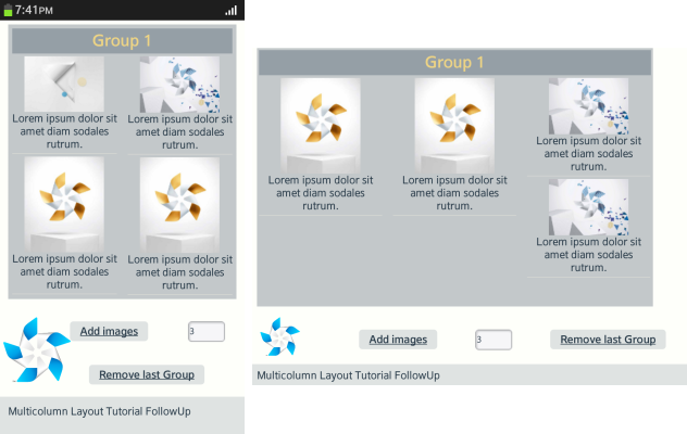
The following figures illustrate the created layout in different display sizes and orientations.
Figure: Dynamic layout on a 480 x 800 display
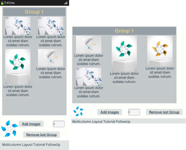
Figure: Dynamic layout on a 720 x 1280 display
Source Code
For the complete source code related to this use case, see the following files:

