CSS Multi-column Layout Module
This feature is supported in mobile applications only.
You can arrange the screen content into columns. Using the CSS column- properties, the content elements can flow between columns when the column height or number changes. You can use the properties alone to create a basic layout, or add JavaScript code to make the layout dynamic.
You can manage the following column-related features:
- Setting the column number and width
- Setting the column gap
- Setting the column rule
- Setting the column span
- Setting the column break
| Note |
|---|
| Up to Tizen SDK version 2.2, most CSS properties and values used in Tizen required the -webkit- prefix. To ensure future compatibility, these properties can now be used with or without the prefix. |
Setting the Column Number and Width
When the layout is set to a constant number of columns using the column-count (or -webkit-column-count) property, the column width is set to fill the available horizontal space.
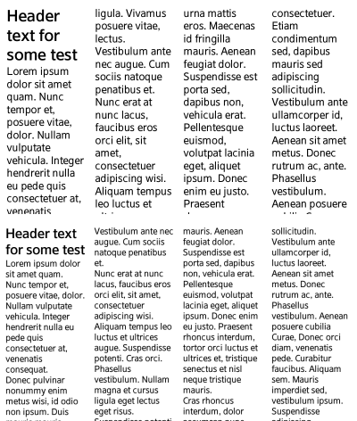
In the following code snippet and figure, the column number is set to 4. As a result, on a 480 x 800 display (shown on the top), the column width is 116 px, whereas on a 720 x 1280 display (shown on the bottom), the column with is 143 px.
The following code snippet demonstrates how to use the column-count property. For a complete source code, see multi_column_column_count/renamed_index.html.
article
{
   column-count: 4;
   -webkit-column-count: 4;
   margin: 10px;
}
Figure: 4 columns on different resolution displays
The column-width (or -webkit-column-width) property sets the base column width.
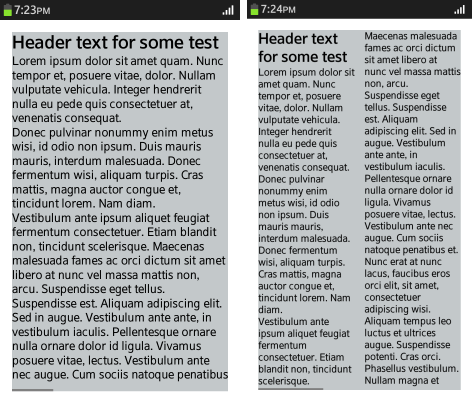
In the following code snippet and figure, the column width is set to 153 px, but the effective column width is 288 px for a 480 x 800 display (shown on the left) and 154 px for a 720 x 1280 display (shown on the right). The parameter sets the column to at least the defined width, but not wider than the available display space or twice the defined width. The actual column width is calculated using a pseudo-algorithm.
The code snippet shows how the multi-column layout is implemented when the vertical space is limited. If there is more content than fits the available space, the next column is set outside the available space. Using the overflow: scroll property, the column can be scrolled horizontally.
The following code snippet demonstrates how to use the column-width property. For a complete source code, see multi_column_column_width/renamed_index.html.
article
{
   width: 90vw;
   height: 90vh;
   column-width: 153px;
   -webkit-column-width: 153px;
   margin: 5vw;
   background: #c3c8ca;
   overflow: scroll;
}
Figure: Column width 153 px on different resolution displays
Setting the Column Gap
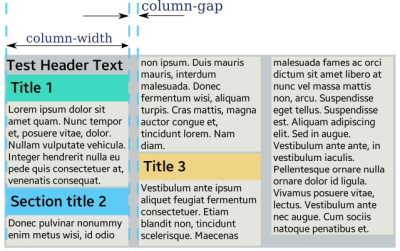
The column-gap (or -webkit-column-gap) property sets the distance between columns. The property affects the column width, as the column width, gap, and margins all take available space. In the following code snippet and figure, the column gap is set to 17 px.
The following code snippet demonstrates how to use the column-gap property. For a complete source code, see multi_column_column_gap/renamed_index.html.
article
{
   height: 303px;
   column-width: 153px;
   -webkit-column-width: 153px;
   column-gap: 17px;
   -webkit-column-gap: 17px;
   margin: 7px;
   padding: 3px;
   background: #c3c8ca;
}
Figure: Column gap
Setting the Column Rule
The column-rule (or -webkit-column-rule) property displays a vertical line in the middle of the column gap.
The rule has analogical parameters, such as width, line style, and color, but its size is not included in the available space, and it is a drawing similar to the background.
Rules are only displayed in the content area. If the padding property is set in the same element, the rule appears shorter than the background. In the following code snippet and figure, the rule width is set to 5 px.
The following code snippet demonstrates how to use the column-rule property. For a complete source code, see multi_column_column_rule/renamed_index.html.
article
{
   -webkit-column-rule-width: 5px;
   -webkit-column-rule-color: rgb(92, 203, 246);
   -webkit-column-rule-style: solid;
}
Figure: Column rule

| Note |
|---|
| In Tizen SDK version 2.2, to avoid displaying the rules incorrectly, do not use the column-rule (or -webkit-column-rule) property with horizontal scrolling of the columns. |
Setting the Column Span
By default, all elements within the columns are no wider than the column width. The column-span (or -webkit-column-span) property can be used to display content across all columns.
When using this property with column elements which have the column-count or column-width property set, the following restrictions apply:
- Column element height is not used and elements in columns take more vertical space than is set in height.
- If the column element has the overflow property set to hidden, the column-span property is ignored.
- An element using the column-span property does not have to be a direct child of the column element.
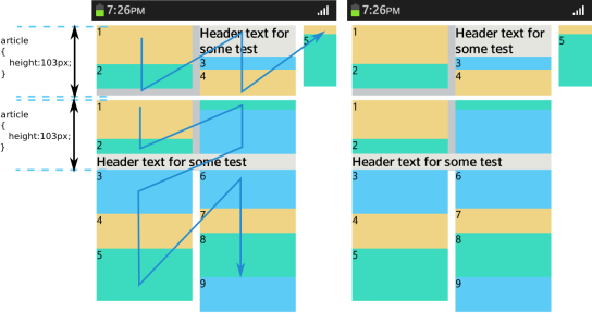
In the figure below, the blue arrow shows the order of the column elements. In the upper header area, the column-span property is not used, and in the lower header area, the column-span property is set to all, as in the following code snippet.
The following code snippet demonstrates how to use the column-span property. For a complete source code, see multi_column_column_span/renamed_index.html.
article.left header
{
   column-span: all;
   -webkit-column-span: all;
}
Figure: Column span
Setting the Column Break
By default, column elements are broken to balance column height. The break-before (or -webkit-column-break-before), break-after (or -webkit-column-break-after), and break-inside (or -webkit-column-break-inside) properties can be used to define that an element cannot be broken between columns (set to avoid), or that an element must begin or end within a given column.
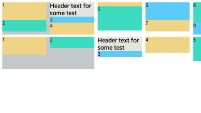
The following code snippet and figure illustrate the use of the break- property. In the upper header area, the break- property is not used, and in the lower header area, the break-before property is set to always.
The following code snippet demonstrates how to use the column-break property. For a complete source code, see multi_column_column_break/renamed_index.html.
article.lower section
{
   break-before: always;
   -webkit-column-break-before: always;
}
Figure: Column break
