Control
PUBLISHED


Dependencies
- Tizen 2.4 and Higher for Mobile
- Tizen 3.0 and Higher for Wearable
Content
Related Info
The Dali::Toolkit::Control class is the base class for all UI components in DALi. With this class, you can, for example, manage the background color and images for UI components.
In this tutorial, the following subjects are covered:
Control events
The following table lists the basic signal provided by the Dali::Toolkit::Control class.
Table: Dali::Toolkit::Control input signals
| Input signal | Description |
|---|---|
KeyEventSignal() |
Emitted when key event is received. |
KeyInputFocusGainedSignal() |
Emitted when the control gets Key Input Focus. |
KeyInputFocusLostSignal() |
Emitted when the control loses Key Input Focus. |
ResourceReadySignal() |
Emitted after all resources required by a control are loaded and ready. |
Setting the Background Color
You can set a background color for a UI component. To set a red background for a component:
Control control = Control::New();
control.SetSize( 200.0f, 200.0f );
control.SetBackgroundColor( Color::RED );
Figure: Control object with a red background

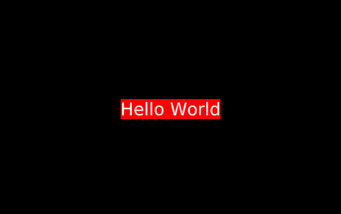
You can handle all existing controls similarly. For example, to set the background color for a TextLabel:
TextLabel label = TextLabel::New( "Hello World" );
label.SetBackgroundColor( Dali::Color::RED );
Figure: TextLabel object with a red background
Setting the Background Image
You can set a background image of a control:
Control control = Control::New();
Image image = Image::New( "image.png" );
control.SetProperty( Control::Property::BACKGROUND, image );
Figure: Control object with a background image

Control Properties
The following table lists the available Control properties.
Table: Control properties
| Property | Type | Description |
|---|---|---|
STYLE_NAME |
STRING | The name of the style to be applied to the control |
KEY_INPUT_FOCUS |
BOOLEAN | Receives key events to the control |
BACKGROUND |
MAP | The background of the control |
Was this document helpful?
We value your feedback. Please let us know what you think.