Components
PUBLISHED
UI components are interactive components for layout and scrolling the user interface. NUI provides UI components, such as buttons, scroll view, table view, text controls, image view, flex container, slider, and video view.
Figure: UI components
The following table lists the available UI components:
Table: UI components
| Control | Description | Related classes |
|---|---|---|
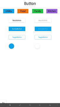
| Button | A button that can set action when user select it. | Button |
| FlexContainer | A FlexContainer implements a subset of the flexbox spec. | FlexContainer |
| ImageView | An image view is a class for displaying an image resource. | ImageView |
| Loading | A loading is used to give information about the ongoing operations. | Loading |
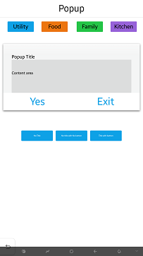
| Popup | A popup is used as a popup window. | Popup |
| Progress | A progress is used to show the ongoing status using a long narrow bar. | Progress |
| Scrollbar | A scrollbar is used to show the range of content. | ScrollBar |
| Slider | A slider that indicates a modifiable value within a specific range. | Slider |
| Switch | A switch that can be used as a selector. | Switch |
| Tab | A tab is easy to explore and switch between different views. | Tab |
| TableView | A table view that can align child actors in a grid like layout. | TableView |
| TextEditor | A text editor that provides a multi line editable text. | TextEditor |
| TextField | A text field that provides a single line editable text. | TextField |
| TextLabel | A text label that renders a short text string. | TextLabel |
| Toast | A toast is used to provide simple messages. | Toast |
| VideoView | A video view that controls and displays video playback. | VideoView |
The base class for the components is View. This class can also be used to create your own custom UI components. For more information on the view class, see View. In this UI Components guide, both the terms control and component are used to refer to a UI component.
You can customize the look of the UI components with stylesheets. For a reusable rendering logic that can be used by all UI components, take advantage of visuals.
Was this document helpful?
We value your feedback. Please let us know what you think.