TextEditor [1]
PUBLISHED
The TextEditor class provides a control that allows multi line text editing. It is similar to the TextField [2] control, where a different formatting can be applied to different parts of the text. You can change, for example, the font color, font style, point size, and font family.
The TextEditor also supports markup, and text can be scrolled vertically within it.
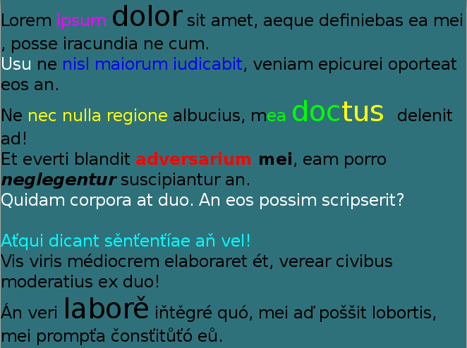
Figure: TextEditor
In this tutorial, the following subjects are covered:
TextEditor events
The following table lists the basic signals provided by the TextEditor class.
Table: TextEditor input signals
| Input signal | Description |
|---|---|
TextChanged |
Emitted when the text changes. |
ScrollStateChanged |
Emitted when TextEditor scrolling is started or finished. |
Creating a TextEditor
The following basic example shows how to create a TextEditor object:
// Create a TextEditor instance
Window window = Window.Instance;
TextEditor editor = new TextEditor();
editor.Position2D = new Position2D(10, 700);
editor.Size2D = new Size2D(400, 90);
editor.BackgroundColor = Color.Red;
editor.PointSize = 20;
editor.TextColor = Color.White;
editor.Text = "This is a multiline text.\n I can write several lines.\n"
window.Add(editor);
TextEditor Properties
You can modify the TextEditor appearance and behavior through its properties.
The following table lists the available TextEditor properties.
Table: TextEditor properties
| Property | Type | Description |
|---|---|---|
Text |
String | The text to display in UTF-8 format. |
TextColor |
Vector4 | The color of the text. |
FontFamily |
String | The requested font family. |
FontStyle |
PropertyMap | The requested font style. |
PointSize |
Float | The size of font in points. |
HorizontalAlignment |
String | The horizontal line alignment. |
ScrollThreshold |
Float | Horizontal scrolling will occur, if the cursor is closer to the control border. |
ScrollSpeed |
Float | The scroll speed is in pixels per second. |
PrimaryCursorColor |
Vector4 | The color to apply to the primary cursor. |
SecondaryCursorColor |
Vector4 | The color to apply to the secondary cursor. |
EnableCursorBlink |
Boolean | Enable or disable the cursor blink. |
CursorBlinkInterval |
Float | The time interval in seconds between cursor on or off states. |
CursorBlinkDuration |
Float | The cursor will stop blinking after this number of seconds. |
CursorWidth |
Integer | The width of the cursor. |
GrabHandleImage |
String | The image to display for the grab handle. |
GrabHandlePressedImage |
String | The image to display when the grab handle is pressed. |
SelectionHandleImageLeft |
PropertyMap | The image to display for the left selection handle. |
SelectionHandleImageRight |
PropertyMap | The image to display for the right selection handle. |
SelectionHandlePressedImageLeft |
PropertyMap | The image to display for the left selection handle. |
SelectionHandlePressedImageRight |
PropertyMap | The image to display for the right selection handle. |
SelectionHandleMarkerImageLeft |
PropertyMap | The image to display for the left selection handle marker. |
SelectionHandleMarkerImageRight |
PropertyMap | The image to display for the right selection handle marker. |
SelectionHighlightColor |
Vector4 | The color of the selection is highlighted. |
DecorationBoundingBox |
Rectangle | The decorations (handles etc) within the on-screen area will be positioned. |
EnableMarkup |
Boolean | Enable the Markup string, to process text within the Markup tags using DALi application. Note: By default, the Markup string is disabled. |
InputColor |
Vector4 | The color of the new input text. |
InputFontFamily |
String | The font's family of the new input text. |
InputFontStyle |
PropertyMap | The font's style of the new input text. |
InputPointSize |
Float | The font's size of the new input text in points. |
LineSpacing |
Float | The default extra space between lines in points. |
InputLineSpacing |
Float | The extra space between lines in points. |
Underline |
PropertyMap | The default underline parameters. |
InputUnderline |
String | The underline parameters of the new input text. |
Shadow |
PropertyMap | The default shadow parameters. |
InputShadow |
String | The shadow parameters of the new input text. |
Emboss |
String | The default emboss parameters. |
InputEmboss |
String | The emboss parameters of the new input text. |
Outline |
PropertyMap | The default outline parameters. |
InputOutline |
String | The outline parameters of the new input text. |
SmoothScroll |
Boolean | Enable or disable the smooth scroll animation. |
SmoothScrollDuration |
Float | Sets the duration of smooth scroll animation. |
EnableScrollBar |
Boolean | Enable or disable the scroll bar. |
ScrollBarShowDuration |
Float | Sets the duration of scroll bar to show. |
ScrollBarFadeDuration |
Float | Sets the duration of scroll bar to fade out. |
PixelSize |
Float | The size of font in pixels. |
LineCount |
Integer | The line count of text. |
EnableSelection |
Boolean | Enable or disable Text selection. |
Placeholder |
PropertyMap | Sets the placeholder : text, color, font family, font style, point size, and pixel size. |
LineWrapMode |
LineWrapMode | Line wrap mode when text lines are greater than the layout width. |
TranslatablePlaceholderText |
String | The TranslatablePlaceholderText property can set the SID value. |
TranslatableText |
String | The TranslatableText property can set the SID value. |