TextField [1]
PUBLISHED
The TextField class provides a control that allows single line editable text field.
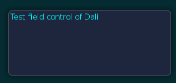
Figure: TextField
In this tutorial, the following subjects are covered:
TextField events
The following table lists the basic signals provided by the TextField class.
Table: TextField input signals
| Input signal | Description |
|---|---|
TextChanged |
Emitted when the text changes. |
MaxLengthReached |
Emitted when the inserted text exceeds the maximum character limit. |
Creating a TextField
Before text has been entered, the TextField class displays a placeholder text. An alternative placeholder is displayed when the TextField has keyboard focus. For example, a TextField is used to enter a username can initially show the text Unknown Name and the text Enter Name, when the cursor is visible.
The following basic example illustrates creation of a TextField object:
Window window = Window.Instance;
TextField field = new TextField();
PropertyMap propertyMap = new PropertyMap();
propertyMap.Add("placeholderText", new PropertyValue("Unnamed Name"));
propertyMap.Add("placeholderTextFocused", new PropertyValue("Enter Name."));
field.Placeholder = propertyMap;
window.Add(field);
When the TextField is tapped, it automatically gets the keyboard focus. Key events enter the text. Additionally, the placeholder text is removed. After text has been entered, it can be retrieved from the TEXT property.
Property::Value fieldText = field.GetProperty( TextField::Property::TEXT );
std::string fieldTextString = fieldText.Get< std::string >();
Aligning Text
The TextField class displays a single line of text, which scrolls for either of the following:
- If there is not enough space for the text displayed.
- If there is enough space, the text is aligned horizontally to the beginning, end, or center of the available area.
The code illustrates alignment of the text:
// Begin, Center, or End
field.HorizontalAlignment = HorizontalAlignment.Begin;
TextField Properties
Using Decorations
For text decorations, the following TextField class properties are available. All properties are writable and none are animatable:
Table: TextField properties
| Property | Type | Description |
|---|---|---|
Text |
String | The text to display in UTF-8 format. |
PlaceholderText |
String | The text to display when the TextField is empty and inactive. |
PlaceholderTextFocused |
String | The text to display when the TextField is empty with key-input focus. |
FontFamily |
String | The requested font family. |
FontStyle |
PropertyMap | The requested font style. |
PointSize |
Float | The size of font in points. |
MaxLength |
Integer | The maximum number of characters that can be inserted. |
ExceedPolicy |
Integer | Specifies how the text is truncated when it does not fit. |
HorizontalAlignment |
HorizontalAlignment | The horizontal line alignment. |
VerticalAlignment |
VerticalAlignment | The vertical line alignment. |
TextColor |
Color | The color of the text. |
PlaceholderTextColor |
Vector4 | Set the color of the placeholder text. |
PrimaryCursorColor |
Vector4 | The color to apply to the primary cursor. |
SecondaryCursorColor |
Vector4 | The color to apply to the secondary cursor. |
EnableCursorBlink |
Boolean | Enable or disable the cursor blink. |
CursorBlinkInterval |
Float | The time interval in seconds between the cursor on or off states. |
CursorBlinkDuration |
Float | The cursor will stop blinking after this number of seconds. |
CursorWidth |
Integer | The width of the cursor. |
GrabHandleImage |
String | The image to display for the grab handle. |
GrabHandlePressedImage |
String | The image to display when the grab handle is pressed. |
ScrollThreshold |
Float | Horizontal scrolling will occur, if the cursor is closer to the control border. |
ScrollSpeed |
Float | The scroll speed is in pixels per second. |
SelectionHandleImageLeft |
PropertyMap | The image to display for the left selection handle. |
SelectionHandleImageRight |
PropertyMap | The image to display for the right selection handle. |
SelectionHandlePressedImageLeft |
PropertyMap | The image to display for the left selection handle marker. |
SelectionHandlePressedImageRight |
PropertyMap | The image to display for the right selection handle marker. |
SelectionHandleMarkerImageLeft |
PropertyMap | The image to display for the left selection handle marker. |
SelectionHandleMarkerImageRight |
PropertyMap | The image to display for the right selection handle marker. |
SelectionHighlightColor |
Vector4 | The color of the selection is highlighted. |
DecorationBoundingBox |
Rectangle | The decorations (handles etc) within the on-screen area will be positioned. |
InputMethodSettings |
PropertyMap | The settings related to the System's Input Method, Key and Value. |
InputColor |
Vector4 | The color of the new input text. |
EnableMarkup |
Boolean | Enable the Markup string, to process text within the Markup tags using DALi application. Note: By default, the Markup string is disabled. |
InputFontFamily |
String | The font's family of the new input text. |
InputFontStyle |
PropertyMap | The font's style of the new input text. |
InputPointSize |
Float | The font's size of the new input text in points. |
Underline |
PropertyMap | The default underline parameters. |
InputUnderline |
String | The underline parameters of the new input text. |
Shadow |
PropertyMap | The default shadow parameters. |
InputShadow |
String | The shadow parameters of the new input text. |
Emboss |
PropertyMap | The default emboss parameters. |
InputEmboss |
String | The emboss parameters of the new input text. |
Outline |
PropertyMap | The default outline parameters. |
InputOutline |
String | The outline parameters of the new input text. |
HiddenInputSettings |
PropertyMap | Hides the input characters and instead shows a default character for password or pin entry. |
PixelSize |
Float | The size of font in pixels. |
EnableSelection |
Boolean | Enable or disable the text selection. |
Placeholder |
PropertyMap | Sets the placeholder for text, color, font family, font style, point size, and pixel size. |
Ellipsis |
Boolean | Enable or disable ellipsis, if required. |
TranslatablePlaceholderText |
String | The TranslatablePlaceholderText property can set the SID value. |
TranslatableText |
String | The TranslatableText property can set the SID value. |