FlexContainer
PUBLISHED
A flex container is a NUI container control that contains items, such as buttons, text labels, and images. It is implemented through the Tizen.NUI.BaseComponents.FlexContainer class, which in turn implements a subset of the W3C CSS Flexible Box Layout Module Level 1 [1] specification. The flexible box (flexbox) is a CSS3 Web layout model, which allows you to create containers with responsive elements inside that are automatically arranged to fit different devices or screen sizes.
The flex container can alter the width and height of the flex items within it, so that they optimally fill the available space on any display size. It expands items to fill available free space, or reduces their size to prevent overflow.
The following figure illustrates flex container terminology and alignment axes, based on a flex container where the flex direction is defined as row.
Figure: Flex container terminology

Creating a Flexbox Layout
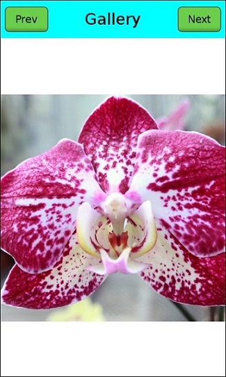
The following example shows how to create a gallery-like flexbox layout using the Tizen.NUI.BaseComponents.FlexContainer [2] object.
Figure: Flex container example
- Create a flex container as the whole view and set its resize policy to fill its parent (the window):
/// Create the main flex container
FlexContainer flexContainer = new FlexContainer();
flexContainer.ParentOrigin = ParentOrigin.TopLeft;
flexContainer.PivotPoint = PivotPoint.TopLeft;
flexContainer.WidthResizePolicy = ResizePolicyType.FillToParent;
flexContainer.HeightResizePolicy = ResizePolicyType.FillToParent;
/// Set the background color to white
flexContainer.BackgroundColor = Color.White;
/// Add the container to the window
Window.Instance.Add(flexContainer);
- To make the toolbar and main content display vertically, set the flex direction of the main container to column:
/// Display toolbar and content vertically
flexContainer.FlexDirection = FlexContainer.FlexDirectionType.Column;
- Create a new flex container as the toolbar and add it to the main container. Because the flex direction in the main container is column, the toolbar is placed at the top.
/// Create the toolbar
FlexContainer toolBar = new FlexContainer();
toolBar.ParentOrigin = ParentOrigin.TopLeft;
toolBar.PivotPoint = PivotPoint.TopLeft;
/// Set the toolbar background color
toolBar.BackgroundColor = Color.Cyan;
/// Add the toolbar to the main container
flexContainer.Add(toolBar);
- To make the buttons and title display horizontally, but vertically aligned to the center of the toolbar, set the toolbar flex direction to row and its
AlignItemsproperty to center:
/// Display toolbar items horizontally
toolBar.FlexDirection = FlexContainer.FlexDirectionType.Row;
/// Align toolbar items vertically center
toolBar.AlignItems = FlexContainer.Alignment.AlignCenter;
- Use the toolbar's
Flexproperty to make the toolbar and the main content share the height of the main container, so that the toolbar occupies 10 percent of the vertical space and the content occupies the remainder:
/// Occupy 10 percent of available space on the cross axis
toolBar.Flex = 0.1f;
- To display the image, create the content area by adding a third flex container at the bottom of the main container.
Show the image in the center of the content area container by centering the item horizontally and vertically inside the area.
/// Create the content area
FlexContainer content = new FlexContainer();
content.ParentOrigin = ParentOrigin.TopLeft;
content.PivotPoint = PivotPoint.TopLeft;
/// Place items horizontally
content.FlexDirection = FlexContainer.FlexDirectionType.Row;
/// Align items horizontally center
content.JustifyContent = FlexContainer.Justification.JustifyCenter;
/// Align items vertically center
content.AlignItems = FlexContainer.Alignment.AlignCenter;
/// Occupy 90 percent of available space on the cross axis
content.Flex = 0.9f;
/// Add the content area to the main container
flexContainer.Add(content);
- Add items to the toolbar.
The toolbar has 1 button on the left, 1 button on the right, and a title in the center. To keep the title in the center, make the title flexible so that it automatically takes all remaining horizontal space. To make the layout look nicer, also add some space around the items.
Creating the toolbar with a flex container allows you to keep the toolbar layout consistent, even as it expands or reduces in size based on screen size and orientation.
/// Add a button to the left of the toolbar PushButton prevButton = new PushButton(); prevButton.ParentOrigin = ParentOrigin.TopLeft; prevButton.PivotPoint = PivotPoint.TopLeft; /// Minimum size the button must keep prevButton.MinimumSize = new Vector2(100.0f, 60.0f); /// Set a 10-pixel margin around the button prevButton.FlexMargin = new Vector4(10.0f, 10.0f, 10.0f, 10.0f); toolBar.Add(prevButton); /// Set the button text PropertyMap labelMap = new PropertyMap(); labelMap.Add("text", new PropertyValue("Prev")); labelMap.Add("textColor", new PropertyValue(Color.Black)); prevButton.Label = labelMap; /// Add a title to the center of the toolbar TextLabel title = new TextLabel("Gallery"); title.ParentOrigin = ParentOrigin.TopLeft; title.PivotPoint = PivotPoint.TopLeft; title.WidthResizePolicy = ResizePolicyType.UseNaturalSize; title.HeightResizePolicy = ResizePolicyType.UseNaturalSize; title.HorizontalAlignment = HorizontalAlignment.Center; title.VerticalAlignment = VerticalAlignment.Center; /// Occupy all remaining space in the toolbar title.Flex = 1.0f; /// Set a 10-pixel margin around the title title.FlexMargin = new Vector4(10.0f, 10.0f, 10.0f, 10.0f); toolBar.Add(title); /// Add a button to the right of the toolbar PushButton nextButton = new PushButton(); nextButton.ParentOrigin = ParentOrigin.TopLeft; nextButton.PivotPoint = PivotPoint.TopLeft; /// Minimum size the button must keep nextButton.MinimumSize = new Vector2(100.0f, 60.0f); /// Set a 10-pixel margin around the button nextButton.FlexMargin = new Vector4(10.0f, 10.0f, 10.0f, 10.0f); toolBar.Add(nextButton); /// Set the button text PropertyMap labelMap2 = new PropertyMap(); labelMap2.Add("text", new PropertyValue("Next")); labelMap2.Add("textColor", new PropertyValue(Color.Black)); nextButton.Label = labelMap2; - Add the image to the content area:
/// Add an image to the center of the content area
ImageView imageView = new ImageView("image.jpg");
imageView.ParentOrigin = ParentOrigin.TopLeft;
imageView.PivotPoint = PivotPoint.TopLeft;
content.Add(imageView);
Modifying FlexContainer Properties
You can modify the flex container appearance and behavior through the following properties:
ContentDirectionThis property specifies the primary direction in which content is ordered along a line.
Figure: ContentDirection LTR
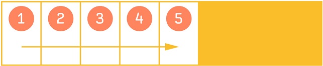
Figure: ContentDirection RTL
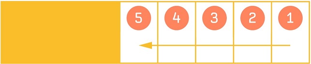
Table: ContentDirection values
Property value Description InheritInherit the direction from the parent LTRPlace content from left to right RTLPlace content from right to left Usage:
FlexContainer flexContainer = new FlexContainer();
flexContainer.ContentDirection = FlexContainer.ContentDirectionType.RTL;
FlexDirectionThis property specifies the main axis direction along which flex items are placed.
Figure: FlexDirection
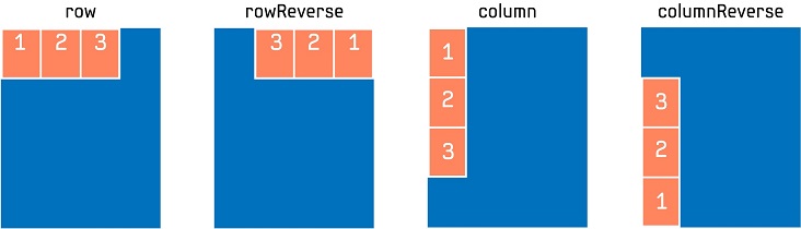
Table: FlexDirection values
Property value Description ColumnPlace items vertically in a column ColumnReversePlace items vertically in a column, but in reverse order RowPlace items horizontally in a row RowReversePlace items horizontally in a row, but in reverse order Usage:
FlexContainer flexContainer = new FlexContainer();
flexContainer.FlexDirection = FlexContainer.FlexDirectionType.RowReverse;
FlexWrapThis property specifies whether the flex items must wrap if there is not enough room for them on 1 flex line.
Figure: FlexWrap
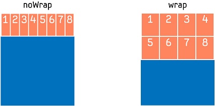
Table: FlexWrap values
Property value Description NoWrapReduce item sizes to fit them in a single line along the main axis WrapShow items over multiple lines, if needed Usage:
FlexContainer flexContainer = new FlexContainer();
flexContainer.FlexWrap = FlexContainer.WrapType.NoWrap;
JustifyContentThis property specifies the alignment for flex items, when they do not use all available space on the main axis.
Figure: JustifyContent
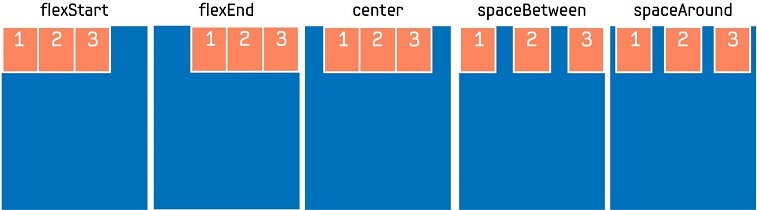
Table: JustifyContent values
Property value Description JustifyFlexStartPosition items at the beginning of the container JustifyCenterPosition items at the center of the container JustifyFlexEndPosition items at the end of the container JustifySpaceBetweenPosition items with equal spacing between them JustifySpaceAroundPosition items with equal spacing before, between, and after them Usage:
FlexContainer flexContainer = new FlexContainer();
flexContainer.JustifyContent = FlexContainer.Justification.JustifySpaceBetween;
AlignItemsThis property specifies the alignment for flex items when they do not use all the available space on the cross axis.
Figure: AlignItems
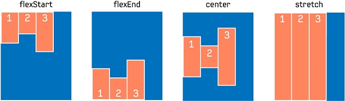
Table: AlignItems values
Property value Description AlignAutoInherit the alignment from the parent (only valid for the AlignSelf property) AlignFlexStartAlign items to the beginning of the container AlignCenterAlign items to the center of the container AlignFlexEndAlign items to the end of the container AlignStretchStretch items to fit the container Usage:
FlexContainer flexContainer = new FlexContainer();
flexContainer.AlignItems = FlexContainer.Alignment.AlignFlexStart;
AlignContentThis property specifies the alignment for flex lines when they do not use all the available space on the cross axis. It is only valid when there are multiple lines.
Figure: AlignContent
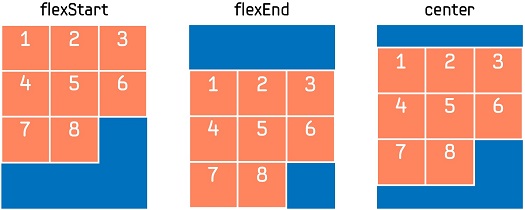
Table: AlignContent values
Property value Description AlignAutoInherit the alignment from the parent (only valid for the AlignSelf property) AlignFlexStartAlign the lines to the beginning of the container AlignCenterAlign the lines to the center of the container AlignFlexEndAlign the lines to the end of the container AlignStretchStretch the lines to fit the container Usage:
FlexContainer flexContainer = new FlexContainer();
flexContainer.AlignContent = FlexContainer.Alignment.AlignFlexEnd;
Modifying FlexItem Properties
Flex items have non-animatable properties, which are registered dynamically to each child before it is added to the flex container. Once the item is added to the container, these values cannot be changed. These properties determine the item's placement inside the flex container.
You can modify the flex item placement through the following properties:
FlexBy default, items in a flex container are not flexible. To make an item flexible, so that it alters its width and height to occupy a specified proportion of free space in the flex container, you can set the item's
Flexproperty. If all items in the flex container use this pattern, their sizes are proportional to the specified flex factor. If you have specified a minimum size for the item, using theMinimumSize()method of the Tizen.NUI.BaseComponents.View [3] class, the item cannot become smaller than the minimum.Figure: Flex
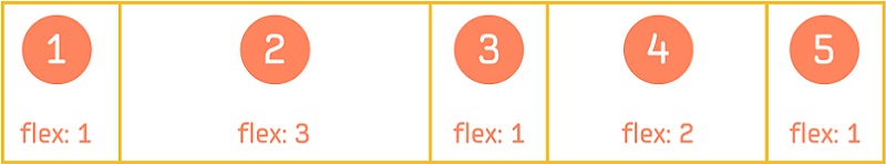
To create a layout with the proportions shown in the above figure:
/// Create the flex container
FlexContainer flexContainer = new FlexContainer();

/// Place items horizontally
flexContainer.FlexDirection = FlexContainer.FlexDirectionType.Row;

/// Create flex items and set their proportions
View item1 = new View();
item1.Flex = 1.0f;
flexContainer.Add(item1);

View item2 = new View();
item2.Flex = 3.0f;
flexContainer.Add(item2);

View item3 = new View();
item3.Flex = 1.0f;
flexContainer.Add(item3);

View item4 = new View();
item4.Flex = 2.0f;
flexContainer.Add(item4);

View item5 = new View();
item5.Flex = 1.0f;
flexContainer.Add(item5);
AlignSelfThis property specifies how the item aligns along the cross axis. If the
AlignSelfproperty is set, it overrides the default alignment defined by the container'sAlignItemsproperty.Figure: AlignSelf
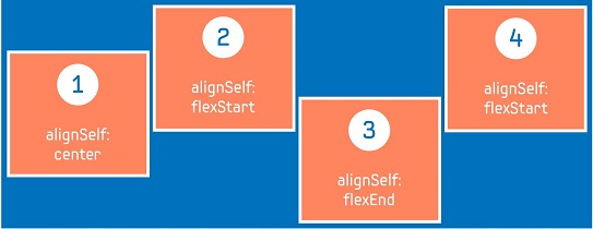
To create the item alignment shown in the above figure:
/// Create the flex container
FlexContainer flexContainer = new FlexContainer();

/// Lay out the items horizontally
flexContainer.FlexDirection = FlexContainer.FlexDirectionType.Row;

/// Set the default alignment along the cross axis to the beginning of the container
flexContainer.AlignItems = FlexContainer.Alignment.AlignFlexStart;

/// Create flex items and add them to the flex container
View item1 = new View();
/// Align item1 to the center of the container
item1.AlignSelf = FlexContainer.Alignment.AlignCenter;
flexContainer.Add(item1);

View item2 = new View();
/// Align item2 to the beginning of the container based on the default alignment
flexContainer.Add(item2);

View item3 = new View();
/// Align item3 to the bottom of the container
item3.AlignSelf = FlexContainer.Alignment.AlignFlexEnd;
flexContainer.Add(item3);

View item4 = new View();
/// Align item4 to the beginning of the container based on the default alignment
flexContainer.Add(item4);
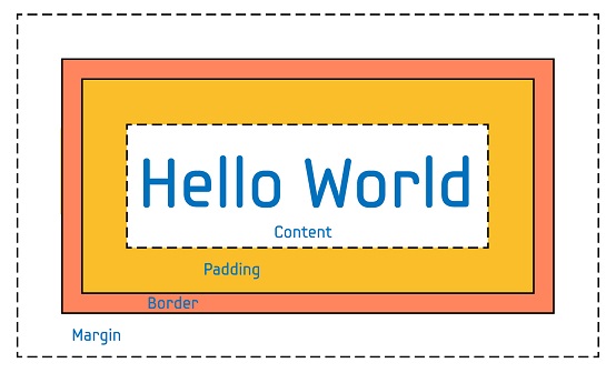
FlexMarginEach flex item inside the flex container is treated like a CSS box, consisting of the following areas:
- Content: Item content
- Padding: Space around the content, but inside the border
- Border: Border around the padding and content
- Margin: Space outside the border
In NUI, the total size of the flex item includes the content size, padding, and border. The flex margin specifies the space around the flex item.
Figure: FlexMargin
To add space around an item:
/// Create the flex container
FlexContainer flexContainer = new FlexContainer();

/// Create a flex item
View item = new View();

/// Add a margin around the item
item.FlexMargin = new Vector4(10.0f, 10.0f, 10.0f, 10.0f);

/// Add the item to the container
flexContainer.Add(item);