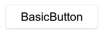
Button
PUBLISHED
Button is a common component and describes what action will occur when you select it.
A button can either contain a text or an icon, and can be created using property.
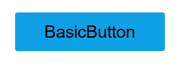
Create with Property
To create a button using property, follow these steps:
- Create Button using the default constructor:
utilityBasicButton = new Button();
- Set the button property:
NPatchVisual nvisual = new NPatchVisual();
nvisual.URL = "rectangle_point_btn_normal.png";
nvisual.Border = new Rectangle(5, 5, 5, 5);
utilityBasicButton.IsSelectable = true;
utilityBasicButton.Background = nvisual.OutputVisualMap;

utilityBasicButton.TextColorSelector = new ColorSelector
{
    Normal = new Color(0, 0, 0, 1),
    Pressed = new Color(0, 0, 0, 0.7f),
    Selected = new Color(0.058f, 0.631f, 0.92f, 1),
    Disabled = new Color(0, 0, 0, 0.4f)
};

utilityBasicButton.Size = new Size(300, 80);
utilityBasicButton.Position = new Position(100, 300);
utilityBasicButton.PointSize = 20;
utilityBasicButton.Text = "BasicButton";
root.Add(utilityBasicButton);
Following output is generated when the button is created using property:
Responding to ClickEvent
When you click a button, the button instance receives a click event. You can declare the click event handler as follows:
Button button = new Button();
button.ClickEvent += OnClick;
private void OnClick(object sender, Button.ClickEventArgs e)
{
    // Do something in response to button click
}
Responding to StateChangedEvent
Button has the following eight states Normal, Focused, Disabled, Selected, Pressed, DisabledFocused, SelectedFocused, and DisabledSelected.
When you change the button state to focus or disable, the button instance receives a state changed event:
Button button = new Button();
button.StateChangedEvent += OnStateChange;
private void OnStateChange(object sender, Button.StateChangeEventArgs e)
{
    // Do something in response to state change
}