Create animated charts with Chart.js
PUBLISHED
This article describes the Chart JavaScript library and how to create a Tizen Web application using it.
Introduction
Chart JS is a super lightweight, dependency free JavaScript library that uses HTML5 canvas element to visualize your data in the form of charts. It's a responsive, modular and well documented tool available under the MIT license.
It provides six types of charts: Line, Bar, Radar, Polar Area, Pie and Doughnut. You can customize each of them, add some animation or other interactivity extensions.
More information about Chart JS library can be found HERE. Its documentation is available HERE. Some samples of the library usage you can find on Github and on this page (works submitted to the “Personal dashboard challenge” organized in 2013).
The ChartsOnTizen sample application
After launching the application, we see a single page with a chart in the middle of the screen and its legend in the bottom left corner. Above the chart you can see its type and two buttons: “Prev” and “Next” intended to change a type of displayed chart.

Figure 1 Sample application screen shot
How to work with the Chart JS library
To use the Chart JS library in your Tizen Web application:
- Download it from this page. You can choose compressed or uncompressed version of the library.
- Include the downloaded file into the index.html file of your Tizen Web application, e.g.
<script type="text/javascript" src="js/Chart.min.js"></script>
To create a chart:
- Create a canvas element – its 2D context is a mandatory argument for Chart constructor.
<canvas width="300px" height="450px"></canvas>
- Create a chart:
- provide the data for the chart (format of provided data depends on chart's type),
- create a chart element:
new Chart(canvas.getContext("2d")).chart_type(data);where chart_type = Line || Bar || Radar || PolarArea || Pie || Doughnut
Line, Bar and Radar chart types
The data for the chart:
| Monday | Tuesday | Wednesday | Thursday | Friday | Saturday | Sunday | |
| Dataset1 | 11 | 28 | 30 | 28 | 15 | 14 | 25 |
| Dataset2 | 14 | 15 | 21 | 31 | 31 | 32 | 25 |
| Dataset3 | 3 | 1 | 2 | 2 | 9 | 11 | 17 |
You need to present it in the following form:
var data = {
    labels : [ "Monday", "Tuesday", "Wednesday", "Thursday", "Friday", "Saturday", "Sunday" ],
    datasets : [ {
        label : "Dataset 1",
        fillColor : "rgba(220,35,65,0.2)",
        strokeColor : "rgba(220,35,65,1)",
        pointColor : "rgba(220,35,65,1)",
        pointStrokeColor : "#fff",
        pointHighlightFill : "#fff",
        pointHighlightStroke : "rgba(220,35,65,1)",
        data : [ 11, 28, 30, 28, 15, 14, 25 ]
    }, {
        label : "Dataset 2",
        fillColor : "rgba(35,35,220,0.2)",
        strokeColor : "rgba(35,35,220,1)",
        pointColor : "rgba(35,35,220,1)",
        pointStrokeColor : "#fff",
        pointHighlightFill : "#fff",
        pointHighlightStroke : "rgba(35,35,220,1)",
        data : [ 14, 15, 21, 31, 31, 32, 25 ]
    },
    {
        label : "Dataset 3",
        fillColor : "rgba(22,200,79,0.2)",
        strokeColor : "rgba(22,200,79,1)",
        pointColor : "rgba(22,200,79,1)",
        pointStrokeColor : "#fff",
        pointHighlightFill : "#fff",
        pointHighlightStroke : "rgba(22,200,79,1)",
        data : [ 3, 1, 2, 2, 9, 11, 17 ]
    } ]
};
Now, you can use it to create a chart:
new Chart(canvas.getContext("2d")).Line(data);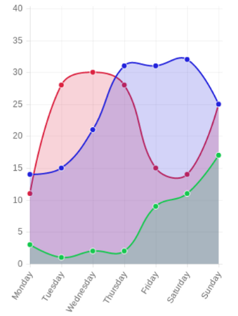
Figure 2 Line chart type
The same format of data you can use to create a Bar and a Radar Chart.
new Chart(canvas.getContext("2d")).Bar(data);
new Chart(canvas.getContext("2d")).Radar(data);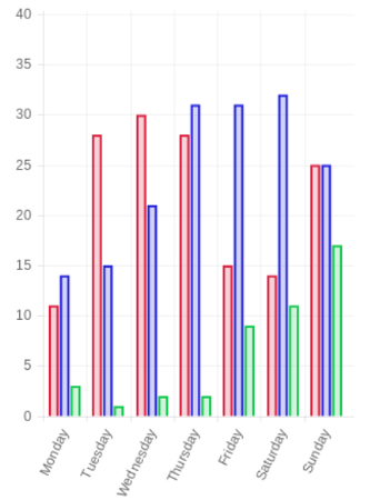
Figure 3 Bar chart type

Figure 4 Radar chart type
PolarArea, Pie and Doughnut chart types
In case of all other chart types the format of data is different and looks as follows:
var data = [ {
    value : 1000,
    color : "#F7464A",
    highlight : "#FF5A5E",
    label : "Rent"
}, {
    value : 500,
    color : "#46BFBD",
    highlight : "#5AD3D1",
    label : "Food"
}, {
    value : 700,
    color : "#FDB45C",
    highlight : "#FFC870",
    label : "Fuel"
}, {
    value : 400,
    color : "#949FB1",
    highlight : "#A8B3C5",
    label : "Entertainment"
}, {
    value : 200,
    color : "#4D5360",
    highlight : "#616774",
    label : "Other"
} ];
We create charts the same as previous:
new Chart(canvas.getContext("2d")).PolarArea(data);
new Chart(canvas.getContext("2d")).Pie(data);
new Chart(canvas.getContext("2d")).Doughnut(data);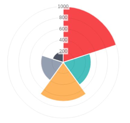
Figure 5 PolarArea chart type
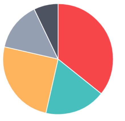
Figure 6 Pie chart type
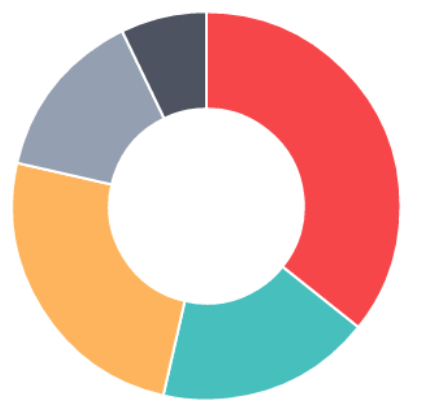
Figure 7 Doughnut chart type
How to create a legend for our chart
To create a legend for our chart we need to create an empty div, where we want to place our legend, e.g.
<div id="lineChartLegend"></div>
Next, we can pass this div element as a first argument of setLegend() method. A second argument is a dataset:
var setLegend = function(legendDiv, datasets) {
    var node = document.getElementById(legendDiv);
    var str = "";
    for ( var i = 0; i < datasets.length; i++)
        str += "<span class=\"legend\" style=\"border-color:"
                + ((datasets[i].color) ? datasets[i].color
                        : datasets[i].strokeColor) + "\">"
                + ((datasets[i].label) ? datasets[i].label : "")
                + "</span>";
    node.innerHTML = str;
};
The method creates a span element of “legend” class:
.legend {
    margin: 0.4em;
    border-style: solid;
    border-width: 0 0 0 1em;
    display: block;
    padding: 0 0.5em;
    font-size: 10px;
}
As an effect we get a legend for chart in a form:
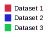
Figure 8 Chart's legend
Summary
We hope this article has shown you how simple and easy is usage of the Chart JavaScript library in your Tizen Web application. Use it to create amazing applications and games.