Media Queries: Labeling Output Devices in Style Sheets
Media queries allow you to apply the CSS differently according to the media type (type of device) and media features (viewport status). Previously, you were able to use the media type only and create Web services with fixed layouts. However, smart phones, tablets, and other devices with various resolutions require a liquid layout. HTML5 now makes various characteristics and conditional defining possible, and can be used to implement responsive Web design (RWD), which is a liquid layout that mainly reacts according to the device resolution.
You can use media queries in 3 ways:
- In CSS
You can define attribute values depending on given conditions:
@media only screen and (max-width: 480px) {styles}Note This approach is popular since it can reduce style overlapping; however, if all the styles are applied to 1 CSS, the maintenance work efficiency decreases. - In an @import rule in CSS
You can import from CSS a file that matches the condition:
@import url(example.css) not screen and (min-width: 480px)
- In HTML
You can directly import the CSS file that matches the condition:
<link rel="stylesheet" media="all and (max-width: 480px)" href="example.css">
Note The disadvantage of this approach is that every time the condition is expanded, the HTML file must be edited. However, since this approach only imports the CSS files that match the condition, the file transmission amount can be reduced.
For more information on the CSS priorities when different media queries are used, see Media Query Priorities.
Media Query Conditions
You can define the following conditions for the media queries:
- Combination and relevancy
You can combine multiple conditions into 1 Boolean query with the and operator. To define a negative condition (something not being relevant), use the not operator.
@media not screen and (min-width: 320px), screen and (max-width: 480px) { .example: after {content: "width: 320px ~ 480px"} } - Viewport width
You can define the query to match to a specific viewport width range using the min-width and max-width attributes.
@media all and (min-width: 320px) and (max-width: 480px) { .example: after {content: "width: 320px ~ 480px"} } - Device and viewport height
The height attribute refers to restoring the viewport's height, and the device-height attribute refers to restoring the resolution set in the device.
The same difference applies to the width and aspect-ratio attributes, which can assign 'device-'.
@media screen and (min-device-height: 700px)
{
   .example: after {content: "min-device-height"}
}
@media screen and (min-height: 550px)
{
   .example: after {content: "min-height"}
}
In the above example, a device with the width-height resolution of 480/720 has the {content: "min-height"} rule applied as a priority in a portrait screen, but the {content "min-device-height"} rule applied in a landscape screen.
- Device aspect ratio
You can use the device-aspect-ratio attribute to check the width-length ratio (aspect ratio) of the printing device.
@media all and (device-aspect-ratio: 9/16) and (orientation: portrait),
       all and (device-aspect-ratio: 2/3) and (orientation: portrait)
{
   .example: after {content: "aspect-ratio, portrait"}
}
Note The device aspect ratio is a reliable way to distinguish the portrait and landscape modes of a smart phone. However, because the aspect ratio of all the devices has to be specified, a precise rule is hard to define. (Currently wildly used screen ratios are 15:9, 16:10, 16:9, 3:2, and 4:3, but devices with other screen ratios may be added in the future.)
Media Query Priorities
When multiple media queries and conditions are defined, CSS is applied with the following priorities:
- In case of the CSS reiteration declaration, the CSS that has been declared last is applied.
- In case of specificity, the CSS with the highest specificity is applied.
The specificity is calculated as follows:
- id attribute = 100
- class attribute = 10
- element = 1
Selectors, such as section#content > .title p, carry the specificity of 112.
- In case of user override, the user CSS is applied instead of the creator CSS.
CSS is applied first based on the conditions in the @import rule, then based on the conditions in CSS, and finally based on the conditions in HTML.
In media queries, regardless of CSS priority, CSS which has not been imported still exists based on the conditions.
To apply media query, consider an example with the following files:
<!--example.html-->
<link rel="stylesheet" media="all and (max-width: 768px)" href="c.css">
<link rel="stylesheet" media="all and (max-width: 768px)" href="a.css">
<link rel="stylesheet" media="all and (min-width: 768px)" href="b.css">
<style>
   @media all and (max-width: 400px)
   {
      .example: after {content: "In HTML head"}
   }
</style>

<!--a.css-->
body {background-color: #ccc}

@media screen and (max-width: 480px)
{
   .example: after {content:"a.css : width: ~ 480px"}
}
@media screen and (min-width: 480px) and (max-width: 768px)
{
   .example: after {content: "a.css : width: 480px ~ 768px"}
}

<!--b.css-->
@import url("c.css");

body {background-color: #333; color: #fff}

@media screen and (min-width: 768px) and (max-width: 1024px)
{
   .example: after {content: "b.css : width: 768px ~ 1024px"}
}

<!--c.css-->
body {background-color: tomato}

@media screen and (min-width: 768px) and (max-width: 1024px)
{
   .example: after {content: "c.css : width: 768px ~ 1024px"}
}
@media screen and (min-width: 1024px) and (max-width: 1280px)
{
   .example: after {content: "c.css : width: 1024px ~ 1280px"}
}
The CSS is applied based on the viewport:
- If the viewport is 320 px:
- The a.css file is applied (based on content: "a.css : width: ~ 480px").
- The c.css and b.css files are not imported.
- CSS is applied instead of the HTML <head> (the a.css file has higher priority than content: "In HTML head").
- If the viewport is 700 px:
-
The a.css file is applied (based on content: "a.css : width: 480px ~ 768px").
- The c.css and b.css files are not imported.
-
- If the viewport is 900 px:
- The b.css file is imported.
- c.css is applied (based on content: "c.css : width: 768px ~ 1024px").
- The a.css file is not imported.
- The b.css file is applied (based on content: "b.css : width: 768px ~ 1024px").
Creating a Liquid Layout
To enhance the user experience of your application, you must learn to define media queries to determine the styles to be used in the Web document. This example creates a simple Web document with a liquid layout that organically changes according to the device resolution to show the optimized layout on both portrait and landscape modes.
- Define a page with title and content elements:
<header>
   <h1>Media queries tutorial</h1>
   <h1><img src="logo.png" alt="Tizen"></h1>
</header>
<div class="container">
   <section class="contents">
      <h2>Section Title</h2>
      <p class="desc">
         The quick brown fox jumps over a lazy dog.  The quick brown...
      </p>
   </section>
   <aside>
      Aside
   </aside>
</div>
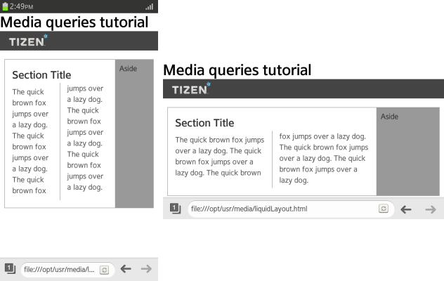
- Define basic styles for the page, using a flexible box (in mobile or wearable applications) and multi-column (in mobile applications only) layout with 2 columns. (The following figure applies to mobile applications only.)
.container
{
   display: -webkit-flex;
}
.container aside
{
   -webkit-flex: 1 0 20%;
}
.contents
{
   -webkit-columns: 5em 3;
   -webkit-column-rule: 1px solid #999;
   -webkit-column-gap: 2em;
   -webkit-flex: 1 1 auto;
}
.contents h2
{
   -webkit-column-span: all;
}
The page is easy to view as long as the screen width is about 600 px; however, in a smaller screen below 400 px, the legibility rapidly decreases. You can edit the layout by reducing the number of columns to 1 and moving the Aside area at the bottom of the screen, but those changes then decrease legibility on a wider screen.
-
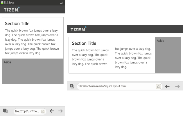
To solve the problem, use a media query to define a liquid layout that changes according to the screen resolution:
@media all and (max-width: 480px) and (orientation: portrait)
{
   .contents {-webkit-columns: 1;}
}
@media all and (min-width: 480px) and (max-width: 768px)
{
   .contents {-webkit-columns: 2;}
   .container {display: -webkit-flex;}
}
With the above media query, the normal resolution has 2 columns (shown on the right in the figure), while in a smaller resolution in a portrait mode only 1 column is used (shown on the left). (The following figure applies to mobile applications only.)

-
If you need to define specific styles for a certain resolution range, simply add more media queries. However, too many conditions make the maintenance harder, so carefully consider what kind of resolution ranges you need.
The following conditions are generally used and cover all possibilities up to a Web browser in a PC:
<!--Portrait mode of a smart phone-->
@media screen and (max-width: 480px) and (orientation: portrait) {<!--Specific layout-->}

<!--Landscape mode of a smart phone and a small tablet-->
@media screen and (min-width: 480px) and (max-width: 768px) {<!--Specific layout-->}

<!--Tablet and a small laptop-->
@media screen and (min-width: 768px) and (max-width: 1024px) {<!--Specific layout-->}

<!--PC browser-->
@media screen and (min-width: 1024px) {<!--Specific layout-->}
@media print {<!--Specific layout-->}
Source Code
For the complete source code related to this use case, see the following files:


