CSS Backgrounds and Borders Module (Level 3): Specifying Background and Border Styles
You can manage the CSS properties for specifying the border style or background of any HTML element.
When creating a background for an element, you can use the following properties:
-
background-color
Defines the color of the background.
-
background-image
Defines the image to be used. You can add images as separate layers to an element. To add multiple images, separate them by commas to add each image as a separate layer. The images are added in the order they are defined.
-
background-position
Defines the exact position of the image.
-
background-repeat
Defines whether the image is repeated to fill the entire background (in case the image is too small to do it otherwise).
-
background-origin
Defines the position of the initial background for the item.
-
background-size
Defines the size of the image in the background.
-
background-clip
Defines the area of the cropped background element.
The border properties specify the line thickness, style, and color for the element border. You can define the border using 3 separate properties (border-width, border-style, and border-color), or by listing the values for all 3 properties together in 1 border property. To define rounded corners for the border, you can additionally use the border-radius property.
To define shading for an element, you can define the horizontal and vertical offset, blur radius, and the spread distance values within the box-shadow property. To switch the shadow from outside to inside the element, add the inset keyword to the property too.
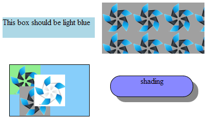
The following image shows a simple background color (top left), a background image (top right), multiple images with a solid black border (bottom left), and an element with shading and a solid black border with rounded corners (bottom right). The background image at top right is automatically repeated to cover the entire background, while the images at bottom left are not repeated due to the background-repeat property value.
Figure: Background examples

The following code snippet demonstrates how to set the background color, images, borders, and shadings.
<!--Background color-->
#one
{
   width: 180px;
   height: 40px;
   background-color: lightblue;
}

<!--Background image-->
#one
{
   width: 200px;
   height: 100px;
   background-color: #00F;
   background-image: url(t3.png);
}

<!--Multiple images-->
#multi
{
   width: 155px;
   height: 100px;
   border: 1px solid #000;
   background-color: #87CEFA;
   background-image: url(t1.png), url(t2.png), url(t3.png);
   background-position: center center, 20% 100%, top left;
   background-repeat: no-repeat;
}

<!--Shading and border with rounded corners-->
#shading
{
   width: 160px;
   height: 40px;
   border: 1px solid #000;
   border-radius: 20px;
   background-color: #88f;
   box-shadow: #888 10px 10px;
}
Creating Backgrounds
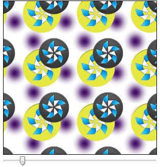
To enhance the user experience of your application, you must learn to create a multilayer background with the parallax effect using the CSS box model. The background consists of 3 images on separate layers, and 2 of the layers can be moved over each other.
Figure: Background with the parallax effect

- Prepare 3 images (tizen.png, tizen2.png, and dot.png), each with a transparent background.

- Create a div element with id="parallelexample" and a slider input element with the minimum, maximum, and initial value:
<div id="parallelexample"></div>
<input id="position" type="range" min="1" max="200" value="50">
- Define the needed styles for the div element in the <head> section using the parallelexample ID.
Define a background using the prepared images in the correct order. The images are shown in the order they have been added, with the first image on the topmost layer. Use the same order when defining the background position for each image.
#parallelexample { width: 300px; height: 300px; background-image: url(tizen2_32.png), url(tizen3_32.png), url(dot.png); background-position: 6.25em 8em, 3.125em 4em, center top; background-repeat: repeat, repeat, repeat; border: 1px solid black; margin: 0px auto; } - To create the parallax effect, create a method that moves the background layers by changing the horizontal position values of the images in the div element. To determine the position value change, add an onchange event handler for the slider to determine the change based on the slider handle movement.
function moveLayers()
{
   /* Get slider value */
   var poz = document.getElementById('position');
   /* Get the div element */
   var example = document.getElementById('ParallaxExamle');
   /* Add the event handler */
   poz.onchange = function()
   {
      var layer1 = this.value/8, layer2 = this.value/16;
      example.style.backgroundPosition = layer1 +'em 8em, '
                                         + layer2 + 'em 4em, center top';
   }
}
Source Code
For the complete source code related to this use case, see the following files:


