UI Containers: Creating Layouts Using Container UI Components
All applications use containers to create the layout of the UI. The EFL and Elementary support several ways to create this layout. You can use predefined layouts or animated layouts, or you can create your own layouts. It is important to note that container UI components do not have their own visual identity - only logical structures for assignment or placement of the UI components.
When you use container components, such as naviframe, conformant, button, and box, you need to understand certain APIs related to alignment, and EDC parts for, for example, the core layout and animated layout. For more information on the containers EDC parts, see Positioning and Laying out Parts Using the EDC File. The use of the container UI components only differs from the use of the UI components through their absence of a visual identity.
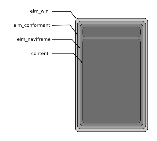
Most of the time, your application has to manage multiple views. The easiest way to handle them with the EFL is to create a naviframe object. This object is a container. At first, it is used to contain the pages your application is composed of. Every Tizen application can use this top-layer object to facilitate navigation. More details can be found in Creating a Naviframe for Navigation.
Another interesting object that has to be present in every application is the conformant object. Conformant is a container component that accounts for the space taken up by the indicator, virtual keyboard, and softkey windows. The conformant content will be resized and positioned based on the space available. When the virtual keyboard is displayed, the content does not change.
Figure: Basic EFL application structure

Container Components
The following table lists the available UI container components.
| Container name | Description |
|---|---|
| Box | One of the most simple containers in the EFL is a box. |
| Conformant | A conformant is a container component that accounts for the space taken by the indicator, virtual keyboard, and softkey windows. |
| Grid | In a grid, objects are placed at specific positions along a fixed grid. |
| Layout | A layout is a container component that takes a standard Edje design file and wraps it very thinly in a UI component. |
| Mapbuf | A mapbuf is a container component that uses an Evas map to hold a content object. This UI component is used to improve the moving and resizing performance of complex UI components. |
| Naviframe | A naviframe component consists of a stack of views. New views are pushed on top of previous ones, and only the top-most view is displayed. |
|
Panes (in mobile applications only) |
A panes component adds a draggable bar between two sections of content. The sections are resized when the bar is dragged. |
| Scroller | A scroller holds (and clips) a single object and allows you to scroll across it. |
| Table | A table is like a box but with 2 dimensions. |


