Scalability Support
To ensure that your application works well in diverse devices, you must consider scalability when designing the application layout:
Key Concepts
When designing the application layout to be scalable, you must pay attention to the following key concepts:
- Understand the character of the relative position and the fixed position
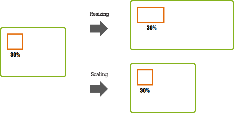
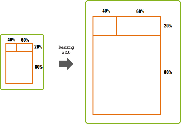
In the relative position, the size is determined in proportion to the size of the referred object. For example, if an orange rectangle occupies 30% of the green rectangle, and the green rectangle is expanded, the orange rectangle is expanded accordingly. However, if the scaling value is changed and the green rectangle is not scaled, the orange rectangle remains unchanged too.
Figure: Relative position
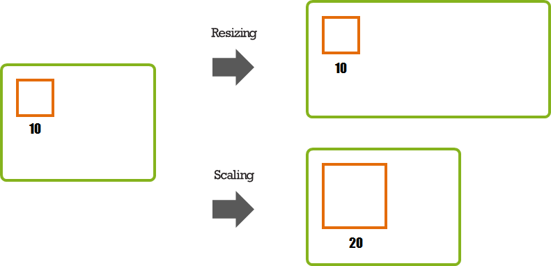
In the fixed position, the size is determined by a value set for the object. For example, the orange rectangle set to the size of 10. If the green rectangle is expanded, the orange rectangle does not change. However, if the scaling value is, for example, doubled, the size of the orange rectangle grows to 20.
Figure: Fixed position
- Use the relative position
If you set the object size as a percentage, the ratio remains fixed regardless of the changes in the screen size or resolution. If you want the object size changed in proportion of the window size, use the relative position.
Figure: Scaling relative position
- Multiply the scaling value, if you use the fixed size
If you use the EDC file to set up the layout, you can set the scale in the part element:
parts
{
   part
   {
      name: "box";
      type: RECT;
      scale: 1;
   }
}
If you set the fixed size in C code, you can use the ELM_SCALE_SIZE macro:
evas_object_size_hint_min_set(object, ELM_SCALE_SIZE(100), ELM_SCALE_SIZE(100));
For more information see Applying the Base Scale.
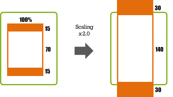
- Do not fill the width or height out with a fixed size only
If you fill the entire height out with a fixed size only and it is scaled, the end result can be larger than the screen size.
Figure: Height filled with a fixed size
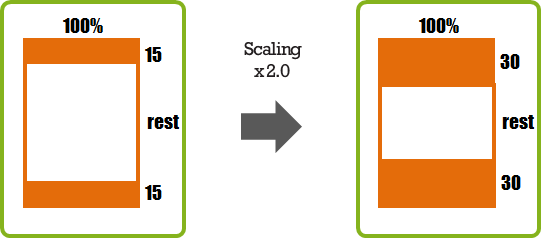
If you set a partial width or height with a fixed size and leave the remaining area flexible, the layout does not expand outside the screen.
Figure: Height with a flexible area
Scalability Using Elementary UI Components
The Tizen platform provides a UI component toolkit library, called Elementary, that includes an extensive set of UI components. You can use elementary UI components to compose your application user interface (UI). While creating the UI, you can set specific properties for the UI components to control the scalable behavior of the UI. Before you try to create a scalable UI using elementary UI components, make sure you understand the following core concepts on how scalability works with elementary UI components.
| Note |
|---|
The Elementary library provides 3 groups of APIs:
|
Using Containers for Effective Layouts
The Elementary library provides several containers to display UI components in an effective layout. The containers have no visual identity of their own.
- Box
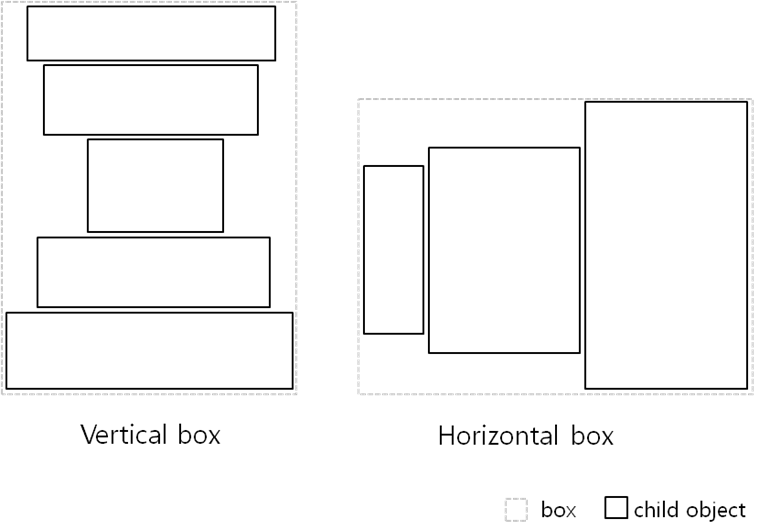
The box container makes a layout where child UI components are stacked in either horizontal or vertical direction. The box size is the sum of its child UI components' size:
- A vertical box calculates its height as the sum of its children's height and its width as the width of the widest child.
- A horizontal box calculates its width as the sum of its children's width and its height as the height of the tallest child.
Figure: Box layout
The box-based linear layout is the best solution to ensure a minimum size for the child UI components in any device or any orientation.
- Grid
The grid container makes a layout where child UI components set their position and size relative to the container position and size. You can define the virtual width and height of the grid (by default: 100 x 100). You then packs the child UI components into the grid while setting their position and size based on the virtual size of the grid.
Figure: Grid layout
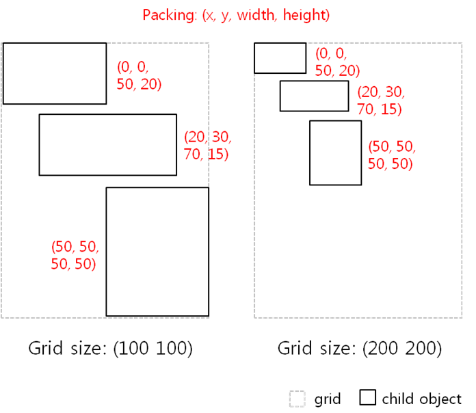
The grid-based relative layout can always fill the full screen in any device or any orientation. However, the size of the child UI components is changed based on the screen size.
Using Weight and Align Properties
To make a layout scalable with UI components, the UI components must be packed into a container using only the weight and align properties based on their minimum size. Do not resize the UI components directly using pixels.
The weight and align properties are associated with every elementary UI component, and they serve as hints for the container they are in. They tell the container how the UI component wants to occupy the space and pack itself with other UI components in the container.
Weight
You can set the weight property with the evas_object_size_hint_weight_set(x_weight, y_weight) function:
- Containers use the weights of the child UI components by normalizing them across all child UI components along both X and Y directions.
- The parameter values can be 0 or positive values (default: 0.0).
0.0 means that the container allocates a minimum size of the UI component area.
1.0 (EVAS_HINT_EXPAND) means that the container allocates all of the remaining area to the UI component.
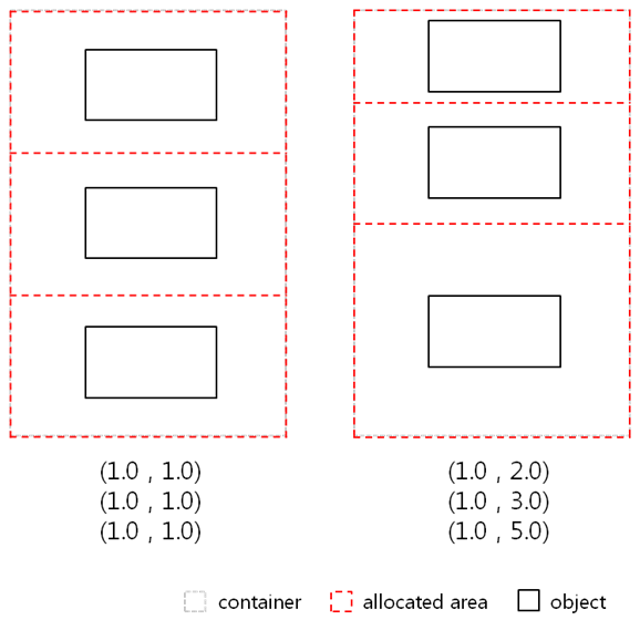
- If the container has several UI components, it allocates the UI component area relative to the weights of other UI components.
Figure: Weight hint
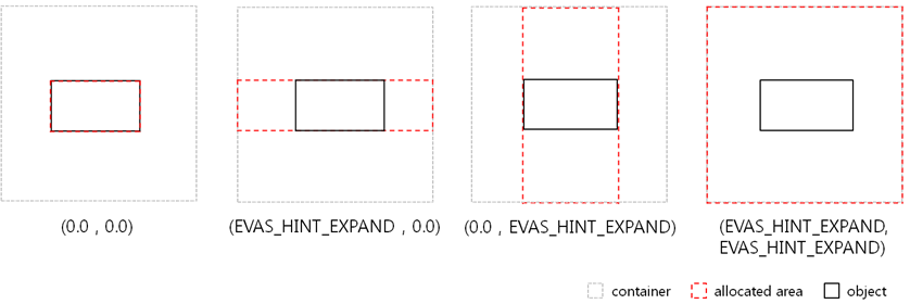
Figure: Weight hint across multiple child UI components
Align
You can set the align property with the evas_object_size_hint_align_set(x_align, y_align) function:
- UI components use the alignment for their position or size along both X and Y directions.
- The parameter values can be from 0.0 to 1.0 or -1.0 (default: 0.5).
- The values define positions as follows: left is (x=0.0), right is (x=1.0), top is (y=0.0), and bottom is (y=1.0). The center is (x=0.5, y=0.5).
-1.0 (EVAS_HINT_FILL) means that the UI component fills all of the allocated area.
Figure: Alignment hint

Scalability Using Edje
The Tizen platform provides a complex graphical design and layout library called Edje, which provides an abstraction layer between the application code and the interface. You can use Edje in your Tizen applications to create visual elements and control the layout, look, and feel.
Internally, Edje holds a geometry state machine and a state graph that defines, for example, what is visible, where, at what size, and with what colors. These details are described to Edje using an Edje .edj file. The file can be produced by using Edje_cc to take a text file (a .edc file) and "compile" an output .edj file that contains the state graph information, images, and any other needed data.
While creating Edje, you set specific element properties to control the scalable behavior of the UI. Before creating a scalable UI using Edje, you must be familiar with the following scalability properties and part types.
Part
Parts are used to represent the most basic layout elements, such as a line in a border or a text on an image.
The parts can have the following property:
-
scale: 0-1
Specifies whether the part scales its size with the scaling factor (Tizen has a scaling factor to resize the application layout and object). This property is used to scale properties, such as font size or min/max size of the part.
The default value is 0 (off) and the default scaling factor is 1.0. To make a part scalable, set the property to 1 (on).
Description
Every part can have one or more description blocks to define the layout properties of the part.
The descriptions can have the following properties:
-
min/max: width height
Specifies the minimum or maximum size of the part in pixels. It has no effect on the container size.
When the scale property of the part is set to 1 (on), the size is multiplied by the scaling factor.
-
fixed: 0-1 0-1
When the min or max property is set, this property sets a boolean value for each dimension (horizontal and vertical, respectively) that tells the application whether it must be scaled when resized.
The default value is 0 0. To fix a part size to its min or max, set the value to 1.
-
align: X-axis Y-axis
When the displayed object size is smaller than its container, this property moves it along both axes using the relative position.
To move the property, use x = 0.0 to move to left, x = 1.0 to move to right, y = 0.0 to move to the top, and y = 1.0 to move to the bottom. The x = 0.5, y = 0.5 value sets the object at the center of its container.
The default value is 0.5 0.5.
-
rel1/rel2
Specifies the position of the left-top and bottom-right corners of the part's container.
-
relative: X-axis Y-axis
Specifies the relative position of the part's container.
The default value is 0.0 0.0 for rel1.relative and 1.0 1.0 for rel2.relative.
-
to/to_x/to_y
Specified that a corner must be positioned relatively to another part's container.
By default, the corners of a part are placed to the whole interface.
Table: Edje part property example collections { group { name: "property_test"; images { image: "panorama.png" COMP; } parts { part { name: "rect1"; type: RECT; description { state: "default" 0.0; rel1 {relative: 0.3 0.4;} rel2 {relative: 0.7 0.6;} color: 0 127 255 255; } } part { name: "rect2"; type: RECT; // Affected by scaling factor scale: 1; description { state: "default" 0.0; fixed: 0 1; // Height: 100 pixels (when the scaling factor is 1.0) min: 0 100; rel1 {relative: 0.0 1.0;} rel2 {relative: 1.0 1.0;} // Bottom-aligned align: 0.5 1.0; color: 255 127 0 255; } } part { name: "image"; // Affected by scaling factor scale: 1; description { state: "default" 0.0; fixed: 1 1; // Image size: 720 x 180 pixels (when the scaling factor is 1.0) min: 720 180; // Y-axis is positioned relative to "rect2" part rel1 {relative: 0.5 0.0; to_y: "rect2";} rel2 {relative: 0.5 0.0; to_y: "rect2";} // Bottom-aligned align: 0.5 1.0; image.normal: "panorama.png"; } } } } }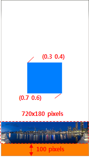
-
relative: X-axis Y-axis
-
aspect: min max
Specifies the width to height ratio to keep when the part is resized. When both values are the same, the ratio is fixed. When they differ, the part is forced to keep the ratio between the min and max properties when resized.
The default value is 0.0 0.0.
-
aspect_preference: dimension
Specifies the scope of the aspect property to a given dimension.
The possible values are BOTH, VERTICAL, HORIZONTAL, and NONE. The default is NONE.
Table: Edje part property aspect example collections { group { name: "property_test"; images { image: "island.png" COMP; } parts { part { name: "image"; description { state: "default" 0.0; rel1 {relative: 0.0 0.0;} rel2 {relative: 1.0 1.0;} image.normal: "island.png"; aspect: 8/5 8/5; // Keep the aspect ratio based on the part width aspect_preference: HORIZONTAL; } } } } }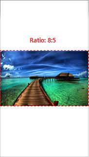
Text
The text elements are used to display text on the screen.
The texts can have the following properties:
-
size: font-size
Specifies the font size for the text. When the scale property of the part is set to 1 (on), the size is multiplied by the scaling factor.
-
min: horizontal vertical
Specifies a pair of boolean values that define whether the container can be reduced further than the text size. The property is used to prevent the container from chopping the text.
When min is set horizontally or vertically, the minimum height or width of the part is decided by the text size.
The default value is 0 0.
-
max: horizontal vertical
Specifies a pair of boolean values that define whether the container can be expanded further than the text size.
When max is set horizontally or vertically, the maximum height or width of the part is decided by the text size.
The default value is 0 0.
Table: Edje text property example collections { group { name: "property_test"; parts { part { name: "text"; type: TEXT; scale: 1; description { state: "default" 0.0; rel1 {relative: 0.0 0.0;} rel2 {relative: 1.0 0.0;} align: 0.5 0.0; color: 108 108 108 255; text { font: "TIZEN"; // Affected by scaling factor size: 80; // Minimum height of the part container is decided by the text size min: 0 1; text: "Test properties!!"; } } } } } }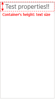
-
fit: horizontal vertical
Specifies a pair of values that define whether the text is scaled to fill its container horizontally and/or vertically.
The default value is 0 0.
Table: Edje text property fit example collections { group { name: "property_test"; parts { part { name: "text"; type: TEXT; description { state: "default" 0.0; rel1 {relative: 0.0 0.0;} rel2 {relative: 1.0 0.1;} color: 108 108 108 255; text { font: "TIZEN"; // Resize text to fill the container height fit: 0 1; text: "Test properties!!"; } } } } } }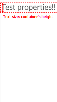
Image
The image elements are used to display images on the screen.
The images can have the following properties:
-
border: left right top bottom
Specifies the border size of the image in pixels. This property sets the area of each side of the image to be displayed as a fixed size border, preventing the corners from being changed on a resize.
-
border_scale
Specifies whether the border scales its size according to the scaling factor.
The default value is 0 (off). To make the border scalable, the value must be set to 1 (on).
Table: Edje image property example collections { group { name: "property_test"; images { image: "00_button_01_normal.png" COMP; } parts { part { name: "image"; description { state: "default" 0.0; rel1 {relative: 0.0 0.6;} rel2 {relative: 1.0 0.7;} image.normal: "00_button_01_normal.png"; } } part { name: "ninepatch_image"; description { state: "default" 0.0; rel1 {relative: 0.0 0.8;} rel2 {relative: 1.0 0.9;} image { normal: "00_button_01_normal.png"; border: 4 4 0 0; // Affected by scaling factor border_scale: 1; } } } } } }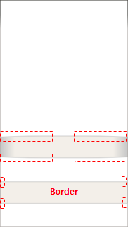
Image Set
The image set elements are used to display a specific image on the screen based on the container size.
The image sets can have the following properties:
-
name: image-name
Specifies the name of the image file.
-
size: minw minh maxw maxh
Specifies the minimum and maximum size that causes a specified image to be selected and shown.
The image set is used to control resource quality when the image part is scaled to multiple devices. According to the size of the part's container, an appropriate image is loaded.
Table: Edje image set property example collections { group { name: "property_test"; images { set { name: "alternative_animal"; image { image: "pig.png" COMP; size: 640 800 1200 1500; } image { image: "monkey.png" COMP; size: 400 500 639 799; } image { image: "cat.png" COMP; size: 240 300 399 499; } image { image: "mouse.png" COMP; size: 80 100 239 299; } image { image: "snail.png" COMP; size: 0 0 79 99; } } } parts { part { name: "image1"; description { state: "default" 0.0; rel1 {relative: 0.0 0.0;} rel2 {relative: 1.0 0.45;} image.normal: "alternative_animal"; aspect: 4/5 4/5; aspect_preference: BOTH; } } part { name: "image2"; description { state: "default" 0.0; rel1 {relative: 0.0 0.5;} rel2 {relative: 1.0 0.75;} image.normal: "alternative_animal"; aspect: 4/5 4/5; aspect_preference: BOTH; } } part { name: "image3"; description { state: "default" 0.0; rel1 {relative: 0.0 0.8;} rel2 {relative: 1.0 1.0;} image.normal: "alternative_animal"; aspect: 4/5 4/5; aspect_preference: BOTH; } } } } }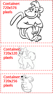
Part Types
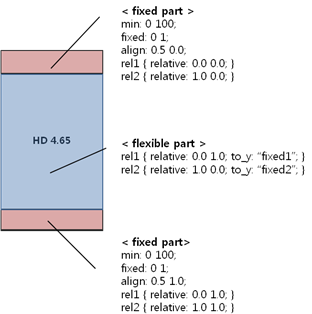
You can use fixed and flexible parts:
- Fixed parts
- Fixed parts have a minimum size (at least width or height).
- When the part scale property is set to 1 (on), the scaling factor has an effect on the minimum size.
- Fixed parts are used when the parts must keep a fixed size in any device or any orientation.
- Flexible parts
- Flexible parts resize according to the container size and other fixed parts' size.
- Flexible parts are used when the parts can be resized in any device or any orientation.
Figure: Fixed and flexible parts
Aspect Ratio
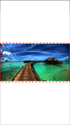
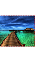
In Tizen, the application generally fills out the screen. However, sometimes you want the application to be shown in a specific aspect ratio, regardless of the screen size.
As images are scaled in different devices, they are resized based on the container size. The images have specific properties that define the area to be shown when resized.
For example, the following table illustrates what happens to the parts marked with yellow rectangles in the following figures, when scaling properties are applied.
Figure: Original image [1920x1280 (8:5)]
![Original image [1920x1280 (8:5)]](../../images/scale_original_image.png)
| Note |
|---|
| To set the required aspect ratio, use the evas_object_size_hint_aspect_set() function or the aspect_preference attribute in the EDC. |
| Aspect | Container area | |
|---|---|---|
| 720x384 (15:8) | 720x640 (9:8) | |
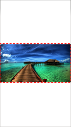
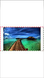
| HORIZONTAL
Resizing based on the container width while keeping the image aspect ratio. Extra height goes outside the image area and is clipped. |
|
|
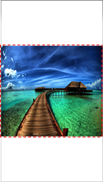
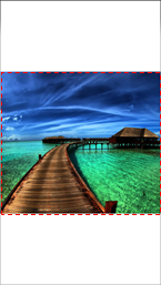
| VERTICAL
Resizing based on the container height while keeping the image aspect ratio. Extra width goes outside the image area and is clipped. |
|
|
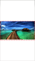
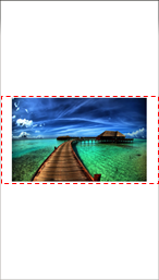
| BOTH
Resizing based on the container area while keeping the image aspect ratio. No extra width or height goes outside the image area, so the entire image is always shown. |
|
|
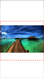
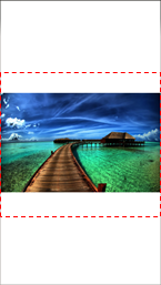
| NONE
Resizing to fill the available area while keeping the image aspect ratio. Extra width or height goes outside the image area and is clipped. |
|
|
Setting the Image Aspect Ratio
In case of an image object, you can set its aspect ratio with additional APIs:
-
elm_image_fill_outside_set()
If the function is set to TRUE, the image resizes to fill the entire area while keeping its aspect ratio. It lets the extra width or height go outside of the area (same result as with the aspect NONE in the above table).
-
elm_image_aspect_fixed_set()
If the function is set to FALSE, the image resizes to fill the entire area without keeping its original aspect ratio. The image can be distorted to fit the area.
Table: Image resizing without keeping the aspect ratio Container area 720x384 (15:8) 720x640 (9:8) 