
UI Builder
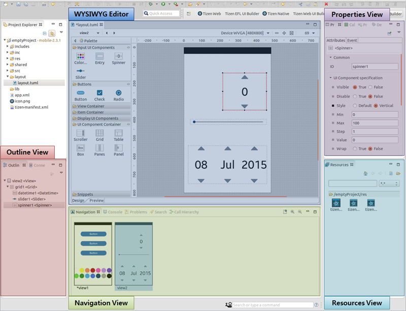
The Tizen native UI Builder is a graphical user interface builder tool that simplifies the creation of Tizen native UIs by allowing you to arrange UI components using a drag-and-drop WYSIWYG (What You See Is What You Get) editor.
The UI Builder supports a variety of UI components and views and editors.
The UI Builder is not only a UI layout code generating tool, it also supports an easy-to-use programming model though the UI Builder project.
Figure: UI Builder
| Note |
|---|
| The UI Builder is supported only in mobile Ubuntu. |
Supported Views and Editors
The UI Builder supports the following views and editors:
Navigation View
The Navigation view displays thumbnail images of all the views in the currently selected project. If the Navigation view is not visible, open it from Window > Show View > Other > Tizen > Navigation.
Figure: Navigation view
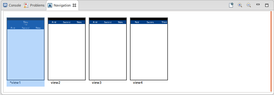
The Navigation view provides the following features:
- View navigation
- You can see the view thumbnails.
- You can select a view to edit in the WYSIWYG Editor.
- View management
- You can create and delete views.
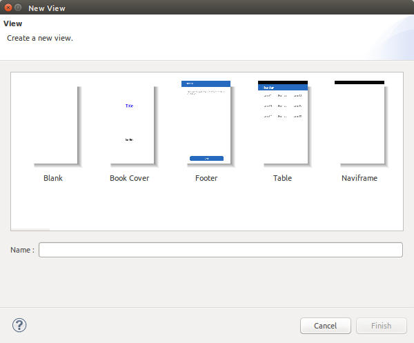
- To create a new view, select New in the context menu.
Figure: New View Wizard
- To add an empty view, select Add Empty View (Ctrl + a) in the context menu.
- To delete a view, select Delete (Delete) in the context menu.
Startup and Editing views cannot be deleted.
- To create a new view, select New in the context menu.
- You can copy, cut, paste, and move views.
- You can select a startup view.
- You can create and delete views.
- View templates
- You can create and delete view templates.
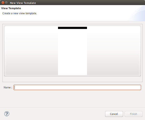
- To create a new view template, select Create View Template in the context menu.
Figure: New View Template Wizard
- To create a new view template, select Create View Template in the context menu.
- You can use the view templates to create a new view.
- You can create and delete view templates.
Outline View
The Outline view displays the hierarchical structure of the view currently open in the WYSIWYG Editor view. If the Outline view is not visible, open it from Window > Show View > Other > General > Outline.
Figure: Outline view
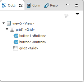
The Outline view provides the following features:
- UI component navigation
- You can see the UI component hierarchy.
- UI component management
- You can copy, cut, paste, delete, and rename UI components.
Properties View
The Properties view displays the properties of the UI component selected in the WYSIWYG Editor view. If the Properties view is not visible, open it from Window > Show View > Other > General > Properties.
The Properties helps you to edit UI components and events.
Figure: Properties view
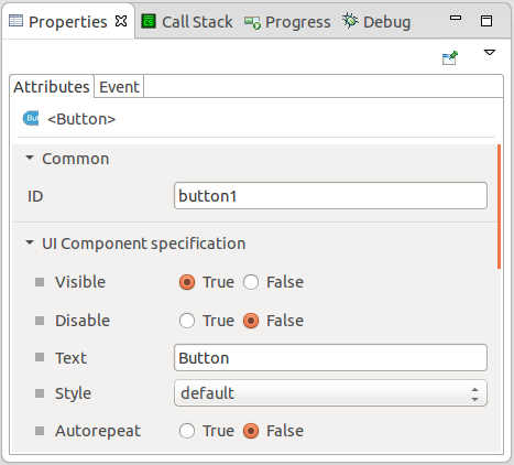
The Properties view consists of Attributes, and Event tabs:
-
Attributes
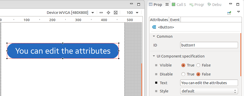
In the Attributes tab, you can edit UI component attributes. Attributes are categorized into common (common UI component properties) and UI component specification (UI component-specific properties) attributes. The UI component specification attributes are divided into categories according to the UI component attributes.
-
Common
The Common category only includes the ID attribute, which is the default UI component identifier in the code.
-
UI component specification
The UI component specification category includes all UI component-specific attributes.
-
Common
-
Event
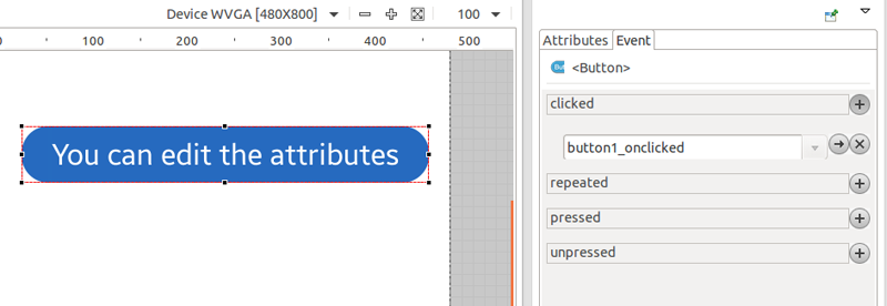
In the Event tab, you can create an event handler and bind it. If you click the
 button, the C editor opens. When the event handler function is focused, you can start writing code.
Resources View
The Resources view displays the resources in the selected project. If the Resources view is not visible, open it from Window > Show View > Other > Tizen > Resources.
Figure: Resources view
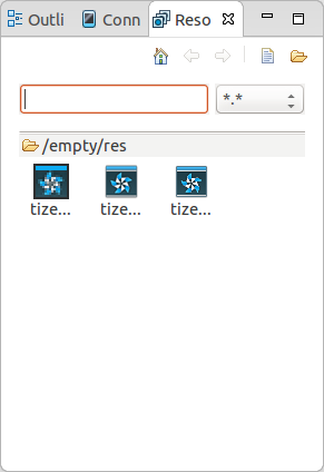
The Resources view provides the following features:
- Resource navigation
You can move files to child and parent folders.
- Resource management
You can copy, paste, delete, and rename resources.
- Resource filter
You can filter the view to show resources of a particular name or extension.
- Resource import
You can import files or folders.
- Easy editing
You can edit the resource property of the UI components using drag and drop.
WYSIWYG Editor
The WYSIWYG Editor view is a WYSIWYG (What You See Is What You Get) editor for the UI Builder project.
Figure: WYSIWYG Editor
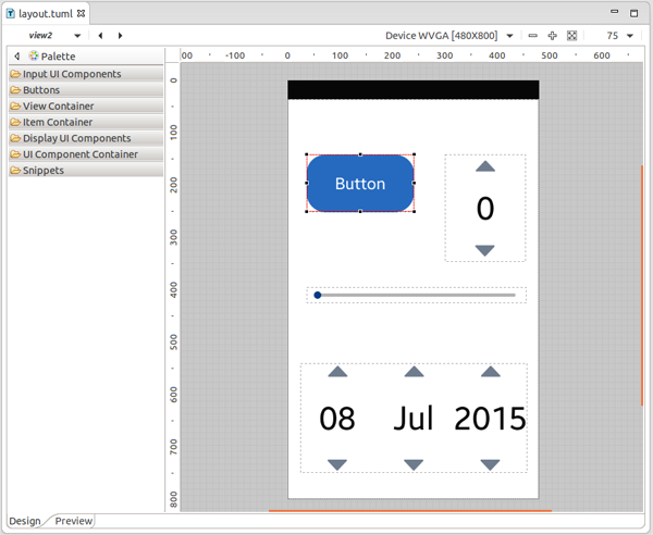
The WYSIWYG Editor view consists of the following parts:
-
Palette
The palette contains EFL UI components, which you can select and add to the design area.
- Supported UI components:
Scroller, Grid, Table, Box, Panes, Panel, Button, Check, Radio, Colorselector, Entry, Spinner, Slider, Naviframe, List, Genlist, Toolbar, Multibuttonentry, Gengrid, Index, Background, Datetime, Icon, Image, Label, Progressbar, and Layout
- Supported UI components:
-
Toolbar
The toolbar supports the following functions:
- Select the view you want to edit using the view combo.
View button Description 
Move to the previous view. 
Move to the next view. - Select the resolution of the design area using the
 drop-down menu.
 - Zoom within the design area.
Zoom button Description 
Zoom out. 
Zoom in. 
Maximize the design area on the screen. 
Change the design area size to a predefined percentage value.
- Select the view you want to edit using the view combo.
-
Design area
You can work with UI components visually so that you can see what your application looks like as you build it.
