Media Queries: Labeling Output Devices in Style Sheets
This tutorial demonstrates how you can define media queries to determine the styles to be used in the Web document.
Warm-up
Become familiar with the Media Queries API basics by learning about:
-
Creating a Liquid Layout
Create a liquid document layout that organically changes according to the device resolution.
Creating a Liquid Layout
To enhance the user experience of your application, you must learn to define media queries to determine the styles to be used in the Web document. This example creates a simple Web document with a liquid layout that organically changes according to the device resolution to show the optimized layout on both portrait and landscape modes.
- Define a page with title and content elements:
<header>
   <h1>Media queries tutorial</h1>
   <h1><img src="logo.png" alt="Tizen"></h1>
</header>
<div class="container">
   <section class="contents">
      <h2>Section Title</h2>
      <p class="desc">
         The quick brown fox jumps over a lazy dog.  The quick brown...
      </p>
   </section>
   <aside>
      Aside
   </aside>
</div>
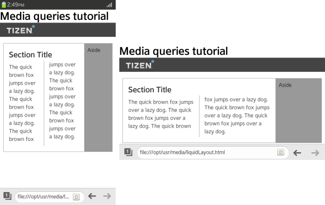
- Define basic styles for the page, using a flexible box (in mobile or wearable applications) and multi-column (in mobile applications only) layout with 2 columns. (The following figure applies to mobile applications only.)
.container
{
   display: -webkit-flex;
}
.container aside
{
   -webkit-flex: 1 0 20%;
}
.contents
{
   -webkit-columns: 5em 3;
   -webkit-column-rule: 1px solid #999;
   -webkit-column-gap: 2em;
   -webkit-flex: 1 1 auto;
}
.contents h2
{
   -webkit-column-span: all;
}
The page is easy to view as long as the screen width is about 600 px; however, in a smaller screen below 400 px, the legibility rapidly decreases. You can edit the layout by reducing the number of columns to 1 and moving the Aside area at the bottom of the screen, but those changes then decrease legibility on a wider screen.
-
To solve the problem, use a media query to define a liquid layout that changes according to the screen resolution:
@media all and (max-width: 480px) and (orientation: portrait)
{
   .contents {-webkit-columns: 1;}
}
@media all and (min-width: 480px) and (max-width: 768px)
{
   .contents {-webkit-columns: 2;}
   .container {display: -webkit-flex;}
}
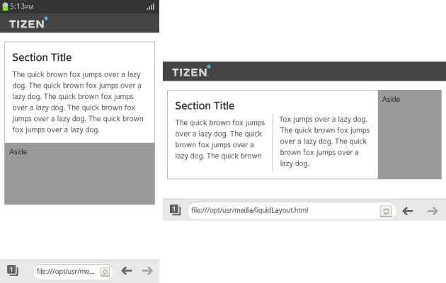
With the above media query, the normal resolution has 2 columns (shown on the right in the figure), while in a smaller resolution in a portrait mode only 1 column is used (shown on the left). (The following figure applies to mobile applications only.)

-
If you need to define specific styles for a certain resolution range, simply add more media queries. However, too many conditions make the maintenance harder, so carefully consider what kind of resolution ranges you need.
The following conditions are generally used and cover all possibilities up to a Web browser in a PC:
<!--Portrait mode of a smart phone-->
@media screen and (max-width: 480px) and (orientation: portrait) {<!--Specific layout-->}

<!--Landscape mode of a smart phone and a small tablet-->
@media screen and (min-width: 480px) and (max-width: 768px) {<!--Specific layout-->}

<!--Tablet and a small laptop-->
@media screen and (min-width: 768px) and (max-width: 1024px) {<!--Specific layout-->}

<!--PC browser-->
@media screen and (min-width: 1024px) {<!--Specific layout-->}
@media print {<!--Specific layout-->}
Source Code
For the complete source code related to this use case, see the following files:


