CSS Basic User Interface Module Level 3 (CSS3 UI): Applying Styles to HTML Documents
This tutorial demonstrates how you can change the Web form UI and control the box model in HTML documents.
Warm-up
Become familiar with the CSS Basic User Interface Module Level 3 (CSS3 UI) API basics by learning about:
-
Using Pseudo-element Selectors
Change the Web Form UI using a CSS3 pseudo-class based on the user actions.
-
Using Box Model Properties
Use the box model properties to control the box model.
Using Pseudo-element Selectors
To enhance the user experience of your application, you must learn how to use pseudo-element selectors:
-
Use the pseudo-classes, such as :enabled and :disabled, to add different styles based on the state of the DOM elements:
input: enabled {border: 1px solid blue}
input: disabled {border: 1px solid red}
Note In the versions prior to CSS3, pseudo-elements, such as :hover, :active, and :focus, were used, and required an attribute selector. Since the :enabled and :disabled classes are not influenced by the display and visibility attributes, they improve the accessibility. - To control the state of the HTML5 Web Forms (in mobile or wearable applications), use the :in-range and :out-of-range pseudo-classes.
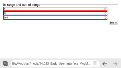
They check for any values that have exceeded the inserted range. (The following figure applies to mobile applications only.)
<!--HTML-->
<input type="number" step="10" min="10" max="100">
<!--CSS-->
input[type="number"]: in-range {border: 3px solid blue; width: 90%}
input[type="number"]: out-of-range {border: 3px solid red; width: 90%}
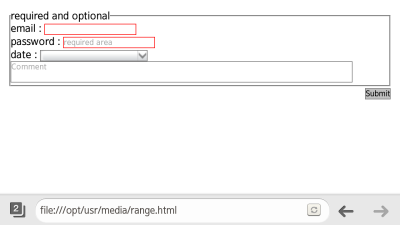
- To apply different styles to required input items and option items, use the :required and :optional pseudo-classes. (The following figure applies to mobile applications only.)
<!--HTML-->
<fieldset>
   <legend>required and optional</legend>
   <label>email: <input type="email" required></label>
   <label>password: <input type="Password" placeholder="required area" required></label>

   <label>date: <input type="date" placeholder="You know what to do, huh?"></label>
   <textarea placeholder="Comment"></textarea>
</fieldset>
<!--CSS-->
input: required, textarea: required {border: 1px solid red}
input: optional, textarea: optional {border: 1px solid #777}
Source Code
For the complete source code related to this use case, see the following files:
Using Box Model Properties
To enhance the user experience of your application, you must learn how to use box model properties:
| Note |
|---|
| The properties dependent on mouse and keyboard functions are not discussed in this tutorial. |
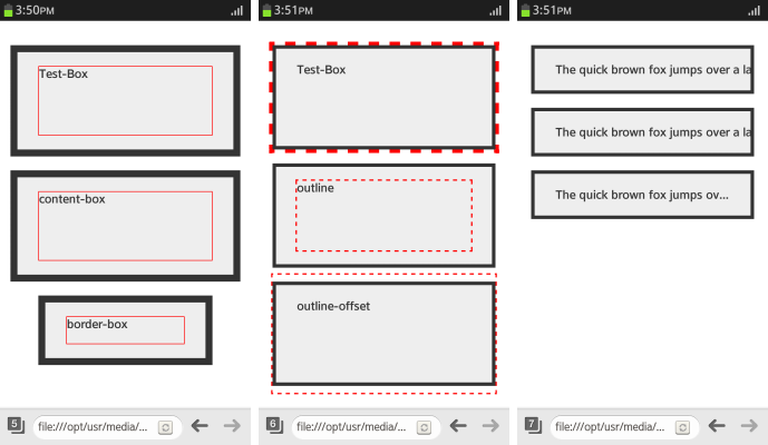
- To assign the area that is included in the width and height of the box automatically, use the box-sizing property. To assign the width without a margin, use the box-sizing: border-box property.
div.content-box {box-sizing: content-box} <!--width (height) = content--> div.border-box {box-sizing: border-box} <!--width (height) = content + padding + border--> div.border-box: before {height: 40px} - To draw an outline without using up the area, use the outline property:
.Test-Box {outline: 5px dashed red} .outline: before {outline: 2px dashed red} .outline-offset: before {outline-offset: 35px} - To handle text that exceeds the area of the box model, use the text-overflow property. The text-overflow: ellipsis property is used to indicate the text exceeded the padding area as '...'.
div
{
   width: 250px;
   margin: 20px auto;
   padding: 20px 30px;
   background-color: #eee;
   color: #333;
   border: 5px solid #333;
   font-weight: bold;
   overflow: hidden;
   white-space: nowrap;
}

.clip {text-overflow: clip}
.ellipsis {text-overflow: ellipsis}
The following figure illustrates the box model properties; from left to right, it shows the effects of the box sizing, outline, and text overflow properties.
Figure: Box model properties (in mobile applications only)

Source Code
For the complete source code related to this use case, see the following files:


