CSS Animations Module Level 3: Creating Animations
This tutorial demonstrates how you can create animations in your application.
Warm-up
Become familiar with the CSS Animations Module Level 3 API basics by learning about:
-
Creating a Logo Animation
Animate the Tizen logo on the screen.
Creating a Logo Animation
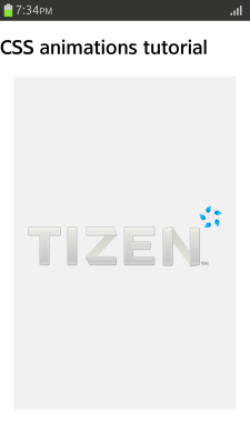
To enhance the user experience of your application, you must learn to create a logo animation, where element properties can be assigned and changed for each element and keyframe. The logo animation is similar to the animation that appears when a Tizen device (or Emulator) is switched on:
- No elements are initially shown on the screen.
- The Tizen logo gradually appears in the middle of the screen, and as it moves to the right, it becomes smaller.
- Each letter in the word "TIZEN" consecutively comes in from the left of the screen and moves to the right to its correct location.
Figure: Logo animation (in mobile applications only)

To create a logo animation:
- Create the HTML layout for the animation. To be able to manage the movement of each animation part separately, you must define individual elements for each part.
<div class="animation-holder">
   <span class="tizen-txt t"></span>
   <span class="tizen-txt i"></span>
   <span class="tizen-txt z"></span>
   <span class="tizen-txt e"></span>
   <span class="tizen-txt n"></span>
   <span class="tizen-txt tm"></span>
   <span class="tizen-logo"></span>
</div>
- Define the basic style for the animation:
.example-body {width: 320px; height: 480px; background: #000; margin: 0 auto; position: relative; border: 2px solid #fff; overflow: hidden;} .animation-holder {width: 280px; height: 88px; position: absolute; left: 50%; top: 50%; margin: -54px 0 0 -140px;} .tizen-txt, .tizen-logo {position: absolute; display: block; background-repeat: no-repeat; background-position: 50% 50%} .tizen-txt.t {width: 48px; height: 56px; background-image: url(images/txt_t.png);} .tizen-txt.i {width: 15px; height: 56px; background-image: url(images/txt_i.png);} .tizen-txt.z {width: 46px; height: 56px; background-image: url(images/txt_z.png);} .tizen-txt.e {width: 45px; height: 56px; background-image: url(images/txt_e.png);} .tizen-txt.n {width: 54px; height: 58px; background-image: url(images/txt_n.png);} .tizen-txt.tm {width: 11px; height: 6px; background-image: url(images/txt_tm.png);} .tizen-logo {width: 220px; height: 211px; left: 30px; top: -61px; background-image: url(images/logo_tizen.png); background-size: 100% 100%;} - Create the animation:
- To ensure that all the animation elements are played within the same time frame, some common properties are defined for the animation. The animation movement time is 7 seconds, and the animation repeats infinitely.
When an animation that repeats itself is activated, it can look unnatural when it suddenly returns to its initial position after finishing an iteration. To make the repetition move naturally, set the animation-direction property to alternate. The alternate direction means that during the odd iterations the animation proceeds in the normal direction (from the 0% keyframe to the 100% keyframe), while during the even iterations the keyframes are played in the opposite direction from 100% to 0%.
.tizen-txt, .tizen-logo { -webkit-animation-duration: 7s; -webkit-animation-iteration-count: infinite; -webkit-animation-direction: alternate; } - Create the keyframes to implement the flow for the Tizen logo:
- During the first 25% of the animation total playing time (7 seconds), the transparency disappears and the Tizen logo appears.
- During the 25 - 50% of the playing time, the logo size becomes smaller as the width and height values are reduced, and due to the left and top value, the logo is positioned to the top right corner of the screen.
- During the 50 - 100% of the playing time, the values do not change, and the logo remains in its new position.
@-webkit-keyframes tizen-logo
{
   0% {width: 220px; height: 211px; left: 30px; top: -61px; opacity: 0;}
   25% {width: 220px; height: 211px; left: 30px; top: -61px; opacity: 1;}
   50% {left: 247px; top: 0px; width: 33px; height: 32px; opacity: 1;}
   100% {left: 247px; top: 0px; width: 33px; height: 32px; opacity: 1;}
}
Note If the 100% keyframe is not defined, the animation is executed based on the original properties, and the logo size increases to its original size at the end. - Create the keyframes to implement the flow for each letter in the word "TIZEN":
- To hide the letter initially, the property has been assigned outside the screen at the 0% keyframe. To allow the Tizen logo to appear first, the first letter is introduced at the 30% keyframe.
- To create a slight collision animation, the letter element moves to -10 px of the final value at the 40% keyframe before reaching its final 0 px value at the 45% keyframe.
- The animation-timing-function property can be changed for each keyframe point, and is used to determine the pace of the animation. When the letter is actually shown on the screen and moved to its final location, the ease in and out timing functions are used.
To show the letters one at a time, the timing is pushed back a bit more for each consecutive letter:
<!--Letter T--> @-webkit-keyframes tizen-txt-t { 0% {left: 340px; top: 31px;} 30% {left: 340px; top: 31px; animation-timing-function: ease-in;} 40% {left: -10px; top: 31px; animation-timing-function: ease-out;} 45% {left: 0; top: 31px;} 100% {left: 0; top: 31px;} } <!--Letter I--> @-webkit-keyframes tizen-txt-i { 0% {left: 340px; top: 31px;} 40% {left: 340px; top: 31px; animation-timing-function: ease-in;} 50% {left: 47px; top: 31px; animation-timing-function: ease-out;} 55% {left: 57px; top: 31px;} 100% {left: 57px; top: 31px;} } <!--Remaining letters--> -
After creating all the keyframes, define the animation-name property for each element:
.tizen-txt.t
{
   -webkit-animation-name: tizen-txt-t;
}
.tizen-txt.i
{
   -webkit-animation-name: tizen-txt-i;
}
- To ensure that all the animation elements are played within the same time frame, some common properties are defined for the animation. The animation movement time is 7 seconds, and the animation repeats infinitely.
Source Code
For the complete source code related to this use case, see the following files:


