
WearableUIComponents Sample Overview
The WearableUIComponents sample application demonstrates how you can implement UI components, such as header, footer, buttons, and lists, to add variety to your application.
For information on creating the sample application project in the IDE, see Creating Sample Applications.
The following figure illustrates the screens of the WearableUIComponents.
Figure: WearableUIComponents screens
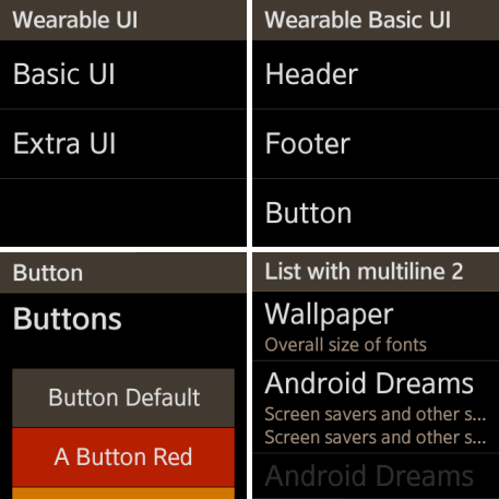
The application opens with the Wearable UI screen, where you can select the basic UI or the more advanced extra UI to see a list of various UI components. Click the list items to view individual screens that demonstrate the selected UI component's functionality.
To return to the previous screen, flick down on the screen.
Source Files
You can create and view the sample application project including the source files in the IDE.
| File name | Description |
|---|---|
| app.js | This file defines the hardware key events for the application. |
| basic/ | This directory contains files for implementing the individual basic UI component screens. |
| config.xml | This file contains the application information for the platform to install and launch the application, including the view mode and the icon to be used in the device menu. |
| css/style.css | This file contains the CSS styling for the application UI. |
| extra/ | This directory contains files for implementing the individual extra UI component screens. |
| index.html | This is a starting file from which the application starts loading. It contains the layout of the application screens. |
| lowBatteryCheck.js | This file contains the code for exiting the application when the device battery is low. |
