CSS Flexible Box Layout Module
CSS attributes, such as float, display, and position, can be used to adjust and align the screen layout according to various resolutions. However, operating the layout accurately among changing screen sizes is difficult.
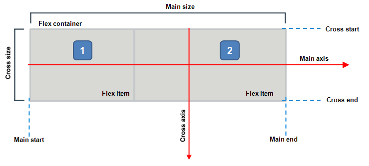
Tizen supports the CSS Flexible Box Layout Module API that enables you to create an easily manageable flexible layout, which fluidly adjusts the layout according to viewport size changes. When you create and use a flexible box layout, the alignment method or object (flex item) size within a specific area (flex container) can be adjusted.
The main components of the flexible box layout include:
-
Flex container, which refers to flex or inline-flex DOM elements assigned by the display.
You can use the flex container to assign a flex area and the flex items included in it. The flex container properties are used to assign the indication area and alignment method.
-
Flex item, which refers to the child nodes of the flex container.
The flex item changes its size fluidly according to the area of the flex container. You can define flex item properties to assign the sizes of the respective items and the alignment method.
Figure: Flexible box layout