CSS Backgrounds and Borders Module Level 3
You can manage the CSS properties for specifying the border style or background of any HTML element.
When creating a background for an element, you can use the following properties:
-
background-color
Defines the color of the background.
-
background-image
Defines the image to be used. You can add images as separate layers to an element. To add multiple images, separate them by commas to add each image as a separate layer. The images are added in the order they are defined.
-
background-position
Defines the exact position of the image.
-
background-repeat
Defines whether the image is repeated to fill the entire background (in case the image is too small to do it otherwise).
-
background-origin
Defines the position of the initial background for the item.
-
background-size
Defines the size of the image in the background.
-
background-clip
Defines the area of the cropped background element.
The border properties specify the line thickness, style, and color for the element border. You can define the border using 3 separate properties (border-width, border-style, and border-color), or by listing the values for all 3 properties together in 1 border property. To define rounded corners for the border, you can additionally use the border-radius property.
To define shading for an element, you can define the horizontal and vertical offset, blur radius, and the spread distance values within the box-shadow property. To switch the shadow from outside to inside the element, add the inset keyword to the property too.
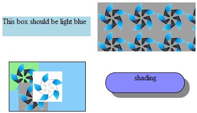
The following image shows a simple background color (top left), a background image (top right), multiple images with a solid black border (bottom left), and an element with shading and a solid black border with rounded corners (bottom right). The background image at top right is automatically repeated to cover the entire background, while the images at bottom left are not repeated due to the background-repeat property value.
Figure: Background examples

The following code snippet demonstrates how to set the background color, images, borders, and shadings.
<!--Background color-->
#one
{
   width: 180px;
   height: 40px;
   background-color: lightblue;
}

<!--Background image-->
#one
{
   width: 200px;
   height: 100px;
   background-color: #00F;
   background-image: url(t3.png);
}

<!--Multiple images-->
#multi
{
   width: 155px;
   height: 100px;
   border: 1px solid #000;
   background-color: #87CEFA;
   background-image: url(t1.png), url(t2.png), url(t3.png);
   background-position: center center, 20% 100%, top left;
   background-repeat: no-repeat;
}

<!--Shading and border with rounded corners-->
#shading
{
   width: 160px;
   height: 40px;
   border: 1px solid #000;
   border-radius: 20px;
   background-color: #88f;
   box-shadow: #888 10px 10px;
}


